CSS3 转换
版权声明:未经博主授权,内容严禁转载
什么是转换
转换时使元素改变形状、尺寸和位置的一种效果。
可以对元素应用 2D 或 3D 转换,从而对元素进行旋转、缩放、移动或倾斜。
2D 转换:使元素在 X 轴和 Y 轴平面上发生变化。
3D 转换:元素同时还可以在 Z 轴上发生变化。
转换属性 - transform
transform 属性向元素应用 2D 或 3D 转换。
指定一组转换函数,取值为
transform:none / transform-function
- none:默认值,表示元素不进行转换。
- transform-function:表示一个会多个转换函数,中间以空格分开。
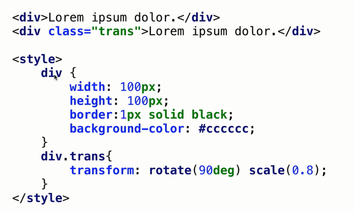
案例代码
<style media="screen">
  div{
    width: 100px;
    height: 100px;
    border: 2px solid red;
    background-color: #cccccc;
  }
  div.trans{
    /* rotate(90deg) 为旋转90,scale(0.8)刻度为0.8,变为原来的0.8倍 */
    transform: rotate(90deg) scale(0.8);
  }
</style>

<div>
  wadjl akdjl kawjd lk aj lka jklv kfl
</div>

<div class="trans">
  dv bghn ujui ku jh ygt frdex cevb tn
</div>
转换的原点 - transform-origin
transform-origin 属性指定元素转换原点的位置。
默认情况下,转换原点在元素的中心。
- 或者 X 轴和 Y 轴的50%处。
transform-origin:数值 / 百分比 / 关键字(上下左右中间)
- 一个值:表示所有轴的位置。
- 两个值:表示 X 轴和 Y 轴。
- 三个值:表示 X 轴、Y 轴和 Z 轴。
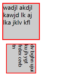
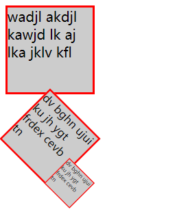
案例代码
<style media="screen">
  div{
    width: 100px;
    height: 100px;
    border: 2px solid red;
    background-color: #cccccc;
  }
  div.trans1{
    /* rotate(90deg) 为旋转90,scale(0.8)刻度为0.8,变为原来的0.8倍 */
    transform: rotate(45deg) scale(0.8);
  }
  div.trans2{
    /* rotate(90deg) 为旋转90,scale(0.8)刻度为0.8,变为原来的0.8倍 */
    transform: rotate(45deg) scale(0.4);
    /* 按照 右上角旋转 */
    transform-origin: right  top;
  }
</style>

<div>
  wadjl akdjl kawjd lk aj lka jklv kfl
</div>

<div class="trans1">
  dv bghn ujui ku jh ygt frdex cevb tn
</div>

<div class="trans2">
  dv bghn ujui ku jh ygt frdex cevb tn
</div>
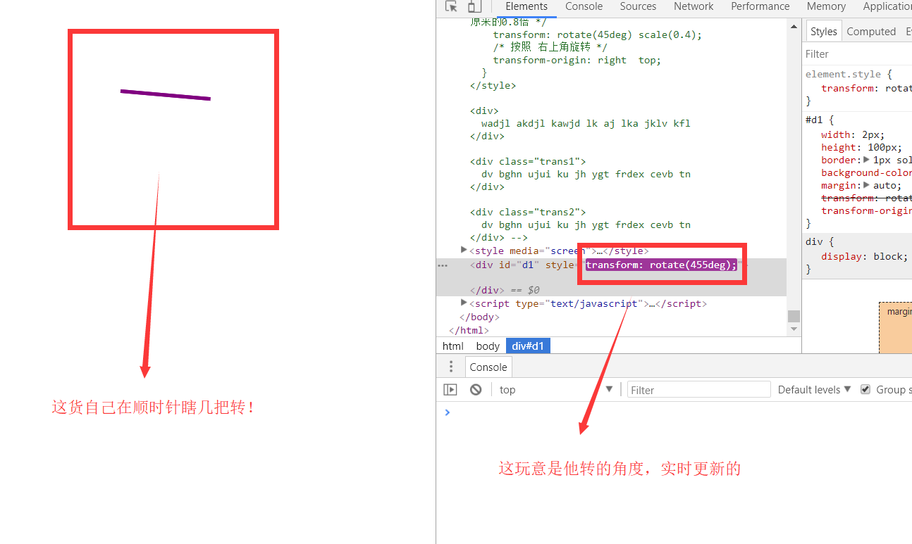
案例
做一个时钟,时钟秒针旋转。
案例代码
<style media="screen">
  #d1{
    width: 2px;
    height: 100px;
    border: 1px solid purple;
    background-color: purple;
    margin: auto;
    transform: rotate(0deg);
    transform-origin: bottom;
  }
</style>


<div id="d1">

</div>

<script type="text/javascript">
  var d1 =document.getElementById("d1");
  // 设置一个定时器
  var t = setInterval("drotate()",100);
  var d = 0;
  function drotate() {
    d1.style.transform = "rotate("+d+"deg)";
    d+=5;
  }
</script>
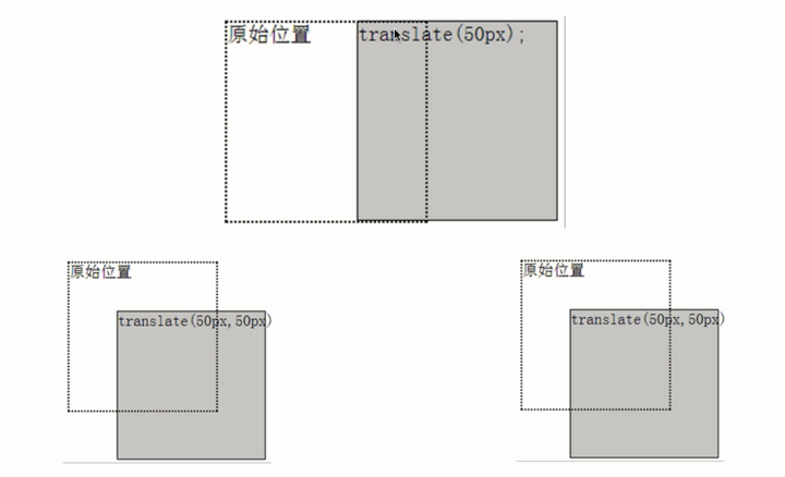
2D 位移 - translate()
translate() 方法将元素从当前位置移动到 X 或 Y 轴坐标。
translate(x) 或者 translate(x,y)
可取值
- 数值、百分比
- 也可以是负值
也可以使用单向位移函数
- translateX(x)
- translateY(y)
案例代码
<style media="screen">
  div{
    width: 100px;
    height: 100px;
    border: 1px solid black;
    background-color: #cccccc;
    position: absolute;
  }
  #d1{
    transform: translate(50px);
    background-color:rgba(255,0,0,0.2) ;
  }
  #d2{
    transform: translate(90px,90px);
    background-color:rgba(0,255,0,0.2) ;
  }
</style>


<div id="d0">
  <div id="d1">

  </div>
  <div id="d2">

  </div>
</div>
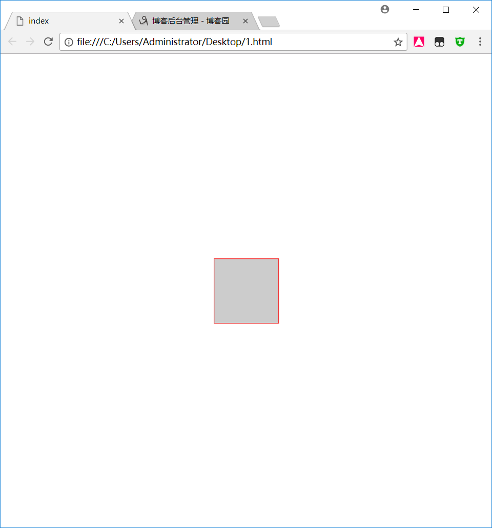
案例
做一个元素,使其垂直居中
代码案例
<style media="screen">
  #d0{
    width: 100px;
    height: 100px;
    border: 1px solid red;
    background-color: #cccccc;
    position: absolute;
    left: 50%;
    top: 50%;
    transform: translate(-50%,-50%);
  }
</style>

<div id="d0">

</div>
2D 缩放 - scale()
scale() 方法用于改变元素的尺寸。
- 根据给定的高度和宽度。
scale(x) 或者 scale(x,y)
- 一个参数时,第二个参数默认和第一个一样。
可取值
- 默认为1
- 缩小:0到1之间的数值。
- 放大:大于1的数值。
也可以使用单向缩放函数
- scaleX(x)
- scaleY(y)
案例代码
<style media="screen">
  .box100{
    width: 100px;
    height: 100px;
    border: 1px solid black;
    background-color: #cccccc;
    margin: auto;
  }

  #d2{
    transform: scale(2);
    background-color: rgba(255, 0, 0, 0.2);
  }

  #d3{
    transform: scale(0.5);
    background-color: rgba(0, 255, 0, 0.2);
  }

</style>

<div class="box100" id="d1"></div>
<div class="box100" id="d2"></div>
<div class="box100" id="d3"></div>
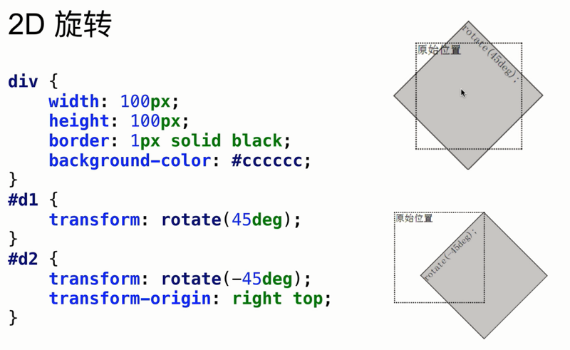
2D 旋转 - ratate()
rotate() 方法用于旋转元素。
- 根据原点,将元素按照顺时针旋转给定的角度。
- 允许负值,元素将按逆时针旋转。
rotate(deg)
案例代码
<style media="screen">
  .box100{
    width: 100px;
    height: 100px;
    border: 1px solid black;
    background-color: #cccccc;
    margin: auto;
  }

  #d2{
    transform: scale(2);
    background-color: rgba(255, 0, 0, 0.2);
    transform: rotate(45deg);
  }

  #d3{
    transform: scale(0.5);
    background-color: rgba(0, 255, 0, 0.2);
    transform: rotate(-30deg);
    transform-origin: right  top;
  }

</style>

<div class="box100" id="d1"></div>
<div class="box100" id="d2"></div>
<div class="box100" id="d3"></div>
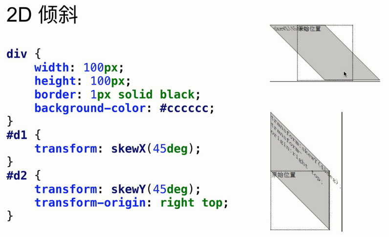
2D 倾斜 - skew()
skew() 方法用于让元素倾斜。
- 以原点位置,围绕 X 轴和 Y 轴按照一定角度倾斜。
- 可能会改变元素形状。
skew(x) 或者 skew(x,y) ,取值为角度。
也可以使用单向倾斜函数
- skewX(x)
- skewY(y)
案例代码
<style>
        .box100 {
            width: 100px;
            height: 100px;
            border: 1px solid black;
            background-color: #cccccc;
            margin: auto;
        }

        #d1 {
            transform: skewX(45deg);
            background-color: rgba(255, 0, 0, 0.2);
            transform-origin: center;
        }

        #d2 {
            transform: skewY(45deg);
            background-color: rgba(0, 255, 0, 0.2);
            transform-origin: center;
        }
    </style>

    <div class="box100">
        <div class="box100" id="d1"></div>
    </div>

    <div class="box100">
        <div class="box100" id="d2"></div>
    </div>
3D 转换 - perspective
perspective 属性定义 3D 元素距视图的距离,单位像素。
- 为元素定义 perspective 属性时,子元素会获得透视效果,而不是元素本身。
- 只影响 3D 转换元素。
浏览器兼容性
- Chrome 和 Safari 支持替代的 -webkit-perspective 属性。
案例代码
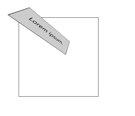
 <style>
         #container {
             position: relative;
             width: 200px;
             height: 200px;
             margin: 50px;
             padding: 10px;
             border: 1px solid black;
             perspective: 120px;
             -webkit-perspective: 120px;
         }

         #d1 {
             padding: 20px;
             position: absolute;
             border: 1px solid black;
             background-color: #cccccc;
             transform: rotate3d(1, 1, 1, 45deg);
      }
</style>


<div id="container">
    <div id="d1">Lorem ipsum.</div>
</div>
完成!