文章目录
前面已经讲解了大量的 Flutter 相关基础知识,从这节课开始,我们将进行 Flutter 的系列 Widget、布局的学习。那么这节博客就带领大家对 Flutter 的基础 Widget 中的几个典型,结合案例来讲解用法。
1.Text Widget
首先我们看 Text Widget 的作用:
Text Widget,从名字也可以看出,在 Flutter 里是用来负责显示文本信息的一个组件,功能类似于 Android 的TextView、HTML 的一些文本标签等等,属于基础组件。
那么知道了它的作用后,我们再看下 Text 这个组件的继承关系:
Text -> StatelessWidget -> Widget -> DiagnosticableTree -> Diagnosticable -> Object
可以看出 Text 是个 StatelessWidget,也就是无状态组件。
接下来看下 Text Widget 的类结构:
可以看出有 2 个构造方法,拥有多个属性参数(f 标志的为属性参数)。
那么我们就重点看下 Text 组件的两个比较重要的构造方法的作用和属性的含义和作用:
const Text(
    //要显示的文字内容
    this.data,
   {
    //key类似于id
    Key key,
    //文字显示样式和属性
    this.style,
    this.strutStyle,
    //文字对齐方式
    this.textAlign,
    //文字显示方向
    this.textDirection,
    //设置语言环境
    this.locale,
    //是否自动换行
    this.softWrap,
    //文字溢出后处理方式
    this.overflow,
    //字体缩放
    this.textScaleFactor,
    //最大显示行数
    this.maxLines,
    //图像的语义描述,用于向Andoid上的TalkBack和iOS上的VoiceOver提供图像描述
    this.semanticsLabel,
  })
其中 data 属性是非空的,必须有的参数,传入要显示的 String 类型的字符串。
这里的 style 属性比较常用,传入的是 TextStyle 对象,我们先细看下它可以配置哪些属性样式:
const TextStyle({
    //是否继承父类组件属性
    this.inherit = true,
    //字体颜色
    this.color,
    //文字大小,默认14px
    this.fontSize,
    //字体粗细
    this.fontWeight,
    //字体样式,normal或italic
    this.fontStyle,
    //字母间距,默认为0,负数间距缩小,正数间距增大
    this.letterSpacing,
    //单词间距,默认为0,负数间距缩小,正数间距增大
    this.wordSpacing,
    //字体基线
    this.textBaseline,
    //行高
    this.height,
    //设置区域
    this.locale,
    //前景色
    this.foreground,
    //背景色
    this.background,
    //阴影
    this.shadows,
    //文字划线,下换线等等装饰
    this.decoration,
    //划线颜色
    this.decorationColor,
    //划线样式,虚线、实线等样式
    this.decorationStyle,
    //描述信息
    this.debugLabel,
    //字体
    String fontFamily,
    List<String> fontFamilyFallback,
    String package,
  })
接下来再看另一个构造方法 Text.rich(…) 。
这个的作用就是可以在 Text 里加入一些 Span 标签,对某部分文字进行个性化改变样式,如加入 @ 符号,加入超链接、变色、加表情等等。Text.rich(…) 等价于 RichText(…),用哪个都可以。
// 里面的属性前面都介绍过,这里就不重复介绍了
const Text.rich(
    // 样式片段标签TextSpan
    this.textSpan,
  {
    Key key,
    this.style,
    this.strutStyle,
    this.textAlign,
    this.textDirection,
    this.locale,
    this.softWrap,
    this.overflow,
    this.textScaleFactor,
    this.maxLines,
    this.semanticsLabel,
  })


const RichText({
    Key key,
    // 样式片段标签TextSpan
    @required this.text,
    this.textAlign = TextAlign.start,
    this.textDirection,
    this.softWrap = true,
    this.overflow = TextOverflow.clip,
    this.textScaleFactor = 1.0,
    this.maxLines,
    this.locale,
    this.strutStyle,
  })
我们看下样式标签 TextSpan 的构造方法:
const TextSpan({
    //样式片段
    this.style,
    //要显示的文字
    this.text,
    //样式片段TextSpan数组,可以包含多个TextSpan
    this.children,
    //用于手势进行识别处理,如点击跳转
    this.recognizer,
  })
那么关于 Text 的大部分功能和属性都讲到了,接下来通过一个实例来演示下用法:
// 给出部分核心代码
body: Container(
      child: Column(
        children: <Widget>[
          Text('Text最简单用法'),
          Text('Text Widget',
              textAlign: TextAlign.center,
              style: TextStyle(
                fontSize: 18,
                decoration: TextDecoration.none,
              )),
          Text('放大加粗文字',
              textDirection: TextDirection.rtl,
              textScaleFactor: 1.2,
              textAlign: TextAlign.center,
              style: TextStyle(
                fontWeight: FontWeight.bold,
                fontSize: 18,
                color: Colors.black,
                decoration: TextDecoration.none,
              )),
          Text(
              '可以缩放自动换行的文字,可以缩放自动换行的文字,可以缩放自动换行的文字,可以缩放自动换行的文字,可以缩放自动换行的文字,可以缩放自动换行的文字',
              textScaleFactor: 1.0,
              textAlign: TextAlign.center,
              softWrap: true,
              //渐隐、省略号、裁剪
              maxLines: 2,
              overflow: TextOverflow.ellipsis,
              style: TextStyle(
                fontWeight: FontWeight.bold,
                fontSize: 18,
                color: Colors.black,
                decoration: TextDecoration.none,
              )),
          Text.rich(TextSpan(
            text: 'TextSpan',
            style: TextStyle(
              color: Colors.orange,
              fontSize: 30.0,
              decoration: TextDecoration.none,
            ),
            children: <TextSpan>[
              new TextSpan(
                text: '拼接1',
                style: new TextStyle(
                  color: Colors.teal,
                ),
              ),
              new TextSpan(
                text: '拼接2',
                style: new TextStyle(
                  color: Colors.teal,
                ),
              ),
              new TextSpan(
                text: '拼接3有点击事件',
                style: new TextStyle(
                  color: Colors.yellow,
                ),
                recognizer: new TapGestureRecognizer()
                  ..onTap = () {
                    //增加一个点击事件
                    print(
                        '@@@@@@@@@@@@@@@@@@@@@@@@@@@@@@@@@@@@@@@@@@@@@@@@@@@');
                  },
              ),
            ],
          )),
          RichText(
            text: TextSpan(
              text: 'Hello ',
              style: DefaultTextStyle.of(context).style,
              children: <TextSpan>[
                TextSpan(
                    text: 'bold',
                    style: TextStyle(
                        fontWeight: FontWeight.bold,
                        decoration: TextDecoration.none)),
                TextSpan(
                    text: ' world!',
                    style: TextStyle(
                        fontWeight: FontWeight.bold,
                        decoration: TextDecoration.none)),
              ],
            ),
          ),
        ],
      ),
    ),
运行效果如下图所示:

2.Image Widget
首先说一下 Image Widget 的作用:
Image Widget 在 Flutter 里是用来负责显示图片的一个组件,功能类似于 Android的ImageView、Html 的一些image 标签等等,属于基础组件。
Image 这个组件的继承关系:
Image -> StatefulWidget -> Widget -> DiagnosticableTree -> Diagnosticable -> Object 可以看出 Image 是个 StatefulWidget,也就是有状态组件。
Image Widget 的类结构:

可以看出有 5 个构造方法,拥有多个属性参数(f标志的为属性参数)。
整理下,Image 支持 5 种方式加载图片。
- Image:通过 ImageProvider 来加载图片
- Image.network:用来加载网络图片
- Image.file:用来加载本地 File 文件图片
- Image.asset:用来加载项目内资源图片
- Image.memory:用来加载 Uint8List 资源图片/内存图片
其中这几种其实都是通过 ImageProvider 来从不同源加载图片的,封装类有:NetworkImage、FileImage、AssetImage、ExactAssetImage、MemoryImage。我们既可以用这几个构造方法加载图片,也可以使用这几个封装类来加载。
我们重点来看 Image 组件的 5 个比较重要的构造方法的作用和属性的含义和作用:
//通过ImageProvider来加载图片
const Image({
    Key key,
    // ImageProvider,图像显示源
    @required this.image,
    this.semanticLabel,
    this.excludeFromSemantics = false,
    //显示宽度
    this.width,
    //显示高度
    this.height,
    //图片的混合色值
    this.color,
    //混合模式
    this.colorBlendMode,
    //缩放显示模式
    this.fit,
    //对齐方式
    this.alignment = Alignment.center,
    //重复方式
    this.repeat = ImageRepeat.noRepeat,
    //当图片需要被拉伸显示的时候,centerSlice定义的矩形区域会被拉伸,类似.9图片
    this.centerSlice,
    //类似于文字的显示方向
    this.matchTextDirection = false,
    //图片发生变化后,加载过程中原图片保留还是留白
    this.gaplessPlayback = false,
    //图片显示质量
    this.filterQuality = FilterQuality.low,
  })

// 加载网络图片,封装类:NetworkImage
Image.network(
    //路径
    String src,
   {
    Key key,
    //缩放
    double scale = 1.0,
    this.semanticLabel,
    this.excludeFromSemantics = false,
    this.width,
    this.height,
    this.color,
    this.colorBlendMode,
    this.fit,
    this.alignment = Alignment.center,
    this.repeat = ImageRepeat.noRepeat,
    this.centerSlice,
    this.matchTextDirection = false,
    this.gaplessPlayback = false,
    this.filterQuality = FilterQuality.low,
    Map<String, String> headers,
  })

// 加载本地File文件图片,封装类:FileImage
Image.file(
    //File对象
    File file,
  {
    Key key,
    double scale = 1.0,
    this.semanticLabel,
    this.excludeFromSemantics = false,
    this.width,
    this.height,
    this.color,
    this.colorBlendMode,
    this.fit,
    this.alignment = Alignment.center,
    this.repeat = ImageRepeat.noRepeat,
    this.centerSlice,
    this.matchTextDirection = false,
    this.gaplessPlayback = false,
    this.filterQuality = FilterQuality.low,
  })

// 加载本地资源图片,例如项目内资源图片
// 需要把图片路径在pubspec.yaml文件中声明一下,如:
// assets:
//      - packages/fancy_backgrounds/backgrounds/background1.png
// 封装类有:AssetImage、ExactAssetImage
Image.asset(
    //文件名称,包含路径
    String name,
  {
    Key key,
    // 用于访问资源对象
    AssetBundle bundle,
    this.semanticLabel,
    this.excludeFromSemantics = false,
    double scale,
    this.width,
    this.height,
    this.color,
    this.colorBlendMode,
    this.fit,
    this.alignment = Alignment.center,
    this.repeat = ImageRepeat.noRepeat,
    this.centerSlice,
    this.matchTextDirection = false,
    this.gaplessPlayback = false,
    String package,
    this.filterQuality = FilterQuality.low,
  })

// 加载Uint8List资源图片/从内存中获取图片显示
// 封装类:MemoryImage
Image.memory(
    // Uint8List资源图片
    Uint8List bytes,
  {
    Key key,
    double scale = 1.0,
    this.semanticLabel,
    this.excludeFromSemantics = false,
    this.width,
    this.height,
    this.color,
    this.colorBlendMode,
    this.fit,
    this.alignment = Alignment.center,
    this.repeat = ImageRepeat.noRepeat,
    this.centerSlice,
    this.matchTextDirection = false,
    this.gaplessPlayback = false,
    this.filterQuality = FilterQuality.low,
  })
这里对其中的 colorBlendMode 混合模式和 fit 缩放显示模式进行简单讲解下。
colorBlendMode 混合模式:
// Flutter一共29种混合模式
enum BlendMode {
  clear,src,dst,srcOver,dstOver,srcIn,dstIn,srcOut,dstOut,srcATop,dstATop,xor,plus,modulate,screen,overlay,darken,lighten,colorDodge,colorBurn,hardLight,softLight,difference,exclusion,multiply,hue,saturation,color,luminosity,
}
主要的混合模式效果如下:

fit 缩放显示模式:
//主要有7种
enum BoxFit {
fill,
contain,
cover,
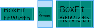
fitWidth,
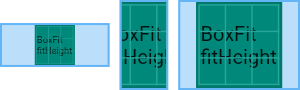
fitHeight,
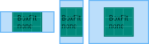
none,
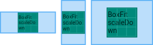
scaleDown,
}
fit 缩放显示模式效果对比图如下。 fill 填充模式,拉伸充满:
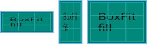
contain,全图显示,显示原比例,不需充满:
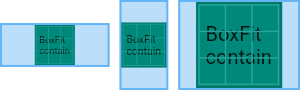
cover,显示可能拉伸,可能裁剪,充满:
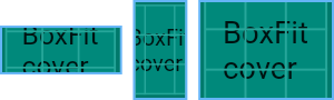
fitWidth,显示可能拉伸,可能裁剪,宽度充满:
fitHeight,显示可能拉伸,可能裁剪,高度充满:
none,对图片不做任何处理显示,高出控件大小就裁剪,否则不处理:
scaleDown,全图显示,显示原比例,不允许显示超过源图片大小,可小不可大:
那么关于 Image 的大部分功能和属性都讲到了,接下来通过一个实例来演示下用法:
body: CustomScrollView(
        slivers: <Widget>[
          SliverPadding(
            padding: const EdgeInsets.all(20.0),
            sliver: SliverList(
              delegate: SliverChildListDelegate(
                <Widget>[
                  //从项目目录里读取图片,需要在pubspec.yaml注册路径
                  Image.asset("assets/assets_image.png"),
                  Text(
                    "项目asset目录里读取",
                    textAlign: TextAlign.center,
                  ),
                  Image(
                    image: AssetImage("assets/assets_image.png"),
                    width: 200,
                    height: 130,
                  ),
                  Text(
                    "AssetImage读取",
                    textAlign: TextAlign.center,
                  ),
                  //从文件读取图片
                  Image.file(
                    File('/sdcard/img.png'),
                    width: 200,
                    height: 80,
                  ),
                  Image(
                    image: FileImage(File('/sdcard/img.png')),
                  ),

                  ///读取加载原始图片
                  // RawImage(
                  //   image: imageInfo?.image,
                  // ),

                  ///内存中读取byte数组图片
                  /// Image.memory(bytes)
                  /// Image(
                  ///   image: MemoryImage(bytes),
                  /// ),

                  // 读取网络图片
                  Image.network(imageUrl),
                  Text(
                    "读取网络图片",
                    textAlign: TextAlign.center,
                  ),
                  Image(
                    image: NetworkImage(imageUrl),
                  ),
                  Text(
                    "用NetworkImage读取网络图片",
                    textAlign: TextAlign.center,
                  ),

                  ///加入占位图的加载图片
                  FadeInImage(
                    placeholder: AssetImage("assets/assets_image.png"),
                    image: FileImage(File('/sdcard/img.png')),
                  ),
                  Text(
                    "加入占位图的加载图片",
                    textAlign: TextAlign.center,
                  ),
                  FadeInImage.assetNetwork(
                    placeholder: "assets/assets_image.png",
                    image: imageUrl,
                  ),

                  /// FadeInImage.memoryNetwork(
                  ///   placeholder: byte,
                  ///   image: imageUrL,
                  /// ),

                  ///加载圆角图片
                  CircleAvatar(
                    backgroundColor: Colors.brown.shade800,
                    child: Text("圆角头像"),
                    backgroundImage: AssetImage("assets/assets_image.png"),
                    radius: 50.0,
                  ),
                  Text(
                    "加载圆角图片",
                    textAlign: TextAlign.center,
                  ),
                  ImageIcon(NetworkImage(imageUrl)),
                  Text(
                    "ImageIcon",
                    textAlign: TextAlign.center,
                  ),
                  ClipRRect(
                    child: Image.network(
                      imageUrl,
                      scale: 8.5,
                      fit: BoxFit.cover,
                    ),
                    borderRadius: BorderRadius.only(
                      topLeft: Radius.circular(20),
                      topRight: Radius.circular(20),
                    ),
                  ),
                  Text(
                    "ClipRRect",
                    textAlign: TextAlign.center,
                  ),
                  Container(
                    width: 120,
                    height: 60,
                    decoration: BoxDecoration(
                      shape: BoxShape.rectangle,
                      borderRadius: BorderRadius.circular(10.0),
                      image: DecorationImage(
                          image: NetworkImage(imageUrl), fit: BoxFit.cover),
                    ),
                  ),
                  Text(
                    "BoxDecoration",
                    textAlign: TextAlign.center,
                  ),
                  ClipOval(
                    child: Image.network(
                      imageUrl,
                      scale: 8.5,
                    ),
                  ),
                  Text(
                    "ClipOval",
                    textAlign: TextAlign.center,
                  ),
                ],
              ),
            ),
          ),
        ],
      ),
运行效果如下图所示:

3.Button Widget
Button Widget 的作用:
Button Widget 在 Flutter 里是用来负责按钮功能的组件,功能类似于 Android 的 Button,HTML 的一些 button 标签等等,属于基础组件。
在 Flutter 中 Button 有很多封装好的 Widget 类:FlatButton(扁平化)、RaisedButton(有按下状态)、OutlineButton(有边框)、MaterialButton(Material风格)、RawMaterialButton(没有应用 style 的 Material 风格按钮)、FloatingActionButton(悬浮按钮)、BackButton(返回按钮)、IconButton(Icon 图标)、CloseButton(关闭按钮)、ButtonBar(可以排列放置按钮元素的)等。
其中大部分的 Button 都是基于 RawMaterialButton 进行的修改定制而成的。
我们看下其中几个的效果。
-
FlatButton
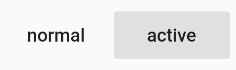
-
RaisedButton

-
OutlineButton
-
IconButton
接下来我们挑一个比较常用的 Button(FlatButton)来分析下它的构造方法的作用和属性的含义:
const FlatButton({
    Key key,
    // 点击事件
    @required VoidCallback onPressed,
    // 高亮改变,按下和抬起时都会调用的方法
    ValueChanged<bool> onHighlightChanged,
    // 定义按钮的基色,以及按钮的最小尺寸,内部填充和形状的默认值
    ButtonTextTheme textTheme,
    // 按钮文字的颜色
    Color textColor,
    // 按钮禁用时的文字颜色
    Color disabledTextColor,
    // 按钮背景颜色
    Color color,
    // 按钮禁用时的背景颜色
    Color disabledColor,
    // 按钮按下时的背景颜色
    Color highlightColor,
    // 点击时,水波动画中水波的颜色,不要水波纹效果设置透明颜色即可
    Color splashColor,
    // 按钮主题,默认是浅色主题,分为深色和浅色
    Brightness colorBrightness,
    // 按钮的填充间距
    EdgeInsetsGeometry padding,
    // 外形
    ShapeBorder shape,
    Clip clipBehavior = Clip.none,
    MaterialTapTargetSize materialTapTargetSize,
    // 按钮的内容,里面可以放子元素
    @required Widget child,
  })
通过一个实例来演示下它的用法和 Button 效果:
body: CustomScrollView(
        slivers: <Widget>[
          SliverList(
            delegate: SliverChildListDelegate(<Widget>[
              Center(
                child: Column(
                  children: <Widget>[
                    //返回按钮
                    BackButton(
                      color: Colors.orange,
                    ),
                    //关闭按钮
                    CloseButton(),
                    ButtonBar(
                      children: <Widget>[
                        //扁平化按钮
                        FlatButton(
                          child: Text('FLAT BUTTON',
                              semanticsLabel: 'FLAT BUTTON 1'),
                          onPressed: () {
                            // Perform some action
                          },
                        ),
                        //扁平化禁用状态按钮
                        FlatButton(
                          child: Text(
                            'DISABLED',
                            semanticsLabel: 'DISABLED BUTTON 3',
                          ),
                          onPressed: null,
                        ),
                      ],
                    ),
                    //可以使用图标
                    FlatButton.icon(
                      disabledColor: Colors.teal,
                      label:
                          Text('FLAT BUTTON', semanticsLabel: 'FLAT BUTTON 2'),
                      icon: Icon(Icons.add_circle_outline, size: 18.0),
                      onPressed: () {},
                    ),
                    FlatButton.icon(
                      icon: const Icon(Icons.add_circle_outline, size: 18.0),
                      label: const Text('DISABLED',
                          semanticsLabel: 'DISABLED BUTTON 4'),
                      onPressed: null,
                    ),
                    ButtonBar(
                      mainAxisSize: MainAxisSize.max,
                      children: <Widget>[
                        //有边框轮廓按钮
                        OutlineButton(
                          onPressed: () {},
                          child: Text('data'),
                        ),
                        OutlineButton(
                          onPressed: null,
                          child: Text('data'),
                        ),
                      ],
                    ),
                    ButtonBar(
                      children: <Widget>[
                        //有图标,有边框轮廓按钮
                        OutlineButton.icon(
                          label: Text('OUTLINE BUTTON',
                              semanticsLabel: 'OUTLINE BUTTON 2'),
                          icon: Icon(Icons.add, size: 18.0),
                          onPressed: () {},
                        ),
                        OutlineButton.icon(
                          disabledTextColor: Colors.orange,
                          icon: const Icon(Icons.add, size: 18.0),
                          label: const Text('DISABLED',
                              semanticsLabel: 'DISABLED BUTTON 6'),
                          onPressed: null,
                        ),
                      ],
                    ),
                    ButtonBar(
                      children: <Widget>[
                        //有波纹按下状态的按钮
                        RaisedButton(
                          child: Text('RAISED BUTTON',
                              semanticsLabel: 'RAISED BUTTON 1'),
                          onPressed: () {
                            // Perform some action
                          },
                        ),
                        RaisedButton(
                          child: Text('DISABLED',
                              semanticsLabel: 'DISABLED BUTTON 1'),
                          onPressed: null,
                        ),
                      ],
                    ),
                    ButtonBar(
                      children: <Widget>[
                        //有波纹按下状态有图标的按钮
                        RaisedButton.icon(
                          icon: const Icon(Icons.add, size: 18.0),
                          label: const Text('RAISED BUTTON',
                              semanticsLabel: 'RAISED BUTTON 2'),
                          onPressed: () {
                            // Perform some action
                          },
                        ),
                        RaisedButton.icon(
                          icon: const Icon(Icons.add, size: 18.0),
                          label: Text('DISABLED',
                              semanticsLabel: 'DISABLED BUTTON 2'),
                          onPressed: null,
                        ),
                      ],
                    ),
                    ButtonBar(
                      children: <Widget>[
                        //Material风格Button
                        MaterialButton(
                          child: Text('MaterialButton1'),
                          onPressed: () {
                            // Perform some action
                          },
                        ),
                        MaterialButton(
                          child: Text('MaterialButton2'),
                          onPressed: null,
                        ),
                      ],
                    ),
                    ButtonBar(
                      children: <Widget>[
                        //原始的Button
                        RawMaterialButton(
                          child: Text('RawMaterialButton1'),
                          onPressed: () {
                            // Perform some action
                          },
                        ),
                        RawMaterialButton(
                          child: Text('RawMaterialButton2'),
                          onPressed: null,
                        ),
                      ],
                    ),
                    ButtonBar(
                      children: <Widget>[
                        //悬浮按钮
                        FloatingActionButton(
                          child: const Icon(Icons.add),
                          heroTag: 'FloatingActionButton1',
                          onPressed: () {
                            // Perform some action
                          },
                          tooltip: 'floating action button1',
                        ),
                        FloatingActionButton(
                          child: const Icon(Icons.add),
                          onPressed: null,
                          heroTag: 'FloatingActionButton2',
                          tooltip: 'floating action button2',
                        ),
                      ],
                    ),
                  ],
                ),
              ),
            ]),
          ),
        ],
      ),

4.AppBar Widget
AppBar 是页面的顶部标题栏,里面可以定制各种按钮、菜单等,一般配合 Scaffold 使用。大致效果如下图:

这个效果图里显示了基本上 AppBar 的所有用法。AppBar 是一个 StatefulWidget,我们先看下它的构造方法:
AppBar({
    Key key,
    // 标题栏最左侧图标,首页一般默认显示logo,其它页面默认显示返回按钮,可以自定义
    this.leading,
    // 是否提供控件占位
    this.automaticallyImplyLeading = true,
    // 标题内容
    this.title,
    // 标题栏上右侧的菜单,可以用IconButton显示,也可以用PopupMenuButton显示为三个点
    this.actions,
    // AppBar下方的控件,高度和AppBar高度一样,通常在SliverAppBar中使用
    this.flexibleSpace,
    // 标题栏下方的空间,一般放TabBar
    this.bottom,
    // 控制标题栏阴影大小
    this.elevation,
    // 标题栏背景色
    this.backgroundColor,
    // 亮度,有白色和黑色两种主题
    this.brightness,
    // AppBar上图标的颜色、透明度、和尺寸信息
    this.iconTheme,
    // AppBar上的文字样式
    this.textTheme,
    // 是否进入到状态栏
    this.primary = true,
    // 标题是否居中
    this.centerTitle,
    // 标题间距,如果希望title占用所有可用空间,请将此值设置为0.0
    this.titleSpacing = NavigationToolbar.kMiddleSpacing,
    // 透明度
    this.toolbarOpacity = 1.0,
    this.bottomOpacity = 1.0,
  })
我们看一个最简单的用法:
 AppBar(
   title: Text('My Fancy Dress'),
   actions: <Widget>[
     IconButton(
       icon: Icon(Icons.playlist_play),
       tooltip: 'Air it',
       onPressed: _airDress,
     ),
     IconButton(
       icon: Icon(Icons.playlist_add),
       tooltip: 'Restitch it',
       onPressed: _restitchDress,
     ),
     IconButton(
       icon: Icon(Icons.playlist_add_check),
       tooltip: 'Repair it',
       onPressed: _repairDress,
     ),
   ],
 )
运行效果:

使用起来很简单,很方便。接下来看一个比较复杂的实例:
class AppbarSamplesState extends State<AppbarSamples>
    with SingleTickerProviderStateMixin {
  TabController _tabController;

  @override
  void initState() {
    super.initState();
    _tabController = TabController(initialIndex: 0, length: 5, vsync: this);
  }

  @override
  Widget build(BuildContext context) {
    return Scaffold(
      appBar: AppBar(
        title: Text('AppBar Widget'),
        primary: true,
        leading: IconButton(
          icon: const Icon(Icons.menu),
          onPressed: () {
            Scaffold.of(context).openDrawer();
          },
        ),
        actions: <Widget>[
          IconButton(icon: Icon(Icons.share), onPressed: () {}),
          IconButton(icon: Icon(Icons.add), onPressed: () {}),
          PopupMenuButton(
            itemBuilder: (BuildContext context) => <PopupMenuItem<String>>[
                  PopupMenuItem<String>(
                    child: Text("热度"),
                    value: "hot",
                  ),
                  PopupMenuItem<String>(
                    child: Text("最新"),
                    value: "new",
                  ),
                ],
            onSelected: (String action) {
              switch (action) {
                case "hot":
                  print("hot");
                  break;
                case "new":
                  print("new");
                  break;
              }
            },
            onCanceled: () {
              print("onCanceled");
            },
          )
        ],
        bottom: TabBar(
          controller: _tabController,
          isScrollable: true,
          tabs: <Widget>[
            Tab(
              text: "Tab1",
              icon: Icon(Icons.battery_full),
            ),
            Tab(
              text: "Tab2",
              icon: Icon(Icons.add),
            ),
            Tab(
              text: "Tab3",
              icon: Icon(Icons.card_giftcard),
            ),
            Tab(
              text: "Tab4",
              icon: Icon(Icons.shop),
            ),
            Tab(
              text: "Tab5",
              icon: Icon(Icons.directions_bike),
            ),
          ],
        ),
      ),
      body: TabBarView(
        controller: _tabController,
        children: <Widget>[
          Center(
            child: Text("data1"),
          ),
          Center(
            child: Text("data2"),
          ),
          Center(
            child: Text("data3"),
          ),
          Center(
            child: Text("data4"),
          ),
          Center(
            child: Text("data5"),
          ),
        ],
      ),
    );
  }
}
这段实例就是前面的图片的效果,运行效果:

5.AlertDialog Widget
AlertDialog Widget 也是一个比较常用的组件,主要是实现对话框效果。Flutter 中 dialog 一般分为:AlertDialog(用于警告提示对话框)、SimpleDialog(有列表选项的对话框)、CupertinoAlertDialog(iOS 风格的 alert dialog)、CupertinoDialog(iOS 风格的对话框)。
我们看下这几种效果图。
AlertDialog:

SimpleDialog:

CupertinoDialog:

再看下弹出对话框的方法,Flutter 自带这几个弹出对话框方法。
- showDialog:弹出 Material 风格对话框
- showCupertinoDialog:弹出 iOS 样式对话框
- showGeneralDialog:弹出自定义的对话框,默认状态下弹出的窗口点击空白处不消失
- showAboutDialog:弹出关于页面适用的对话框
接下来直接给实例看下使用方法。
enum Option { A, B, C }
enum Location { Barbados, Bahamas, Bermuda }

// AlertDialog
  Future<void> dialog1(BuildContext context) async {
    return showDialog<void>(
        context: context,
        // 点击周围空白区域对话框是否消失
        barrierDismissible: false,
        builder: (BuildContext context) {
          return AlertDialog(
            title: Text("提示"),
            content: new Text("是否退出"),
            actions: <Widget>[
              new FlatButton(
                  onPressed: () => Navigator.of(context).pop(false),
                  child: new Text("取消")),
              new FlatButton(
                  onPressed: () {
                    Navigator.of(context).pop(true);
                  },
                  child: new Text("确定"))
            ],
          );
        });
  }

// AlertDialog
  Future<void> officialDialog2(BuildContext context) async {
    return showDialog<void>(
      context: context,
      barrierDismissible: false, // user must tap button!
      builder: (BuildContext context) {
        return AlertDialog(
          title: Text('Rewind and remember'),
          content: SingleChildScrollView(
            child: ListBody(
              children: <Widget>[
                Text('You will never be satisfied.'),
                Text('You\’re like me. I’m never satisfied.'),
              ],
            ),
          ),
          actions: <Widget>[
            FlatButton(
              child: Text('Regret'),
              onPressed: () {
                Navigator.of(context).pop();
              },
            ),
          ],
        );
      },
    );
  }

// SimpleDialog
  Future<void> dialog3(BuildContext context) async {
    return showDialog<void>(
        context: context,
        barrierDismissible: false,
        builder: (BuildContext context) {
          return SimpleDialog(
            title: Text("提示"),
          );
        });
  }

// SimpleDialog
  Future<void> dialog4(BuildContext context) async {
    switch (await showDialog<Option>(
        context: context,
        builder: (BuildContext context) {
          return SimpleDialog(
            title: const Text('Select Answer'),
            children: <Widget>[
              SimpleDialogOption(
                onPressed: () {
                  Navigator.pop(context, Option.A);
                },
                child: const Text('A'),
              ),
              SimpleDialogOption(
                onPressed: () {
                  Navigator.pop(context, Option.B);
                },
                child: const Text('B'),
              ),
              SimpleDialogOption(
                onPressed: () {
                  Navigator.pop(context, Option.C);
                },
                child: const Text('C'),
              ),
            ],
          );
        })) {
      case Option.A:
        // Let's go.
        // ...
        print('A');
        break;
      case Option.B:
        // ...
        print('B');
        break;
      case Option.C:
        // ...
        print('C');
        break;
    }
  }

// 自定义Dialog
  Future<void> dialog5(BuildContext context) async {
    return showDialog<void>(
        context: context,
        builder: (BuildContext context) {
          return LoadingDialog(text: '正在加载...');
        });
  }

// AboutDialog
  Future<void> dialog6(BuildContext context) async {
    return showAboutDialog(
        context: context,
        applicationName: "应用名称",
        applicationVersion: "1.0.0",
        applicationIcon: Icon(Icons.apps),
        applicationLegalese: "内容");
  }
}
运行效果图:


6.Icon Widget
Icon Widget 主要是用来显示图标相关的操作,很常用,也很简单。Flutter Icon 也可以使用 unicode、矢量图标、iconfont 里的图标、Flutter 自带的 Material 图标(需要在 pubspec.yaml 中配置开启)。
// 配置这句就可以使用Material风格内置的Icons了
flutter:

  uses-material-design: true
Material 风格图标使用通过 Icons. 来调用,如 Icons.add,这样就可以使用加号图标了。Flutter 的 Icon 也封装了ImageIcon、IconButton 来提供使用。
Material Design 所有图标可以在官网查看:https://material.io/tools/icons/

使用 Icon 有以下好处:
- 体积小:可以减小应用安装包体积
- 矢量:iconfont 和自带的 Material 图标都是矢量图标,即使放大也不会影像图标清晰度
- 可以动态改变颜色、大小:由于是 PNG 有透明度图标,可以改变图标的颜色、大小、对齐等
- 可以像表情一样通过 TextSpan 和文本混用展示
Icon 是属于 StatelessWidget,我们看下构造方法:
const Icon(this.icon, {
    Key key,
    // 图标大小,默认为24px
    this.size,
    // 图标颜色
    this.color,
    this.semanticLabel,
    // 渲染图标的方向,前提需要IconData.matchTextDirection字段设置为true
    this.textDirection,
  })
接下来我们看一个实例:
class IconSamplesState extends State<IconSamples>
    with TickerProviderStateMixin {
  AnimationController _controller;

  @override
  void initState() {
    super.initState();

    ///动画控制类,产生0-1之间小数
    _controller = AnimationController(
        lowerBound: 0,
        upperBound: 1,
        duration: const Duration(seconds: 3),
        vsync: this);
        _controller.forward();
  }

  @override
  Widget build(BuildContext context) {
    return Scaffold(
      appBar: AppBar(
        title: Text('Icon Widget'),
        primary: true,
        leading: IconButton(
          icon: const Icon(Icons.menu),
          onPressed: () {},
        ),
      ),
      body: Column(
        children: <Widget>[
          IconButton(
            icon: Icon(Icons.directions_bike),
            // 按钮处于按下状态时按钮的主要颜色
            splashColor: Colors.teal,
            // 按钮处于按下状态时按钮的辅助颜色
            highlightColor: Colors.pink,
            // 不可点击时颜色
            disabledColor: Colors.grey,
            // PNG图标主体颜色
            color: Colors.orange,
            onPressed: () {},
          ),
          // 图片PNG格式,有透明度
          ImageIcon(
            AssetImage('assets/check-circle.png'),
            color: Colors.teal,
            size: 30,
          ),
          Icon(
            Icons.card_giftcard,
            size: 26,
          ),
          // 使用unicode
          Text(
            "\uE000",
            style: TextStyle(
                fontFamily: "MaterialIcons",
                fontSize: 24.0,
                color: Colors.green),
          ),
          Icon(IconData(0xe614,
              // 也可以使用自己自定义字体
              fontFamily: "MaterialIcons",
              matchTextDirection: true)),
          AnimatedIcon(
            icon: AnimatedIcons.menu_arrow,
            progress: _controller,
            semanticLabel: 'Show menu',
          )
        ],
      ),
    );
  }
}
运行效果如下图:

7.TextField Widget
不同平台的输入框一般都需要以下功能,提示信息、输入框接收的数据类型、输入框监听事件等。Flutter 里的TextField 同样具有这些属性功能,TextField 属于 StatefulWidget,Flutter 中有两个 TextField,另一个叫TextFormField,顾名思义,这个 TextFormField 主要用于 Form 表单,我们看下要讲的 TextField 的构造方法:
const TextField({
    Key key,
    // 输入框的控制器,监听器
    this.controller,
    // 焦点控制的,控制是否获取和取消焦点
    this.focusNode,
    // 输入框的装饰类(重要)
    this.decoration = const InputDecoration(),
    // 输入框输入类型,键盘显示类型
    TextInputType keyboardType,
    // 控制键盘上的动作按钮图标
    this.textInputAction,
    // 键盘大小写显示控制
    this.textCapitalization = TextCapitalization.none,
    // 输入文本的样式
    this.style,
    // 输入文本的对齐方式
    this.textAlign = TextAlign.start,
    // 输入文本的方向
    this.textDirection,
    // 是否自动获取焦点
    this.autofocus = false,
    // 是否是密码(是否遮盖输入内容,起保护作用)
    this.obscureText = false,
    // 是否自动更正
    this.autocorrect = true,
    // 最大行数
    this.maxLines = 1,
    // 输入文本最大长度
    this.maxLength,
    // 达到最大长度后:为true时会阻止输入,为false时不会阻止输入,但输入框会变红进行提示
    this.maxLengthEnforced = true,
    // 输入内容改变时的回调
    this.onChanged,
    // 输入完成,按回车时调用
    this.onEditingComplete,
    // 输入完成,按回车时回调,回调里有参数:参数为输入的内容
    this.onSubmitted,
    // 输入个事校验,如只能输入手机号
    this.inputFormatters,
    // 是否可用
    this.enabled,
    // 光标宽度
    this.cursorWidth = 2.0,
    // 光标圆角
    this.cursorRadius,
    // 光标颜色
    this.cursorColor,
    // 键盘样式,暗黑主题还是亮色主题
    this.keyboardAppearance,
    this.scrollPadding = const EdgeInsets.all(20.0),
    this.dragStartBehavior = DragStartBehavior.down,
    // 为true的时候长按会显示系统粘贴板的内容
    this.enableInteractiveSelection,
    // 点击事件
    this.onTap,
    this.buildCounter,
  })
接下来着重介绍 TextField 的几个属性。
- InputDecoration
我们看下 InputDecoration 的构造方法:
const InputDecoration({
    //左侧显示的图标
    this.icon,
    // 输入框顶部提示信息
    this.labelText,
    // 提示信息样式
    this.labelStyle,
    // 输入框底部提示信息
    this.helperText,
    this.helperStyle,
    // 输入框内提示信息
    this.hintText,
    this.hintStyle,
    this.hintMaxLines,
    // 输入框底部错误提示信息
    this.errorText,
    this.errorStyle,
    this.errorMaxLines,
    this.hasFloatingPlaceholder = true,
    this.isDense,
    // 输入内容边距
    this.contentPadding,
    // 输入框内部左侧图标
    this.prefixIcon,
    // 输入框内部左侧自定义提示Widget
    this.prefix,
    // 输入框内部左侧提示文本
    this.prefixText,
    this.prefixStyle,
    // 输入框内部后缀图标
    this.suffixIcon,
    this.suffix,
    this.suffixText,
    this.suffixStyle,
    // 输入框右下角字数统计信息
    this.counter,
    this.counterText,
    this.counterStyle,
    // 是否填充颜色
    this.filled,
    // 输入框填充颜色
    this.fillColor,
    this.errorBorder,
    this.focusedBorder,
    this.focusedErrorBorder,
    this.disabledBorder,
    this.enabledBorder,
    // 输入框边框样式
    this.border,
    this.enabled = true,
    this.semanticCounterText,
    this.alignLabelWithHint,
  })
通过 InputDecoration 我们可以个性化定制和配置我们的 TextField,是不是很强大,很方便?
-
TextInputType
用来控制我们的输入内容类型:text、multiline(多行文本)、number、phone、datetime、emailAddress、url,其中 number 还可以详细设置为 signed 或 decimal,这些输入类型和其他平台基本一样。 -
controller
这里使用的是 TextEditingController,一般用于获取输入框值、输入框清空、选择、监听等操作的作用:
TextEditingController _controller= TextEditingController();
// 监听文本变化
_controller.addListener(() {
      print('input ${_controller.text}');
    });
// 或者用onChange属性也可以监听文本变化
onChanged: (text) {
      print("onChange: $text");
    }

// 在任何时候想获取输入框文本内容就直接调用:_controller.text
//设置默认值
_controller.text="我在学习Flutter!";
// 设置文本选中,下面这句代码设置从第三个字符到最后一个字符选中
_controller.selection=TextSelection(
        baseOffset: 3,
    extentOffset: _controller.text.length
    );
- focusNode
focusNode 用于控制输入框焦点,如我们点击回车时候,让某个输入框获取焦点等类似操作或者监听焦点变化。
FocusNode focusNode1 = new FocusNode();
FocusScopeNode focusScopeNode;

...

// 实例化FocusScopeNode
focusScopeNode = FocusScope.of(context);

...

TextField(
    focusNode: focusNode1,
),

...

// 操作焦点
focusScopeNode.requestFocus(focusNode1);

focusScopeNode.autofocus(focusNode1);
那么接下来看一下最基本的 TextField 的用法:
TextField(
    decoration: InputDecoration(
        hintText: "输入用户名",
        icon: Icon(Icons.person)
    ),
)

是不是很简单?
接下来我们写一个简单的登录页面,代码如下:
@override
  Widget build(BuildContext context) {
    return Scaffold(
      appBar: AppBar(title: Text('TextField Widget'), primary: true),
      body: Column(
        children: <Widget>[
          Padding(
              padding: EdgeInsets.all(10),
              child: TextField(
                maxLines: 1,
                keyboardType: TextInputType.emailAddress,
                decoration: InputDecoration(
                    border: OutlineInputBorder(
                        borderRadius: BorderRadius.all(Radius.circular(5.0)),
                        borderSide: BorderSide(color: Colors.grey)),
                    labelText: '用户名',
                    hintText: "输入用户名",
                    icon: Icon(Icons.email)),
              )),
          Padding(
              padding: EdgeInsets.all(10),
              child: TextField(
                textInputAction: TextInputAction.done,
                maxLines: 1,
                keyboardType: TextInputType.text,
                obscureText: true,
                decoration: InputDecoration(
                    border: OutlineInputBorder(
                        borderRadius: BorderRadius.all(Radius.circular(5.0)),
                        borderSide: BorderSide(color: Colors.grey)),
                    labelText: '密码',
                    hintText: "输入密码",
                    icon: Icon(Icons.lock)),
              )),
        ],
      ),
    );
  }
运行效果如下图:

8.Form 表单 Widget
Form 和 HTML 里的 Form 表单作用和用法基本一致,所以很好理解,主要用于提交一系列表单信息,如注册、登录信息表单的提交等操作。
Form 继承自 StatefulWidget,Form 的里面每一个子元素必须是 FormField 类型。就像我们表单里每一条信息都要用 FormField 包装和管理,所以一般 Form 和 TextFormField 搭配使用。我们分别看下它们的构造方法:
const Form({
    Key key,
    // 子元素
    @required this.child,
    // 是否自动校验子元素输入的内容
    this.autovalidate = false,
    // 返回按键处理
    this.onWillPop,
    // Form的任意一个子FormField内容发生变化时触发此回调
    this.onChanged,
  })
FormField 构造方法:
const FormField({
    Key key,
    @required this.builder,
    // 保存回调
    this.onSaved,
    // 验证回调
    this.validator,
    // 初始值
    this.initialValue,
    // 是否自动校验
    this.autovalidate = false,
    // 是否可用
    this.enabled = true,
  })
TextFormField 构造方法,继承自 FormField:
// 大部分属性前面都介绍过
TextFormField({
    Key key,
    this.controller,
    String initialValue,
    FocusNode focusNode,
    InputDecoration decoration = const InputDecoration(),
    TextInputType keyboardType,
    TextCapitalization textCapitalization = TextCapitalization.none,
    TextInputAction textInputAction,
    TextStyle style,
    TextDirection textDirection,
    TextAlign textAlign = TextAlign.start,
    bool autofocus = false,
    bool obscureText = false,
    bool autocorrect = true,
    bool autovalidate = false,
    bool maxLengthEnforced = true,
    int maxLines = 1,
    int maxLength,
    VoidCallback onEditingComplete,
    // 提交数据
    ValueChanged<String> onFieldSubmitted,
    FormFieldSetter<String> onSaved,
    FormFieldValidator<String> validator,
    List<TextInputFormatter> inputFormatters,
    bool enabled = true,
    double cursorWidth = 2.0,
    Radius cursorRadius,
    Color cursorColor,
    Brightness keyboardAppearance,
    EdgeInsets scrollPadding = const EdgeInsets.all(20.0),
    bool enableInteractiveSelection = true,
    InputCounterWidgetBuilder buildCounter,
  })
那么我们的 Form 和 FormField 是如何管理和通信的呢?答案就是通过 key 和 FormState。
GlobalKey<FormState> _formKey = new GlobalKey<FormState>();
FormState _formState;
...

_formState = _formKey.currentState;

Form(
    key: _formKey,
...
// 然后通过调用FormState相关方法,就可以它来对Form的子元素FormField进行统一操作。例如:
// 保存
_formState.save();
// 清空重置
_formState.reset();
// 验证
_formState.validate();

// 调用这几个方法后,会调用Form子元素FormField的对应的方法回调,这样就达到了控制和管理操作
接下来我们看一个实例:
class FormSamplesState extends State<FormSamples> {
  GlobalKey<FormState> _formKey = new GlobalKey<FormState>();
  FormState _formState;
  String _name;
  String _password;

  @override
  void initState() {
    super.initState();
  }

  @override
  Widget build(BuildContext context) {
    return Scaffold(
      appBar: AppBar(title: Text('Form Widget'), primary: true),
      body: Form(
        key: _formKey,
        child: Column(
          children: <Widget>[
            ///TextFormField主要用于Form表单,TextField是普通输入框
            TextFormField(
              decoration: const InputDecoration(
                  icon: Icon(Icons.person),
                  hintText: '请输入用户名',
                  labelText: '用户名',
                  prefixText: '用户名:'),
              onSaved: (String value) {
                _name = value;
              },
              validator: (String value) {
                return value.contains('@') ? '用户名里不要使用@符号' : null;
              },
            ),
            TextFormField(
              decoration: InputDecoration(
                  labelText: '密码',
                  icon: Icon(Icons.lock),
                  hintText: '请输入用户名',
                  prefixText: '密码:'),
              maxLines: 1,
              maxLength: 32,
              obscureText: true,
              keyboardType: TextInputType.numberWithOptions(),
              validator: (value) {},
              onSaved: (value) {
                _password = value;
              },
              onFieldSubmitted: (value) {},
            ),

            ///被Tooltip包裹的控件长按弹出tips
            Tooltip(
              message: '表单提交',
              child: RaisedButton(
                child: Text('登录'),
                onPressed: () {
                  onSubmit();
                },
              ),
            ),
          ],
        ),
      ),
    );
  }

  void onSubmit() {
    final _formState = _formKey.currentState;
    if (_formState.validate()) {
      _formState.save();
      showDialog<void>(
          context: context,
          barrierDismissible: false,
          builder: (BuildContext context) {
            return AlertDialog(
              title: Text("提示"),
              content: Column(
                children: <Widget>[
                  Text(
                    'Name: $_name',
                    style: TextStyle(
                        fontSize: 18, decoration: TextDecoration.none),
                  ),
                  Text(
                    'Password: $_password',
                    style: TextStyle(
                        fontSize: 18, decoration: TextDecoration.none),
                  ),
                ],
              ),
              actions: <Widget>[
                new FlatButton(
                    onPressed: () => Navigator.of(context).pop(false),
                    child: new Text("取消")),
                new FlatButton(
                    onPressed: () {
                      Navigator.of(context).pop(true);
                    },
                    child: new Text("确定")),
              ],
            );
          });
    }
  }
}
运行效果如下图:

