文章目录
Easy介绍
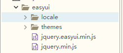
Easyui的目录结构:

Easyui运行需要的依赖文件:
需要引入的文件
<!-- 引入easyui的核心css -->
<link rel="stylesheet" type="text/css" href="easyui/themes/default/easyui.css">
<!-- 引入easyui核心图标css -->
<link rel="stylesheet" type="text/css" href="easyui/themes/icon.css">
<!-- 引入jquery的核心js -->
<script type="text/javascript" src="easyui/jquery.min.js"></script>
<!-- 引入easyui的核心js -->
<script type="text/javascript" src="easyui/jquery.easyui.min.js"></script>
<!-- 引入汉化js -->
<script type="text/javascript" src="easyui/locale/easyui-lang-zh_CN.js"></script>
<!-- 按钮相关的样式 -->
<link rel="stylesheet" href="easyui/themes/color.css">
创建easyui组件的2种方式
Html方式
语法格式:class=“easyui-组件名”
class="easyui-panel" 创建组件
title="值" 设置标题
iconCls="icon-back" 设置图标
collapsible="true" 显示折叠按钮
JS方式
语法格式:jquery对象.组件名() 或者 jQuery对象.组件名({})
当变成easyui组件之后 他不仅仅可是使用easyui自带的属性和样式,还支持原生的css
$("#mydiv").panel({
	title:"这是标题",
	iconCls:"icon-ok",
	collapsible:true,
	width:400,
	height:200
});
设置属性的两种方式
注意:每个组件都依附着指定的标签 就比如说 面板必须依附着div 按钮必须依附这a标签 不能随便依附标签
在easyui组件中html设置属性的方案有两种:
- 方案一:<标签 属性1=“值1” 属性2=“值2” …></标签>
- 方案二:<标签 data-options=“属性1:值1,属性二:值2…”></标签> 推荐
常用的组件
linkbutton
linkbutton常见属性
- iconCls:‘icon-add’ 图标
- disabled:true 禁用按钮(注意:如果js注册事件,是禁用不了的,如果需要禁用 需要自己写业务逻辑)
- style=‘width:15%’ 设置按钮的长度
- iconAlign:默认为left 可选值有top,right,bottom
- size:‘large’ 大图标
- plain:true 简介风格 没有边框 ----ugly
html和js创建组件的区别
注意:大家在创建easyui组件的时候,如果创建使用了html方式创建,就不要再使用js创建了 否则将会创建两次 因为html底层就是用js创建的
panel
Easyui组件的三要素:
- 属性
- 事件
- 方法
panel常见属性:
- title string 在面板头部显示的标题文本
- iconCls string 设置一个16x16图标的CSS类ID显示在面板左上角。
- width number 设置面板宽度。
- height number 设置面板高度。
- left number 设置面板距离左边的位置(即X轴位置)。 注意:单独用没效果,它是要和cls属性一起用才有效果 了解
- top number 设置面板距离顶部的位置(即Y轴位置)。 注意:单独用没效果,它是要和cls属性一起用才有效果 了解
- headerCls string 添加一个CSS类ID到面板头部。 设置面板头部的样式 了解
- bodyCls string 添加一个CSS类ID到面板正文部分 设置面板体的样式 了解
- cls string 添加一个CSS类ID到面板。 设置整个面板的样式 了解
- fit boolean 当设置为true的时候,它会自适应当前window窗体 注意:当用了fit之后,width和height属性就不生效了
- border boolean 定义是否显示面板边框。
- content string 面板主体内容,它的值是多少,面板就展示多少,并且会覆盖面板中已有的值
- collapsible boolean 定义是否显示可折叠按钮。 了解 如果和窗体fit为true一切综合使用的话,效果非常不明显
- minimizable boolean 定义是否显示最小化按钮。 了解 如果和窗体fit为true一切综合使用的话,效果非常不明显
- maximizable boolean 定义是否显示最大化按钮。 了解 如果和窗体fit为true一切综合使用的话,效果非常不明显
- closable boolean 定义是否显示关闭按钮。
- href string 从URL读取远程数据并且显示到面板 它只会加载body中的内容,body以外的内容根本不执行 了解
- collapsed boolean 定义是否在初始化的时候折叠面板。
- minimized boolean 定义是否在初始化的时候最小化面板。 了解
- maximized boolean 定义是否在初始化的时候最大化面板。 了解
- closed boolean 定义是否在初始化的时候关闭面板。
- loadingMessage string 在加载远程数据的时候在面板内显示一条消息。
h5代码
<div class="easyui-panel" data-options="
title:'这是我的标题',
iconCls:'icon-save',
width:300,
height:200,
headerCls:'headerCls',
bodyCls:'bodyCls',
cls:'cls',
left:220,
top:100
">哈哈哈</div>

<div class="easyui-panel" data-options="
title:'ok标题',
iconCls:'icon-ok',
fit:true,
content:'<h1>嘻嘻嘻你被我覆盖了.</h1>'
">嘻嘻</div>
操作easyui默认属性
获取组件拥有默认的属性和事件语法格式: $.fn.{plugin}.defaults
修改默认属性的值 语法格式: $.fn.{plugin}.defaults.属性 = 值
方法的操作
easyui操作方法的语法格式:
jquery对象.组件(“方法名”,参数)
Tree
animate boolean 定义节点在展开或折叠的时候是否显示动画效果。
checkbox boolean 定义是否在每一个借点之前都显示复选框。
h5代码:
<ul class="easyui-tree" data-options="url:'/dept.json',onClick:clickTree,
animate:true,
checkbox:true,
lines:true
">
</ul>
json代码:
[{
    "id":1,
	"text":"总经办",
	"state":"closed",
    "iconCls":"icon-ok",
	"children":[
		{
			"id":11,
		    "iconCls":"icon-remove",
			"text":"教学部",
			"attributes":{
				"url":"https://baidu.com",
				"name":"这是百度"
			}
		},{
			"id":12,
		    "iconCls":"icon-cancel",
			"text":"学工部",
			"checked":true,
			"attributes":{
				"url":"https://baidu.com",
				"name":"这是百度"
			}
		}
	]
},{
    "id":2,
	"text":"总公司",
	"children":[
		{
			"id":21,
			"text":"小卖部",
			"checked":true,
			"name":"随便加",
			"url":"dsfjhsakfdh"
		},{
			"id":22,
			"text":"销售部"
		}
	]
}]
datagrid
- fitColumns boolean 自适应列
- toolbar array,selector 工具栏
- striped boolean 是否显示斑马线效果。
- method string 该方法类型请求远程数据。 GET/POST
- url string 一个URL从远程站点请求数据。
- pagination boolean 时候显示分页条
- rownumbers boolean 如果为true,则显示一个行号列。
- singleSelect boolean 如果为true,则只允许选择一行
- ctrlSelect boolean 如果为true,它支持shift+鼠标左键多选
- pagePosition string 定义分页工具栏的位置。可用的值有:‘top’,‘bottom’,‘both’
- pageNumber number 在设置分页属性的时候初始化页码
- pageSize number 在设置分页属性的时候初始化页面大小。
- pageList array 在设置分页属性的时候 初始化页面大小选择列表。
- rowStyler function 它对行进行上色
<table id="dg" class="easyui-datagrid" data-options="
    fit:true,
    url:'/employee/datagrid',
    title:'员工列表',
    fitColumns:true,
    toolbar:'#tb',
    pagination:true,
    rownumbers:true
    ">
    <thead>
    <tr>
        <th data-options="field:'id',checkbox:true,width:'1%'">ID</th>
        <th data-options="field:'username',width:'14%',align:'center',sortable:true" editor="{type:'validatebox',options:{required:true}}">用户名</th>
        <th data-options="field:'password',width:'20%',align:'center'" editor="{type:'validatebox',options:{required:true}}">密码</th>
        <th data-options="field:'email',width:'20%',align:'center'" editor="{type:'validatebox',options:{required:true,validType:'email'}}">邮箱</th>
        <th data-options="field:'headImage',width:'15%',align:'center',formatter:formatterHeadImage">头像</th>
        <th data-options="field:'age',width:'10%',align:'center',sortable:true" editor="numberbox">年龄</th>
        <th data-options="field:'department',width:'20%',align:'center',formatter:formatterDept">部门</th>
    </tr>
    </thead>
</table>
