已安装完的请忽略 (此步骤参照 https://ng.ant.design/docs/getting-started/zh)
1、安装组件
$ npm install ng-zorro-antd --save
2. 导入模块
import { NzModalModule } from 'ng-zorro-antd/modal'; (此模块为弹窗模块)
import { NzButtonModule } from 'ng-zorro-antd/button'; (此示例应用了官方的按钮样式)
3. 引入样式与 SVG 资源
在 angular.json 文件中引入样式和 SVG icon 资源。
"styles": [
...
"node_modules/ng-zorro-antd/ng-zorro-antd.min.css"
]
在 style.css 文件里:
@import "~ng-zorro-antd/style/index.min.css"; /* 引入基本样式 */ @import "~ng-zorro-antd/button/style/index.min.css"; /* 引入组件样式 */


示例

1.
HTML代码
<button nz-button [nzType]="'danger'" (click)="showModal()"><span>Show Modal</span></button>
<nz-modal [(nzVisible)]="isVisible" nzTitle="The first Modal" (nzOnCancel)="handleCancel()" (nzOnOk)="handleOk()">
<p>Content one</p>
<p>Content two</p>
<p>Content three</p>
</nz-modal>
<router-outlet></router-outlet>
ts 文件
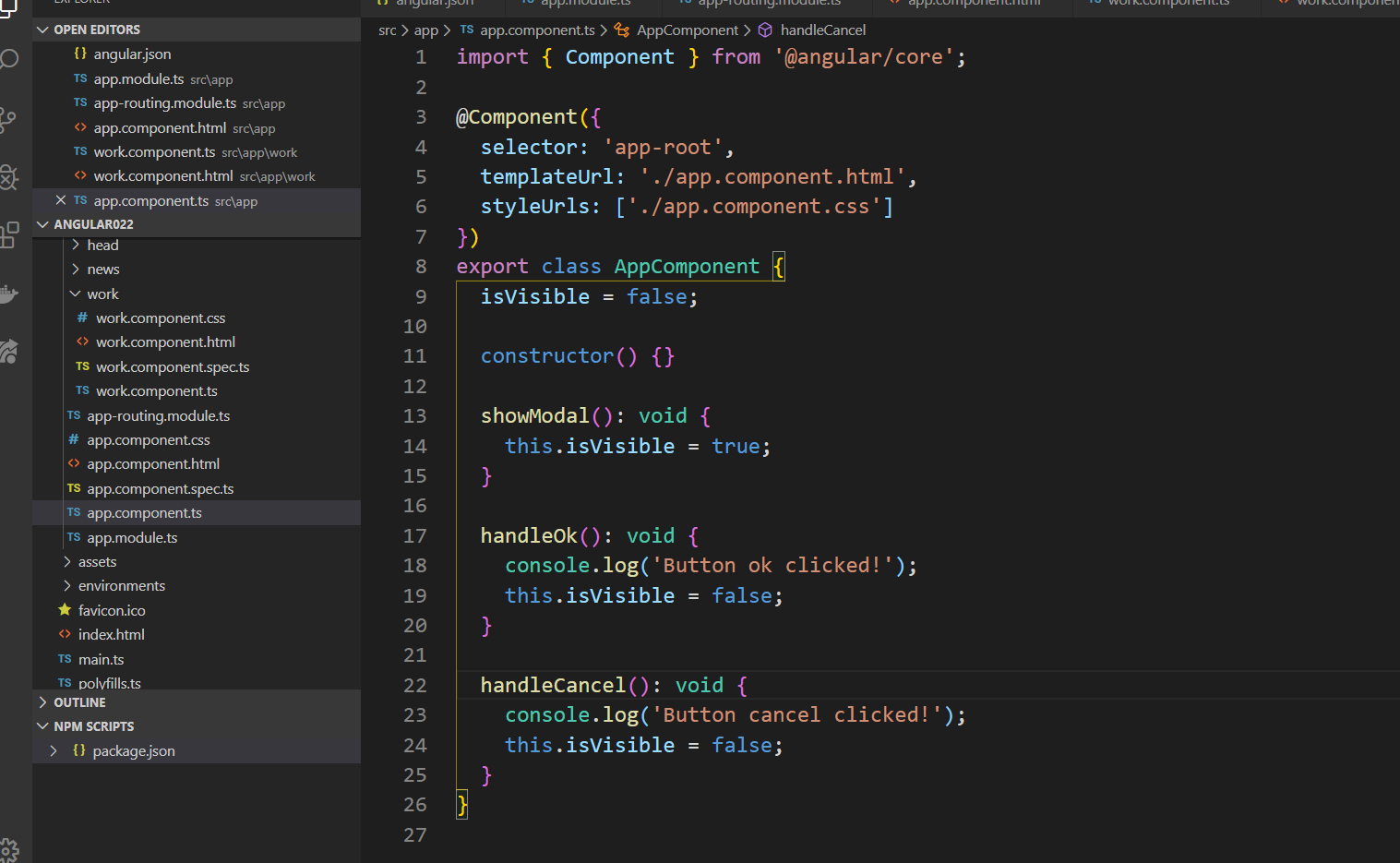
ts代码
import { Component } from '@angular/core';
@Component({
selector: 'app-root',
templateUrl: './app.component.html',
styleUrls: ['./app.component.css']
})
export class AppComponent {
isVisible = false;
constructor() {}
showModal(): void {
this.isVisible = true;
}
handleOk(): void {
console.log('Button ok clicked!');
this.isVisible = false;
}
handleCancel(): void {
console.log('Button cancel clicked!');
this.isVisible = false;
}
}