1、IconButton
只介绍和RaisedButton属性不一样的地方,和RaisedButton属性一样的请看这:https://blog.csdn.net/mengks1987/article/details/84962742
| 属性 | 说明 |
|---|---|
| iconSize | icon 的大小 |
| icon | icon |
| tooltip | 长按出现提示 |
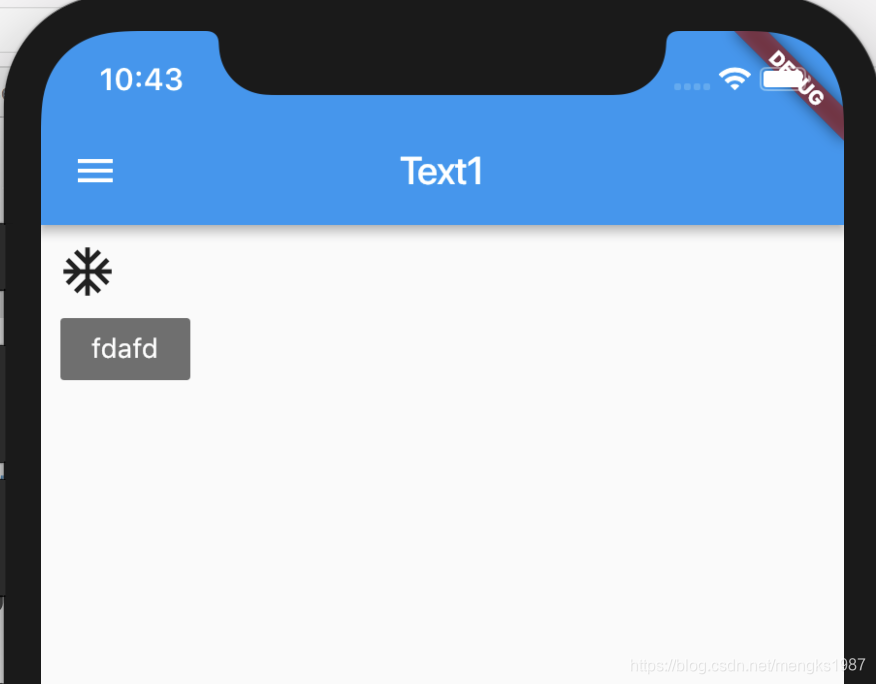
IconButton(
          iconSize: 30,
          icon: Icon(Icons.ac_unit),
          onPressed: (){},
          tooltip: 'fdafd',
        ),
效果,fdafd就是tooltip效果
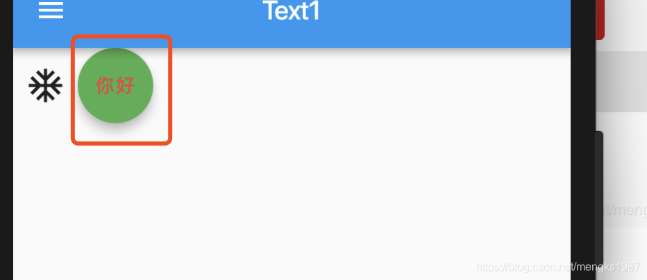
2、FloatingActionButton
FloatingActionButton是一个圆形的按钮
| 属性 | 说明 |
|---|---|
| tooltip | 长按时出现提示 |
| foregroundColor | child 的颜色 |
| backgroundColor | 背景颜色 |
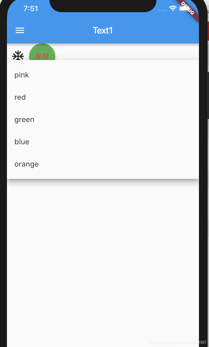
3、DropdownButton
| 属性 | 说明 |
|---|---|
| items | 下拉选项 |
| value | 当前选中的值 |
| hint | value = null 时显示 |
| disabledHint | 禁用时提示 |
| onChanged | 选项发生变化时回调 |
| elevation | 阴影Z轴的值 |
| style | 字体样式 |
| iconSize | 右侧三角图标的大小 |
| isDense | true:下拉框的高度是item高度的一半,默认false,下拉框的高度是item高度一样 |
| isExpanded | 默认false,下拉框最小宽度,true:充满父组件 |
import 'package:flutter/material.dart';

class Button2Demo extends StatefulWidget {
  @override
  State<StatefulWidget> createState() {
    // TODO: implement createState
    return _Button2Demo();
  }
}

class _Button2Demo extends State<Button2Demo> {
  List<String> _colors = <String>['pink', 'red', 'green', 'blue', 'orange'];
  String _color;

  @override
  void initState() {
    // TODO: implement initState
    super.initState();
    setState(() {
      _color = null;
//      _color = _colors[0];
    });
  }

  @override
  Widget build(BuildContext context) {
    return Column(
      children: <Widget>[
        Row(
          children: <Widget>[
            IconButton(
              iconSize: 30,
              icon: Icon(Icons.ac_unit),
              onPressed: () {},
              tooltip: 'tooltip',
            ),
            FloatingActionButton(
              onPressed: () {},
              child: Text('你好'),
              foregroundColor: Colors.red,
              backgroundColor: Colors.green,
            ),
          ],
        ),
        Column(
          children: <Widget>[
            DropdownButton<String>(
              value: _color,
              isDense: true,
              isExpanded: true,
              hint: Text('请选择'),
              onChanged: (String newValue) {
                setState(() {
                  _color = newValue;
                });
              },
              items: _colors.map((String value) {
                return DropdownMenuItem<String>(
                  value: value,
                  child: Text(value),
                );
              }).toList(),
            ),
          ],
        ),
      ],
    );
  }
}
注意_color的值要在initState中初始化,而且不能这样写
_color='pink'
必须这么写:
_color = _colors[0];
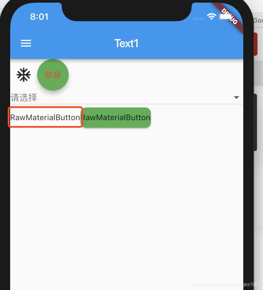
4、RawMaterialButton
没有背景、没有边框的按钮,点击有水波纹效果
| 属性 | 说明 |
|---|---|
| onPressed | 点击回调 |
| onHighlightChanged | 高亮变化回调 |
| textStyle | 字体样式 |
| fillColor | 背景填充颜色 |
| highlightColor | 高亮颜色 |
| splashColor | 水波纹颜色 |
| elevation | 阴影Z轴值 |
| highlightElevation | 高亮 阴影Z轴值 |
| disabledElevation | 禁用阴影Z轴值 |
| padding | padding |
| constraints | 按钮大小,一般设置最小size |
| shape | 按钮形状 |
Row(
          children: <Widget>[
            RawMaterialButton(
              onPressed: (){},
              child: Text('RawMaterialButton'),
            ),
            RawMaterialButton(
              onPressed: (){},
              fillColor: Colors.green,
              shape: RoundedRectangleBorder(
                borderRadius: BorderRadius.all(Radius.circular(10))
              ),
              child: Text('RawMaterialButton'),
            ),
          ],
        ),
效果如下: