介绍
FAB,在Material Design中,一般用来处理界面中最常用,最基础的用户动作。它一般出现在屏幕内容的前面,通常是一个圆形,中间有一个图标。 FAB有三种类型:regular, mini, and extended。不要强行使用FAB,只有当使用场景符合FAB功能的时候使用才最为恰当。
使用原则
- A FAB represents the primary action on a screen.
- A FAB should perform a constructive action (such as create, share, or explore).
- A FAB should be relevant to the screen on which it appears.
类结构
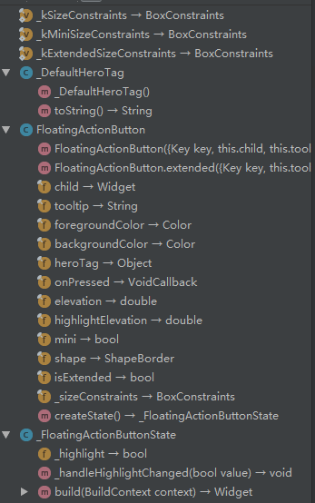
属性值
| 属性 | 意义 |
|---|---|
| child | 子视图,一般为Icon,不推荐使用文字 |
| tooltip | FAB的文字解释,FAB被长按时显示,也是无障碍功能 |
| foregroundColor | 前景色 |
| backgroundColor | 背景色 |
| heroTag | hero效果使用的tag,系统默认会给所有FAB使用同一个tag,方便做动画效果 |
| elevation | 未点击时阴影值,默认6.0 |
| hignlightElevation | 点击时阴影值,默认12.0 |
| onPressed | 点击事件回调 |
| mini | 是否为“mini”类型,默认为false |
| shape | 定义FAB的shape,设置shape时,默认的elevation将会失效,默认为CircleBorder |
| isExtended | 是否为”extended”类型 |
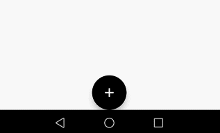
基本使用
示例
  Widget build(BuildContext context) {
    return new Scaffold(
      floatingActionButton: new Builder(builder: (BuildContext context) {
        return new FloatingActionButton(
          child: const Icon(Icons.add),
          tooltip: "Hello",
          foregroundColor: Colors.white,
          backgroundColor: Colors.black,
          heroTag: null,
          elevation: 7.0,
          highlightElevation: 14.0,
          onPressed: () {
            Scaffold.of(context).showSnackBar(new SnackBar(
              content: new Text("FAB is Clicked"),
            ));
          },
          mini: false,
          shape: new CircleBorder(),
          isExtended: false,
        );
      }),
      floatingActionButtonLocation: FloatingActionButtonLocation.centerDocked,
    );
  }
属性分析
mini
FAB 分为三种类型:regular, mini, and extended。大小限制如下
const BoxConstraints _kSizeConstraints = const BoxConstraints.tightFor(
width: 56.0,
height: 56.0,
);
const BoxConstraints _kMiniSizeConstraints = const BoxConstraints.tightFor(
width: 40.0,
height: 40.0,
);
const BoxConstraints _kExtendedSizeConstraints = const BoxConstraints(
minHeight: 48.0,
maxHeight: 48.0,
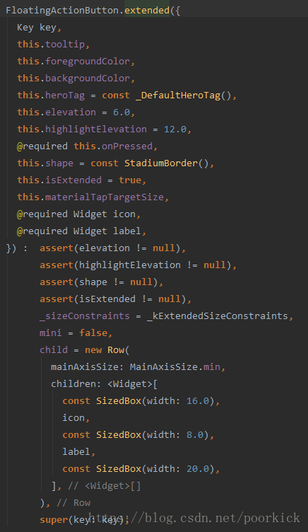
);regular和mini两种类型通过默认的构造方法实现。
extended类型则是通过
new FloatingActionButton.extended()来实现。从参数上看差异并不大,只是把默认构造方法中的child换成了icon和label,不过通过下面的代码可以看到,传入的label和icon也是用来构建child的,不过使用的是Row来做一层包装而已。
| 类型 | 效果 |
|---|---|
| regular | 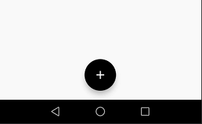 |
| mini | 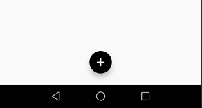 |
| extended | 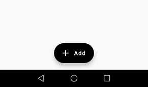 |
heroTag
先看看heroTag对应的注释
  /// The tag to apply to the button's [Hero] widget.
  ///
  /// Defaults to a tag that matches other floating action buttons.
  ///
  /// Set this to null explicitly if you don't want the floating action button to
  /// have a hero tag.
  ///
  /// If this is not explicitly set, then there can only be one
  /// [FloatingActionButton] per route (that is, per screen), since otherwise
  /// there would be a tag conflict (multiple heroes on one route can't have the
  /// same tag). The material design specification recommends only using one
  /// floating action button per screen.
首先我们了解下Hero,简单理解为两个界面内拥有同样tag的元素在界面切换过程中,会有动画效果,是界面切换不再那么生硬。
这里的heroTag就是用来标识FAB的。看下面的两个对比图。
- 不设置heroTag属性,使用系统自带的tag值。

- 设置
heroTag: null,不使用系统自带的tag值。
从上面的效果图,明显可以看出界面之间切换的友好性还是存在很大差距的。若两个界面中均有FAB,建议不设置heroTag为null。避免界面切换的生硬。
floatingActionButtonLocation
这是Scaffold Widget的一个属性,和FAB配合使用。代表FAB在界面中四种不同的拜访方式
static const FloatingActionButtonLocation endFloat = const _EndFloatFabLocation();

static const FloatingActionButtonLocation centerFloat = const _CenterFloatFabLocation();

static const FloatingActionButtonLocation endDocked = const _EndDockedFloatingActionButtonLocation();

static const FloatingActionButtonLocation centerDocked = const _CenterDockedFloatingActionButtonLocation();| 属性值 | 效果 |
|---|---|
| endFloat | 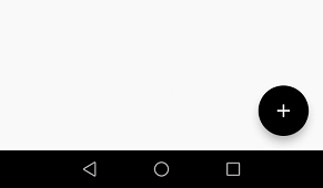 |
| centerFloat | 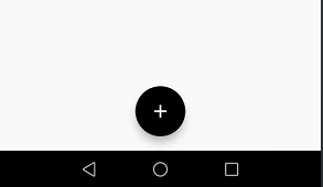 |
| endDocked | 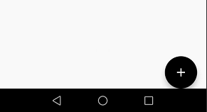 |
| centerDocked | 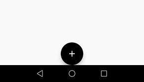 |
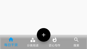
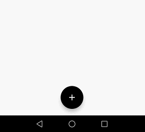
centerDocker&BottomNavigationBar
return new Scaffold(
      floatingActionButton: new Builder(builder: (BuildContext context) {
        return new FloatingActionButton(
          child: const Icon(Icons.add),
          tooltip: "Hello",
          heroTag: null,
          foregroundColor: Colors.white,
          backgroundColor: Colors.black,
          elevation: 7.0,
          highlightElevation: 14.0,
        );
      }),
      floatingActionButtonLocation: FloatingActionButtonLocation.centerDocked,
      bottomNavigationBar: new Theme(
        data: Theme.of(context).copyWith(
            // sets the background color of the `BottomNavigationBar`
            canvasColor: Colors.black12,
            // sets the active color of the `BottomNavigationBar` if `Brightness` is light
            primaryColor: Colors.red,
            textTheme: Theme.of(context)
                .textTheme
                .copyWith(caption: new TextStyle(color: Colors.white))),
        child: new BottomNavigationBar(
          fixedColor: Colors.lightBlue,
          items: [
            new BottomNavigationBarItem(
                icon: new Icon(Icons.home), title: new Text("每日干货")),
            new BottomNavigationBarItem(
              icon: new Icon(Icons.category),
              title: new Text("分类阅读"),
            ),
            new BottomNavigationBarItem(
              icon: new Icon(Icons.whatshot),
              title: new Text("匠心写作"),
            ),
            new BottomNavigationBarItem(
              icon: new Icon(Icons.search),
              title: new Text("搜索"),
            ),
          ],
          type: BottomNavigationBarType.fixed,
          onTap: (int selected) {
            setState(() {
            });
          },
        ),
      ),
    );