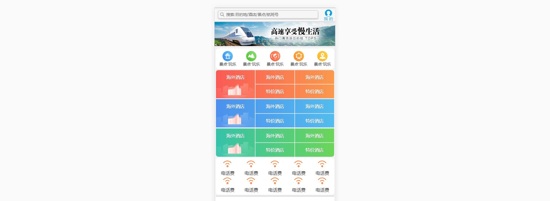
访问网站:m.ctrip.com
1. 技术选型
方案:单独制作移动端页面的方案
技术:采用flex伸缩布局
2.搭建相关文件夹结构
3. 引入相关文件
<head>
    <meta charset="UTF-8">
    <meta name="viewport" content="width=device-width, initial-scale=1.0">
    <meta http-equiv="X-UA-Compatible" content="ie=edge">
    <link rel="stylesheet" href="css/normalize.css">
    <link rel="stylesheet" href="css/index.css">
    <title>携程在手,说走就走</title>
</head>
4. body样式
body {
    max-width: 540px;
    min-width: 320px;
    margin: 0 auto;
    font: normal 14px/1.5 Tahoma, "Lucida Grand", Verdana, "Microsoft Yahei", STXihei, hei;
    color: #000;
    background-color: #f2f2f2;
    /* 永远不显示水平滚动条 */
    overflow-x: hidden;
    /* 清除高亮 */
    -webkit-tab-highlight-color: transparent;
}
5. 统一样式
6. 搜索模块

说明:该模块利用固定定位,分成两个部分,搜索模块和登陆模块,注意这里的搜索模块不是真正意义上的搜索框,是用div盒子做的,右边的登陆模块的背景图片来源一张精灵图。
<!-- 顶部搜索模块 -->
<div class="search-index">
    <div class="search">搜索:目的地/酒店/景点/航班号</div>
    <a href="#" class="user">我 的</a>
</div>
/* 顶部搜索模块 */
.search-index {
display: flex;
position: fixed;
top: 0;
left: 50%;
/*如果不写left值,默认也是水平居中的*/
transform: translateX(-50%);
/* 兼容旧版本的浏览器 */
-webkit-transform: translateX(-50%);
/* 固定定位的盒子应该有宽带 */
width: 100%;
/* 固定定位和父亲没有关系,他以屏幕为准 为了不让其无限制的100% 所以要设定 min-width和max-width */
min-width: 320px;
max-width: 540px;
height: 44px;
background-color: #f6f6f6;
/* 已经定位的盒子用margin:0 auto;是无效的 */
border-top: 1px solid #ccc;
border-bottom: 1px solid #ccc;
}
.search {
position: relative;
flex: 1;
height: 26px;
border: 1px solid #ccc;
padding-left: 25px;
margin: 7px 10px;
border-radius: 5px;
font-size: 12px;
color: #666;
/* line-height: 26px; */
/* 行高等于高之后依然觉得盒子偏下了,原因:这里使用的是C3盒子模型,C3的盒子模型的高height包括border和padding,也就是这里的26px包括了border,实际的内容部分并没有达到26px的高度.所以说这里的line-height设置的偏大,导致文字整体感觉偏下 */
/* 让文字垂直居中,设置行高等于高的一个比较严谨的说法是,让行高等于内容部分的高度 */
/* 修改如下 */
line-height: 24px;
/*26-1-1*/
box-shadow: 0 2px 4px rgba(0, 0, 0, .2);
}
.search::before {
content: "";
position: absolute;
top: 5px;
left: 5px;
width: 15px;
height: 15px;
background: url(../images/sprite.png) no-repeat -59px -279px;
background-size: 104px auto;
/* margin: 5px; 添加定位之后,margin值将不起效果了*/
}
.user {
/* flex布局中,行内元素不用给高 */
width: 44px;
height: 44px;
/* background-color: purple; */
font-size: 12px;
text-align: center;
color: #2eaae0;
}
.user::before {
content: "";
/* 伪元素选择器属于行内元素 */
display: block;
width: 23px;
height: 23px;
background: url(../images/sprite.png) no-repeat -59px -194px;
/* 将精灵图缩小为原图的一半 */
background-size: 104px auto;
/* 上:5px;左右auto;下:-2px */
margin: 5px auto -2px;
}7. 焦点图模块
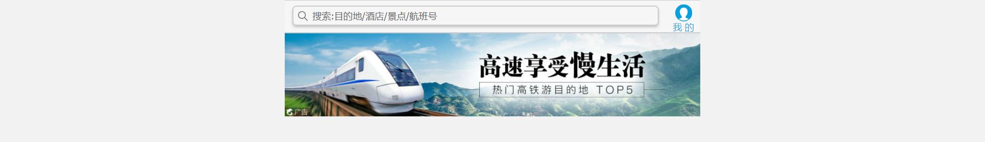
<!-- 焦点图模块 -->
<div class="focus">
    <img src="upload/focus.jpg" alt="">
</div>
/* 焦点图模块 */
.focus {
/* 目的是让img往下移一移,不让最上面固定定位的盒子挡住img焦点图 */
padding-top: 44px;
}
.focus img {
/* 让图片和父盒子一样宽 */
width: 100%;
}8. 局部导航栏

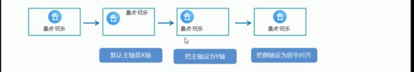
结构搭建就是ul-->li--->a; a里面分上面部分,后面很多地方都是分上下部分的,下面主要讲解一下上下布局的方法。