接上篇ccs之经典布局(二)(两栏,三栏布局)
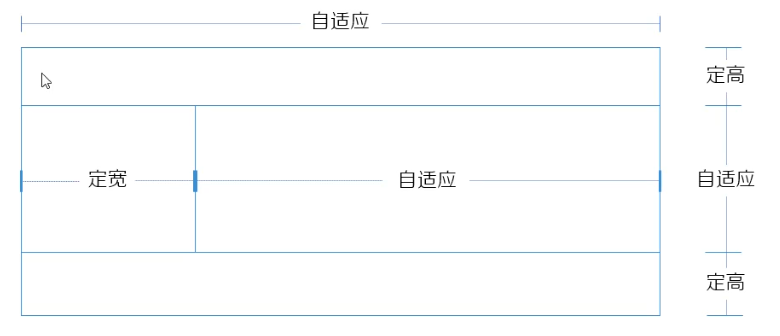
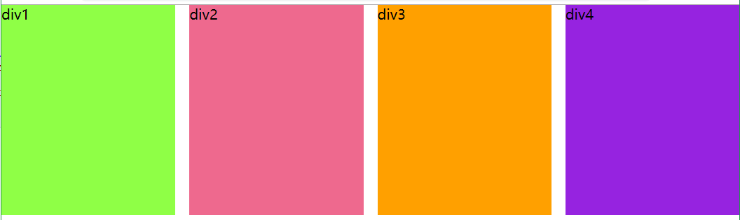
七、等分布局
等分布局是指一行被分为若干列,每一列的宽度是相同的值。两列之间有若干的距离。
1、float+padding+background-clip
使用float让元素在一行内显示,使用padding来实现元素之间的距离,使用background-clip使元素padding部分不显示背景。
2、float+margin+calc
使用calc()函数来计算元素的宽度,使用margin实现元素之间的间距
3、还可以增加结构来实现兼容,不推荐
4、table
元素被设置为table后,内容撑开宽度,兼容性的问题。还有table-cell元素无法设置margin,padding.
5、flex+~选择器 很好用,就是有兼容性的问题,多用于移动端布局

6、grid 很好用,就是有兼容性的问题,多用于移动端布局
<!DOCTYPE html>
<html lang="en"> <head> <meta charset="UTF-8"> <title>等分布局</title> <style> * { margin: 0; padding: 0; } body{ overflow: hidden; } .container { /* margin-left: -20px;       第1种方法 overflow: hidden; border: 1px solid greenyellow; */ /* overflow: hidden;      第2种方法 margin-right: -20px; border: 1px solid greenyellow; */ /* display: flex;     第5种方法 */ /* display: grid;   第6种方法 grid-template-columns: repeat(4,1fr); grid-gap: 20px; */ } .container div { height: 300px; /* float: left;       第1种方法 width: 25%; padding-left: 20px; box-sizing: border-box; background-clip: content-box; */ /* float: left;       第2种方法 width: calc(25% - 20px);       记得空格 margin-right: 20px; */ /* flex:1;         第5种方法 */ } /* .div1 ~ div{ 第5种方法 margin-left: 20px; } */ .div1 { background: greenyellow; } .div2 { background: palevioletred; } .div3 { background: orange; } .div4 { background: blueviolet; } </style> </head> <body> <div class="container"> <div class="div1">div1</div> <div class="div2">div2</div> <div class="div3">div3</div> <div class="div4">div4</div> </div> </body> </html>
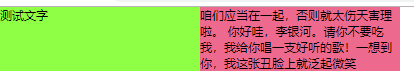
八、等高布局
1、display:table-cell
table布局天然就具有等高的特点,display设置为table-cell此元素会作为一个表格单元格来显示,类似于<td>.
2、flex 弹性盒子布局,默认值就是自带等高布局的特点。(flex-direction和align-item)
3、padding与margin相互抵消
它是假等高,设置父容器的overflow属性为hidden,给每列设置比较大的底内边距,然后用数值相似的负外边距消除这个高度(用到的点有:background会填充padding,不会填充margin,margin有坍塌性,可以设置成负值。overflow:hidden;让容器产生BFC,清浮动。同时截取内容适应填充框,将超出的部分隐藏)
<!DOCTYPE html>
<html lang="en">
<head>
    <meta charset="UTF-8">
    <title>等高布局</title>
    <style>
    *{
        margin: 0;
        padding:0;
    font-size: 12px;
    }
    .container{

       /* display: table;         第1种方法   */
        /* display:flex;         第2种方法        */
        overflow: hidden;
    }
   .left,.right{
        width: 200px;
        /* display:table-cell;          第1种方法    */

        /* padding-bottom: 999em;       第3种方法
        margin-bottom: -999em;
        float: left; */
    }

    .left{
        background: greenyellow;
    }
    .right{
        background: palevioletred;
    }
    </style>
</head>
<body>
    <div class="container">
        <div class="left">测试文字</div>
        <div class="right"> 咱们应当在一起,否则就太伤天害理啦。 你好哇,李银河。请你不要吃我,我给你唱一支好听的歌!一想到你,我这张丑脸上就泛起微笑</div>
    </div>
</body>
</html>
九、全屏布局
全屏布局指的就是HTML页面铺满整个浏览器窗口,且没有滚动条,可以跟随浏览器大小的变化而变化。它在实际的工作中经常用到,下面展示几种方式进行全屏布局的实现。
1、float+clac()这一种方法
2、position+overflow来实现
3、inline-block+calc来实现
4、用absolute来实现
html:
<div class="parent">

        <div class="top">top</div>

        <div class="container">
            <div class="left">left</div>
            <div class="right">
                <div class="inner">right</div>
            </div>
        </div>

        <div class="footer">footer</div>
    </div>
css1:
<style>
    *{
        margin:0;
        padding:0;
    }
    html,body,.parent{
        height: 100%;
    }
    .top,.footer{
        height: 50px;
        background: grey;
    }
    .container{
        overflow: hidden;
        height: calc(100% - 100px);
        background: papayawhip;

    }
    .left{
        width: 100px;
        float: left;
        height: 100%;
        background: palevioletred;
    }
    .right{
        overflow: auto;
        height: 100%;
        background: greenyellow;
    }
    .inner{
        height: 10000px;
    }
    </style>
css2:
<style>
    *{
        margin:0;
        padding:0;
    }
    .top,.footer{
        height: 50px;
        position: fixed;
        /* 有position宽度就不能自适应等于所有后代元素的和,自适应的原因是因为下面的left和right的设置 */
        left: 0;
        right: 0;
        background:  rgb(161, 158, 158);
    }
    .top{
        top:0;
    }
    .footer{
        bottom: 0;
    }
    .container{
        /* height: 100%;  */
        background: papayawhip;
        position: fixed;
        left:0;
        right: 0;
        top:50px;
        bottom:50px;
        overflow: auto;
    }
    .left{
        width: 100px;
        background: palevioletred;
        height: 100%;
        position: fixed;
        left: 0;
        top:50px;
        bottom: 50px;
    }
    .right{
        /* height: 1oo%; */
        height: 1000px;
        background: greenyellow;
        margin-left: 100px;
    }
    </style>
css3:
<style>
       * {
            padding: 0;
            margin: 0;
        }
        body, html,.parent {
            height: 100%;
        }
        .top, .footer {
            height: 50px;
            background: gray;
        }
        .container {
            height: calc(100% - 100px);
            background: orange;
            font-size: 0;
        }
        .left,
        .right {
            display: inline-block;
            vertical-align: top;
            font-size: 16px;
        }
        .left {
            width: 100px;
            height: 100%;
            background: palevioletred;
        }
        .right {
            width: calc(100% - 100px);
            height: 100%;
            overflow: auto;
            background: greenyellow;
        }
        .inner {
            height: 1000px;
        }
    </style>
css4:
 <style>
        * {
            padding: 0;
            margin: 0;
        }
        body, html,.parent {
            height: 100%;
        }
        .top,.footer,.container{
            position: absolute;
            left: 0;
            right: 0;
        }
        .top,.footer{
            height: 50px;
            background: gray;
        }
        .top{
            top:0;
        }
        .footer{
            bottom: 0;
        }
        .container{
            top:50px;
            bottom:50px;
            background: orange;
        }
        .left,.right{
            position: absolute;
            top: 0;
            bottom: 0;
        }
        .left{
            width: 100px;
            background: palevioletred;
        }
        .right{
            left: 100px;
            right: 0;
            overflow: auto;
            background: greenyellow;
        }
        .inner{
            height: 1000px;
        }
    </style>
5、可以通过增加结构来提高兼容性利用float+absolute
html:
 <div class="parent">

        <div class="top">top</div>

        <div class="content">
            <div class="container">
                <div class="left">left</div>
                <div class="right">
                    <div class="inner">right</div>
                </div>
            </div>
        </div>

        <div class="footer">footer</div>
    </div>
css:
 <style>
        *{
            margin:0;
            padding:0;
        }
        html,body,.parent{
            height: 100%;
        }
        .top,.footer{
            position: absolute;
            height: 50px;
            left: 0;
            right: 0;
            background: grey;
        }
        .top{
            top:0;
        }
        .footer{
            bottom: 0;
        }
        .content{
            height: 100%;
            overflow: hidden;
            background: blue;
        }
        .container{
            overflow: hidden;
            height: 100%;
            margin:50px 0;
            background: orange;
        }
        .left{
            width: 100px;
            float: left;
            height: 100%;
            background: palevioletred;
        }
        .right{
            overflow: auto;
            height: 100%;
            background: greenyellow;
        }
        .inner{
            height: 1000px;
        }
    </style>