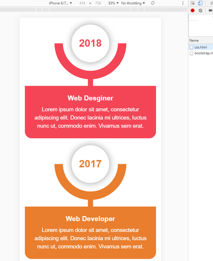
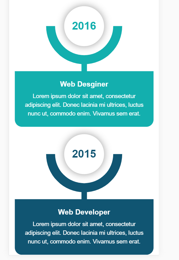
<!DOCTYPE html>
<html lang="en">

<head>
    <meta charset="UTF-8">
    <meta name="viewport" content="width=device-width, initial-scale=1.0">
    <meta http-equiv="X-UA-Compatible" content="ie=edge">
    <link href="https://cdn.bootcss.com/bootstrap/3.3.7/css/bootstrap.min.css" rel="stylesheet">
    <title>Document</title>
    <style>
        .main-timeline {
            overflow: hidden;
            position: relative;
        }

        .main-timeline .timeline {
            position: relative;
            margin-top: -79px;
        }

        .main-timeline .timeline:first-child {
            margin-top: 0;
        }

        .main-timeline .timeline:before,
        .main-timeline .timeline:after {
            content: "";
            display: block;
            width: 100%;
            clear: both;
        }

        .main-timeline .timeline:before {
            content: "";
            width: 100%;
            height: 100%;
            box-shadow: -8px 0 5px -5px rgba(0, 0, 0, 0.5) inset;
            position: absolute;
            top: 0;
            right: 0;
            z-index: 2;
        }

        .main-timeline .timeline-icon {
            width: 210px;
            height: 210px;
            border-radius: 50%;
            border: 25px solid transparent;
            border-top-color: #f44556;
            border-right-color: #f44556;
            margin: auto;
            position: absolute;
            top: 0;
            left: 0;
            bottom: 0;
            right: 0;
            z-index: 1;
            transform: rotate(45deg);
        }

        .main-timeline .year {
            display: block;
            width: 110px;
            height: 110px;
            line-height: 110px;
            border-radius: 50%;
            background: #fff;
            box-shadow: 0 0 20px rgba(0, 0, 0, 0.4);
            margin: auto;
            font-size: 30px;
            font-weight: bold;
            color: #f44556;
            text-align: center;
            position: absolute;
            top: 0;
            left: 0;
            bottom: 0;
            right: 0;
            transform: rotate(-45deg);
        }

        .main-timeline .timeline-content {
            width: 35%;
            float: right;
            background: #f44556;
            padding: 30px 20px;
            margin: 50px 0;
            z-index: 1;
            position: relative;
        }

        .main-timeline .timeline-content:before {
            content: "";
            width: 20%;
            height: 15px;
            background: #f44556;
            position: absolute;
            top: 50%;
            left: -20%;
            z-index: -1;
            transform: translateY(-50%);
        }

        .main-timeline .title {
            font-size: 20px;
            font-weight: bold;
            color: #fff;
            margin: 0 0 10px 0;
        }

        .main-timeline .description {
            font-size: 16px;
            color: #fff;
            line-height: 24px;
            margin: 0;
        }

        .main-timeline .timeline:nth-child(2n):before {
            box-shadow: 8px 0 5px -5px rgba(0, 0, 0, 0.5) inset;
        }

        .main-timeline .timeline:nth-child(2n) .timeline-icon {
            transform: rotate(-135deg);
        }

        .main-timeline .timeline:nth-child(2n) .year {
            transform: rotate(135deg);
        }

        .main-timeline .timeline:nth-child(2n) .timeline-content {
            float: left;
        }

        .main-timeline .timeline:nth-child(2n) .timeline-content:before {
            left: auto;
            right: -20%;
        }

        .main-timeline .timeline:nth-child(2n) .timeline-icon {
            border-top-color: #e97e2e;
            border-right-color: #e97e2e;
        }

        .main-timeline .timeline:nth-child(2n) .year {
            color: #e97e2e;
        }

        .main-timeline .timeline:nth-child(2n) .timeline-content,
        .main-timeline .timeline:nth-child(2n) .timeline-content:before {
            background: #e97e2e;
        }

        .main-timeline .timeline:nth-child(3n) .timeline-icon {
            border-top-color: #13afae;
            border-right-color: #13afae;
        }

        .main-timeline .timeline:nth-child(3n) .year {
            color: #13afae;
        }

        .main-timeline .timeline:nth-child(3n) .timeline-content,
        .main-timeline .timeline:nth-child(3n) .timeline-content:before {
            background: #13afae;
        }

        .main-timeline .timeline:nth-child(4n) .timeline-icon {
            border-top-color: #105572;
            border-right-color: #105572;
        }

        .main-timeline .timeline:nth-child(4n) .year {
            color: #105572;
        }

        .main-timeline .timeline:nth-child(4n) .timeline-content,
        .main-timeline .timeline:nth-child(4n) .timeline-content:before {
            background: #105572;
        }

        @media only screen and (max-width: 1199px) {
            .main-timeline .timeline {
                margin-top: -103px;
            }

            .main-timeline .timeline-content:before {
                left: -18%;
            }

            .main-timeline .timeline:nth-child(2n) .timeline-content:before {
                right: -18%;
            }
        }

        @media only screen and (max-width: 990px) {
            .main-timeline .timeline {
                margin-top: -127px;
            }

            .main-timeline .timeline-content:before {
                left: -2%;
            }

            .main-timeline .timeline:nth-child(2n) .timeline-content:before {
                right: -2%;
            }
        }

        @media only screen and (max-width: 767px) {
            .main-timeline .timeline {
                margin-top: 0;
                overflow: hidden;
            }

            .main-timeline .timeline:before,
            .main-timeline .timeline:nth-child(2n):before {
                box-shadow: none;
            }

            .main-timeline .timeline-icon,
            .main-timeline .timeline:nth-child(2n) .timeline-icon {
                margin-top: -30px;
                margin-bottom: 20px;
                position: relative;
                transform: rotate(135deg);
            }

            .main-timeline .year,
            .main-timeline .timeline:nth-child(2n) .year {
                transform: rotate(-135deg);
            }

            .main-timeline .timeline-content,
            .main-timeline .timeline:nth-child(2n) .timeline-content {
                width: 100%;
                float: none;
                border-radius: 0 0 20px 20px;
                text-align: center;
                padding: 25px 20px;
                margin: 0 auto;
            }

            .main-timeline .timeline-content:before,
            .main-timeline .timeline:nth-child(2n) .timeline-content:before {
                width: 15px;
                height: 25px;
                position: absolute;
                top: -22px;
                left: 50%;
                z-index: -1;
                transform: translate(-50%, 0);
            }
        }
    </style>
</head>

<body>
    <div class="demo">
        <div class="container">
            <div class="row">
                <div class="col-md-12">
                    <div class="main-timeline">
                        <div class="timeline">
                            <div class="timeline-icon"><span class="year">2018</span></div>
                            <div class="timeline-content">
                                <h3 class="title">Web Desginer</h3>
                                <p class="description">
                                    Lorem ipsum dolor sit amet, consectetur adipiscing elit. Donec lacinia mi ultrices,
                                    luctus nunc ut, commodo enim. Vivamus sem erat.
                                </p>
                            </div>
                        </div>
                        <div class="timeline">
                            <div class="timeline-icon"><span class="year">2017</span></div>
                            <div class="timeline-content">
                                <h3 class="title">Web Developer</h3>
                                <p class="description">
                                    Lorem ipsum dolor sit amet, consectetur adipiscing elit. Donec lacinia mi ultrices,
                                    luctus nunc ut, commodo enim. Vivamus sem erat.
                                </p>
                            </div>
                        </div>
                        <div class="timeline">
                            <div class="timeline-icon"><span class="year">2016</span></div>
                            <div class="timeline-content">
                                <h3 class="title">Web Desginer</h3>
                                <p class="description">
                                    Lorem ipsum dolor sit amet, consectetur adipiscing elit. Donec lacinia mi ultrices,
                                    luctus nunc ut, commodo enim. Vivamus sem erat.
                                </p>
                            </div>
                        </div>
                        <div class="timeline">
                            <div class="timeline-icon"><span class="year">2015</span></div>
                            <div class="timeline-content">
                                <h3 class="title">Web Developer</h3>
                                <p class="description">
                                    Lorem ipsum dolor sit amet, consectetur adipiscing elit. Donec lacinia mi ultrices,
                                    luctus nunc ut, commodo enim. Vivamus sem erat.
                                </p>
                            </div>
                        </div>
                    </div>
                </div>
            </div>
        </div>
    </div>
</body>

</html>
效果:移动和PC端