通过单个外联样式,CSS3的@media 媒体类型设置不同的屏幕宽度范围 选用不同的CSS样式
HTML代码
 1 <!DOCTYPE html>
 2 <html lang="en">
 3 <head>
 4     <meta charset="UTF-8">
 5     <title>meta响应式</title>
 6     <link href="../css/meta-response.css" type="text/css" rel="stylesheet">
 7     <meta name="viewport" content="width= divice,initial-scale=1">
 8 </head>
 9 <body>
10   <header>页眉</header>
11
12   <div class="main">
13     <nav>nav</nav>
14       <article>
15         <div class="flx">1</div>
16         <div class="flx">2</div>
17         <div class="flx">3</div>
18         <div class="flx">4</div>
19         山不在高,有仙则灵。
20         水不在深,有龙则灵
21       </article>
22       <aside>aside</aside>
23   </div>
24   <footer>页脚</footer>
25 </body>
26 </html>
CSS代码
  1 /*初始化页面 头部 中间部分  脚部*/
  2 header,
  3 .main,
  4 footer{
  5   background-color: antiquewhite;
  6   margin: 0px auto;
  7 }
  8 header{
  9   height: 50px;
 10 }
 11 footer{
 12   height: 100px;
 13 }
 14 article{
 15   display: flex;
 16   justify-self: center;
 17 }
 18 .flx{
 19   height: 7rem;
 20   width: 16rem;
 21   background-color: #f2c1c1;
 22 }
 23 /*当电脑屏幕大于960px时css显示样式为*/
 24 @media screen and (min-width: 960px) {
 25   .main,
 26   footer,
 27   header{
 28     width: 960px;
 29   }
 30   .main{
 31     height: 500px;
 32   }
 33   nav,
 34   article,
 35   aside{
 36     float: left;
 37     height: 500px;
 38     background-color: #b3d4fc;
 39   }
 40   nav,
 41   aside{
 42     width: 200px;
 43   }
 44   article{
 45     margin: 0px 5px;
 46     width: 550px;
 47   }
 48 }
 49 /*  600px到960px为新的页面效果*/
 50 @media screen and (max-width: 960px) and (min-width: 600px){
 51   header,
 52   .main,
 53   footer{
 54
 55     width: 600px;
 56   }
 57   nav,
 58   article{
 59     float: left;
 60     height: 400px;
 61     background-color: #cccccc;
 62   }
 63   aside{
 64     display: none!important;
 65   }
 66   nav{
 67     width: 160px;
 68   }
 69   article{
 70     width: 435px;
 71     margin-left: 5px;
 72   }
 73   .main{
 74     height: 400px;
 75   }
 76 }
 77 /*当页面小于600px时*/
 78 @media screen and (max-width:600px){
 79   header,
 80   .main,
 81   footer{
 82     width: 600px;
 83     background-color: cadetblue;
 84   }
 85   nav,
 86   aside{
 87     display: none;
 88   }
 89   main{
 90     width: 600px;
 91     height: 500px;
 92     background-color: #b3d4fc;
 93   }
 94   article{
 95     background-color: #b3d4fc;
 96     width: 600px;
 97     height: 500px;
 98   }
 99
100 }
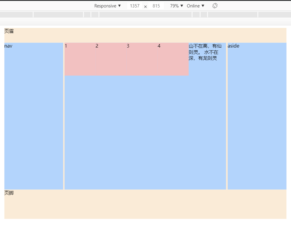
当宽度大于960px的效果图
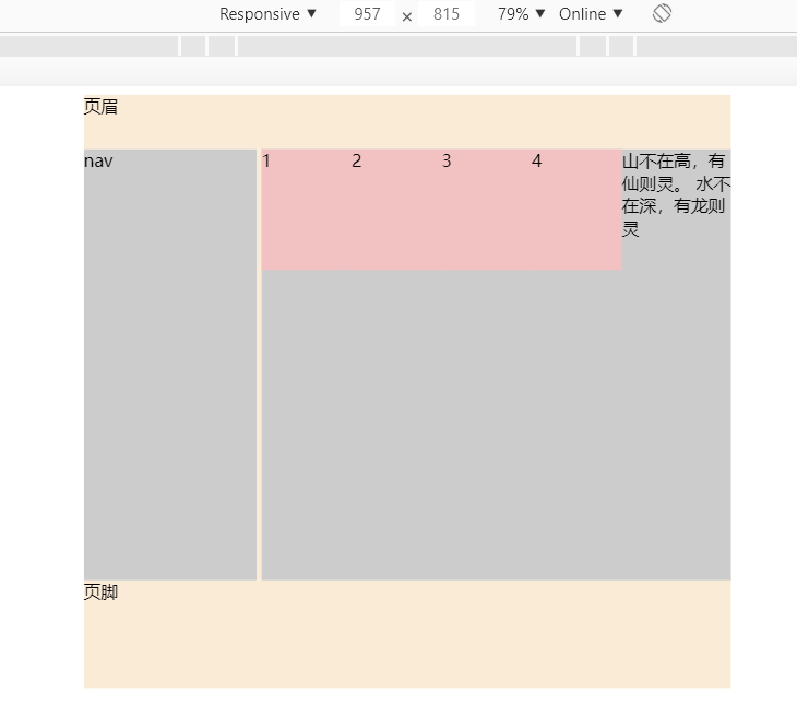
当宽度小于960px但大于600px时的效果图
当宽度小于600px的效果图

不明白的地方可以留言