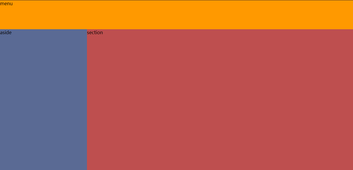
优点:品字形布局,顶部和左侧导航固定,右侧内容随浏览器大小自动调整。
缺点:对低版本浏览器兼容性差,以及其他一些小问题。
<!DOCTYPE html>
<html>
    <head>
        <title>Admin page</title>
        <style type="text/css">
            * {
                padding: 0;
                margin: 0;
             box-sizing: border-box;
            }
            menu{
                height: 100px; /*高度固定,方便后面aside和section的计算*/
                width:100%;
                margin-bottom: -100px; /*通过设置负边距,然后下方元素设置正边距,抵消掉:见.left和.right的margin-top属性*/
                clear:both; /*顶部百分之百宽度*/
                background: #f90;
            }
            aside {
                width: 300px; /*左侧菜单*/
                height: calc(100vh - 100px);
                        /*calc函数用于执行简单加减乘除计算,这里的vh表示当前视口高度,即viewport height,所以vh单位特别适合自适应布局*/
                overflow: hidden; /*左侧不能出现滚动条,多与内容隐藏,一般不会有太多内容*/
                background: #5A6A94;
            }
            section {
                height: calc(100vh - 100px);
                overflow: auto; /*右侧主体内容如果过多,则显示滚动条*/
                background: #BE4F4F;
            }
            .left{
                float: left;
                margin-right: -300px;
                margin-top: 100px;
            }
            .right{
                margin-left: 300px;
                margin-top: 100px;
            }
        </style>
    </head>
    <body>
        <menu class="top">
            menu
        </menu>
        <aside class="left">
            aside
        </aside>
        <section class="right">
            section
        </section>
    </body>
</html>