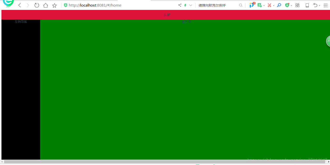
1、上层标签块;
2、左侧菜单块;
2、左侧菜单块;
3、中部内容显示块;
需求:要求上层标签块、左侧菜单快固定不动,滚动条只对中部显示块作用;
<div class="all" style="background: aquamarine;">
  <div class="header" style="background: crimson">
      头部

  </div>
  <div class="con">
    <div class="asilde" style="background: black">
      左侧导航
    </div>
    <div class="main">
      主内容
    </div>
  </div>
</div>
<style>
  .all{
    position: absolute;
    top: 0px;
    bottom: 0px;
    width: 100%;
    height: 100%;
  }
  .header{
    height: 50px;
    line-height: 50px;
  }
  .con .asilde{
    position:absolute;
    top:50px;
    left:0;
    bottom:0;
    width:200px;
    background-color:red;
  }
  .con .main{
    position:absolute;
    top:50px;
    left:200px;
    right:0;
    background-color:green;
    bottom:0;
    /* “bottom:0 与 overflow” 结合使用的效果:当内容超出显示器时,自动添加本区域的滚动条,其他区域保持不变*/
    overflow:auto;
    /*除了上面的方式,还有一种是不定义bottom,也不用overflow,这样内容是多少,中间内容区的行高就是多少,自适应,但是菜单和标题栏就会随着滚轮而动*/
  }
  /*.con{position: relative; width:100%; height:100%;}*/
  /*.asilde,.main{position: absolute;top:0px; bottom:0;height:100%;}*/
  /*.asilde{width:222px;left:0;background:#eee;}*/
  /*.main{left:0;right:0;margin-left:222px; background:#999;width:100%;}*/
</style>
页面显示示例: