文章目录
今天主要总结一下Matplotlib库的基本使用,后期将会补充一些Matplotlib可视化最有价值图表,和一些其他可视化库。
import numpy as np
import pandas as pd
import matplotlib.pyplot as plt
# %matplotlib notebook
%matplotlib inline
基本设置:
| matplotlib图标正常显示中文 | |
|---|---|
| 设置 | 释义 |
| mpl.rcParams[‘font.sans-serif’]=[‘SimHei’] | 用来正常显示中文标签 |
| mpl.rcParams[‘axes.unicode_minus’]=False | 用来正常显示负号 |
| 为了将图片内嵌在交互窗口 | |
| %matplotlib inline | notebook模式下 |
| %pylab inline | ipython模式下 |
1. 基本参数
| 配置项 | 释义 |
|---|---|
| figure | 控制dpi、边界颜色、图形大小、和子区( subplot)设置 |
| grid | 设置网格颜色和线性 |
| legend | 设置图例和其中的文本的显示 |
| line | 设置线条(颜色、线型、宽度等)和标记 |
| xticks和yticks | 为x,y轴的主刻度和次刻度设置颜色、大小、方向,以及标签大小 |
| axex | 设置坐标轴边界和表面的颜色、坐标刻度值大小和网格的显示 |
| backend | 设置目标暑促TkAgg和GTKAgg |
| patch | 是填充2D空间的图形对象,如多边形和圆。控制线宽、颜色和抗锯齿设置等 |
| savefig | 可以对保存的图形进行单独设置。例如,设置渲染的文件的背景为白色 |
| verbose | 设置matplotlib在执行期间信息输出,如silent、helpful、debug和debug-annoying |
| font | 字体集(font family)、字体大小和样式设置 |
2. 颜色、标记和线型
| 标记 | 释义 | 标记 | 释义 |
|---|---|---|---|
| ‘o’ | 圆圈 | ‘.’ | 点 |
| ‘D’ | 菱形 | ‘s’ | 正方形 |
| ‘h’ | 六边形1 | ‘*’ | 星号 |
| ‘H’ | 六边形2 | ‘d’ | 小菱形 |
| ‘_’ | 水平线 | ‘v’ | 一角朝下的三角形 |
| ‘8’ | 八边形 | ‘<’ | 一角朝左的三角形 |
| ‘p’ | 五边形 | ‘>’ | 一角朝右的三角形 |
| ‘,’ | 像素 | ‘^’ | 一角朝上的三角形 |
| ‘+’ | 加号 | ‘’ | 竖线 |
| ‘None’,’’,’ ‘ | 无 | ‘x’ | X |
| 颜色 | 释义 | 线型 | 释义 |
| b | 蓝色 | ‘-’ | 实线 |
| r | 红色 | ‘–’ | 破折线 |
| c | 青色 | ‘-.’ | 点划线 |
| m | 洋红色 | ‘:’ | 虚线 |
| g | 绿色 | null | null |
| y | 黄色 | null | null |
| k | 黑色 | null | null |
| w | 白色 | null | null |
plt.figure()
data = np.random.randn(30).cumsum()
plt.plot(data, 'r--', label='Default')
plt.plot(data, 'g-', drawstyle='steps-post', label='steps-post')
plt.legend(loc='best')

3. Figure和Subplot
matplotlib的图像都位于Figure对象中
| Figure和Subplot | 释义 |
|---|---|
| plt.figure() | |
| plt.figure(1) | 第一张图 |
| plt.figure(2) | 第二张图 |
| plt.figure(n) | 第n张图 |
| plt.subplot() | |
| plt.subplot(nrows , ncols , …) | 分割图形区域 |
| fig=plt.subplot(); ax1=fig.add_subplot(nrows , ncols , x) | 不同区域绘图 |
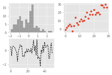
fig = plt.figure()
ax1=fig.add_subplot(2,2,1)
ax2=fig.add_subplot(2,2,2)
ax3=fig.add_subplot(2,2,3)

plt.plot(np.random.randn(50),'k--') # 默认最后一张图绘制
ax1.hist(np.random.randn(100), bins=20, color='k', alpha=0.3)
ax2.scatter(np.arange(30), np.arange(30) + 3 * np.random.randn(30))
4. 刻度、标签和图例
| 刻度、标签和图例 | 释义 |
|---|---|
| plt.axis([xmin, xmax, ymin, ymax]) | |
| xlim(xmin, xmax) | 设置x轴范围 |
| ylim(ymin, ymax) | 设置y轴范围 |
| plt.xlable() / plt.ylable() | X轴标签/Y轴标签 |
| plt.title() | 添加图的题目 |
| plt.text() | 在图中的任意位置添加文字 |
| plt.xticks() / plt.yticks() | 设置轴记号 |
| plt.xticklabels() / plt.yticklabels() | 设置轴标签 |
| plt.annotate() | 在图中的任意位置添加文本注释 |
| plt.axes() | Figure对象中可以包含一个,或者多个Axes对象 每个Axes对象都是一个拥有自己坐标系统的绘图区域 |
| plt.add_patch() | 图形对象 |
| plt.sivefig() | 图片保存为文件 |
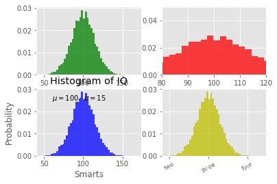
mu, sigma = 100, 15
x = mu + sigma * np.random.randn(10000)

# 原图形
fig = plt.figure()
ax1 = fig.add_subplot(2, 2, 1)
plt.grid(True)
ax1.hist(x, 50, normed=1, facecolor='g', alpha=0.75)

# 设置坐标范围
ax2 = fig.add_subplot(2, 2, 2)
plt.xlim(80, 120)
plt.ylim(0, 0.05)
plt.grid(True)
ax2.hist(x, 50, normed=1, facecolor='r', alpha=0.75)

# 设置轴标签、主题、文字说明
ax3 = fig.add_subplot(2, 2, 3)
plt.xlabel('Smarts')
plt.ylabel('Probability')
plt.title('Histogram of IQ') # 添加标题
plt.text(60, .025, r'$\mu=100,\ \sigma=15$') # 添加文字
plt.grid(True)
ax3.hist(x, 50, normed=1, facecolor='b', alpha=0.75)

# 设置轴记号、图例
ax4 = fig.add_subplot(2, 2, 4)
ax4.set_xticks([0, 50, 100, 150, 200, 250])
ax4.set_xticklabels(['one', 'two', 'three', 'four', 'five','six'],rotation=30, fontsize='small')
ax4.legend(loc='best')
plt.grid(True)
ax4.hist(x, 50, normed=1, facecolor='y', alpha=0.75)
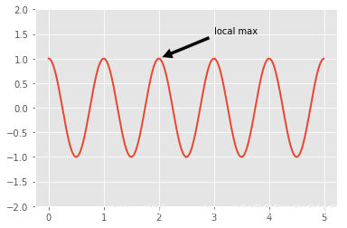
# plt.annotate() 示例
ax = plt.subplot(111)

t = np.arange(0.0, 5.0, 0.01)
s = np.cos(2*np.pi*t)
line, = plt.plot(t, s, lw=2)

plt.annotate('local max', xy=(2, 1), xytext=(3, 1.5),
            arrowprops=dict(facecolor='black', shrink=0.05),
            )

plt.ylim(-2,2)
plt.show()
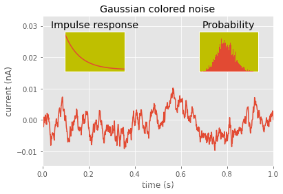
# plt.axes() 示例(参考:http://matplotlib.org/examples/pylab_examples/axes_demo.html)
# 创建一些数据用于绘图
dt = 0.001
t = np.arange(0.0, 10.0, dt)
r = np.exp(-t[:1000]/0.05)               # impulse response
x = np.random.randn(len(t))
s = np.convolve(x, r)[:len(x)]*dt  # colored noise

# 创建主图
plt.plot(t, s)
plt.axis([0, 1, 1.1*np.amin(s), 2*np.amax(s)])
plt.xlabel('time (s)')
plt.ylabel('current (nA)')
plt.title('Gaussian colored noise')

# 插入子图1
a = plt.axes([.65, .6, .2, .2], axisbg='y')
n, bins, patches = plt.hist(s, 400, normed=1)
plt.title('Probability')
plt.xticks([])
plt.yticks([])

# 插入子图2
a = plt.axes([0.2, 0.6, .2, .2], axisbg='y')
plt.plot(t[:len(r)], r)
plt.title('Impulse response')
plt.xlim(0, 0.2)
plt.xticks([])
plt.yticks([])

plt.show()
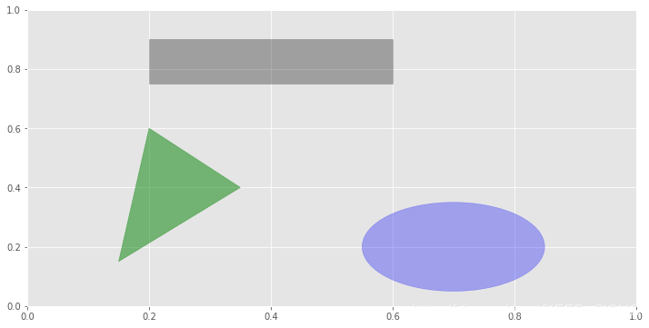
# plt.add_patch()图形对象示例(参考:利用python进行数据分析)
fig = plt.figure(figsize=(12, 6))
ax = fig.add_subplot(1, 1, 1)
rect = plt.Rectangle((0.2, 0.75), 0.4, 0.15, color='k', alpha=0.3)
circ = plt.Circle((0.7, 0.2), 0.15, color='b', alpha=0.3)
pgon = plt.Polygon([[0.15, 0.15], [0.35, 0.4], [0.2, 0.6]],
                   color='g', alpha=0.5)
ax.add_patch(rect)
ax.add_patch(circ)
ax.add_patch(pgon)
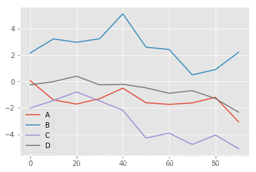
5. Pandas中的绘图函数
5.1 线形图
df = pd.DataFrame(np.random.randn(10, 4).cumsum(0),
                  columns=['A', 'B', 'C', 'D'],
                  index=np.arange(0, 100, 10))
df.plot()
5.2 柱状图
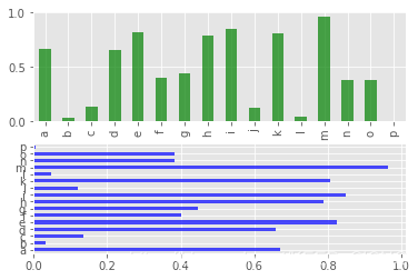
# 常规柱状图
fig, axes = plt.subplots(2, 1)
data = pd.Series(np.random.rand(16), index=list('abcdefghijklmnop'))
data.plot.bar(ax=axes[0], color='g', alpha=0.7)
# data.plot(kind='bar',ax=axes[0], color='g', alpha=0.7)
data.plot.barh(ax=axes[1], color='b', alpha=0.7)
# data.plot(kind='barh',ax=axes[1], color='b', alpha=0.7)
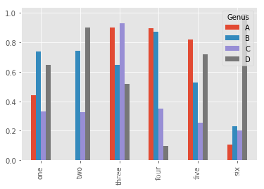
# 分组柱状图
df = pd.DataFrame(np.random.rand(6, 4),
index=['one', 'two', 'three', 'four', 'five', 'six'],
columns=pd.Index(['A', 'B', 'C', 'D'], name='Genus'))
df.plot.bar()
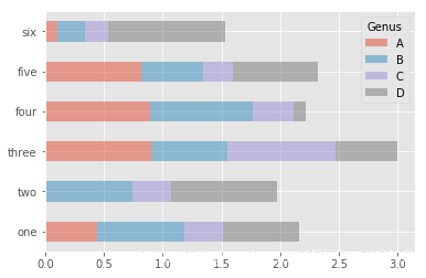
# 堆积柱状图
df.plot.barh(stacked=True, alpha=0.5)
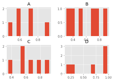
5.3 直方图和密度图
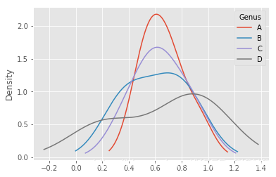
df = pd.DataFrame(np.random.rand(6, 4),
                  index=['one', 'two', 'three', 'four', 'five', 'six'],
                  columns=pd.Index(['A', 'B', 'C', 'D'], name='Genus'))
plt.figure()

df.hist() # 直方图
df.plot(kind='kde') # 密度图
# df.plot.density()
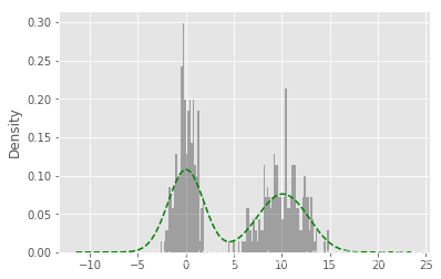
# 直方图与密度图组合
comp1 = np.random.normal(0, 1, size=200)
comp2 = np.random.normal(10, 2, size=200)
values = pd.Series(np.concatenate([comp1, comp2]))
values.hist(bins=100,alpha=0.3, color='k',normed=True)
values.plot(kind='kde', style='g--')
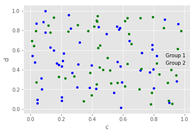
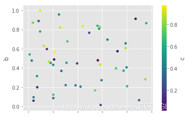
5.4 散点图
df = pd.DataFrame(np.random.rand(50, 4), columns=['a', 'b', 'c', 'd'])
ax = df.plot.scatter(x='a', y='b', color='b', label='Group 1')
df.plot.scatter(x='c', y='d', color='g', label='Group 2', ax=ax)
df.plot.scatter(x='a', y='b', c='c', colormap='viridis')