三、可视化分析
- 各个时间段单车的租赁变化
考虑到在所给的变量中,时间变量比较多,因此首先考虑各个时间段,单车的租赁情况。
首先看看,2011年和2012年,两年中每个月平均使用情况
 1 #首先看一下整体的租赁
 2 fig = plt.subplots(figsize=(15,15))
 3
 4 ax1 = plt.subplot2grid((4,2), (0,0), colspan=2)
 5 df1 = train_2.groupby(['Month', 'Year']).mean().unstack()['count']
 6 #print(df1)
 7 df1.plot(kind='area', ax=ax1, alpha=0.6,fontsize=15)
 8 ax1.set_title('Monthly bicycle usage in 2011-2012',fontsize=15)
 9 ax1.set_xlabel('month',fontsize=15)
10 ax1.legend(loc=0)
11 plt.show()
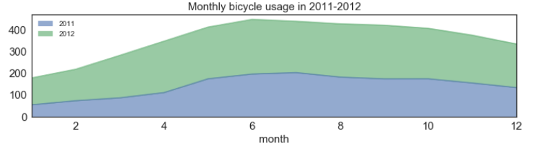
明显能够看到,在2012年,共享单车的使用情况明显好于2011年,我们可以这么认为,共享单车在出现之初,使用量以及普及率没有那么可观,随着共享单车的慢慢普及,租赁情况明显有所上升。同时我们可以看到5-10月的使用情况最好,可能是由于天气温度等原因的影响。
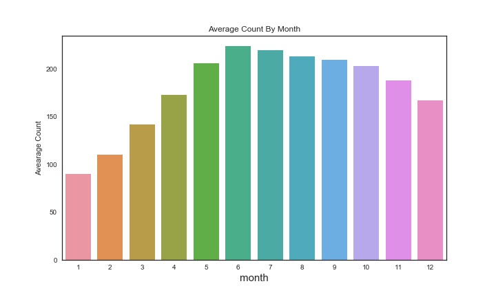
接下来,看看这两年中每个月的平均使用率。
1 #每月平均使用
2 fig,ax2=plt.subplots(figsize=(10,6))
3 th=train_2.groupby('Month')['count'].mean()
4 #print(th)
5 sns.barplot(y=th.values,x=np.arange(1,13),ax=ax2)
6 ax2.set_xlabel('month',size=15)
7 ax2.set_ylabel('Avearage Count')
8 ax2.set_title('Average Count By Month')
9 plt.show()
接下来,以周为时间周期,看看每天各个时间段平均使用量
1 #一周每天的使用情况
2 fig,ax3=plt.subplots(figsize=(10,6))
3 season_week=train_2.groupby(['Hour','Weekday']).mean().unstack()['count']
4 #season_week.columns=['Spring','Summer','Fall','Winter']
5 season_week.columns=['Mon','Tue','Wed','Thu','Fri','Sat','Sun']
6 season_week.plot(ax=ax3,style='-.')
7 plt.show()
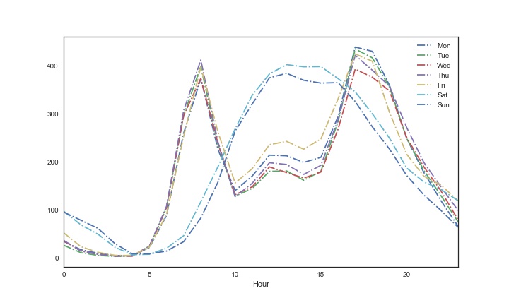
从上图我们可以看出,周一到周五中,一天中早上8-9点和下午5-7点,使用量比较多,可能是早上上班时间和晚上下班时间导致的,同时包含外出吃饭的原因,而对于周末,时间比较集中,基本在11点到下午5点左右使用量比较多,这个时间估计是大家的休闲时间。
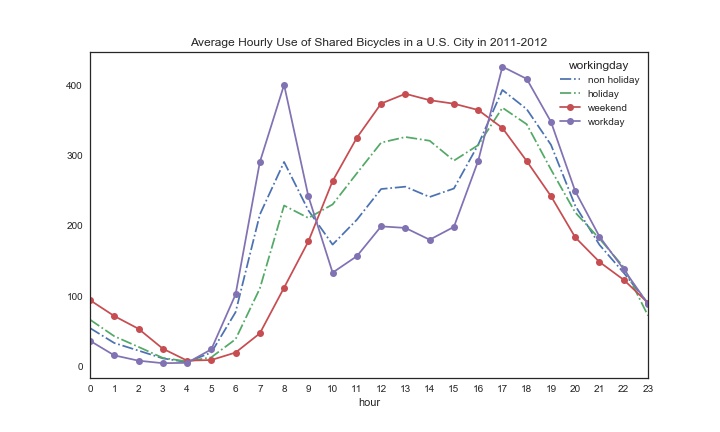
然后,我们看看各个季节,一天中各个时段,单车的使用情况
 1 #每个季节一天平均使用量
 2 fig,ax4=plt.subplots(figsize=(10,6))
 3 season_hour=train_1.groupby(['Hour','season']).mean().unstack()['count']
 4 season_hour.columns=['Spring','Summer','Fall','Winter']
 5 #print(season_hour)
 6 season_hour.plot(ax=ax4, style='--.')
 7 ax4.set_title('Average Hourly Use of Shared Bicycles in a U.S. City in 2011-2012')
 8 ax4.set_xlabel('hour')
 9 ax4.set_xticks(list(range(24)))
10 ax4.set_xticklabels(list(range(24)))
11 ax4.set_xlim(0,23)
12 plt.show()

从上图我们可以看出,春天的使用量明显偏少,可能是温度较低的原因,同时,早上八点和晚上5点左右使用较多,与我们上面分析一样。
最后展示一下在节假日时,单车的使用情况
 1 #接着看看节假日单车使用情况
 2 fig,ax5=plt.subplots(figsize=(10,6))
 3 #ax5 = plt.subplot2grid((4,2), (3,0), colspan=2)
 4 df51 = train_2.groupby(['Hour', 'holiday']).mean().unstack()['count'].rename(columns={0:'non holiday',1:'holiday'})
 5 df52 = train_2.groupby(['Hour', 'workingday']).mean().unstack()['count'].rename(columns={0:'weekend',1:'workday'})
 6 df51.plot(ax=ax5, style='-.')
 7 df52.plot(ax=ax5, style='-o')
 8 ax5.set_title('Average Hourly Use of Shared Bicycles in a U.S. City in 2011-2012')
 9 ax5.set_xlabel('hour')
10 ax5.set_xticks(list(range(24)))
11 ax5.set_xticklabels(list(range(24)))
12 ax5.set_xlim(0,23)
13 plt.savefig('hol.jpg')
14 plt.show()
明显可以看到,周末和工作日,单车的使用主要集中在不同时间,而节假日和非节假日使用时间比较接近,但是节假日使用明显高于非节假日。
- 天气对单车租赁的影响
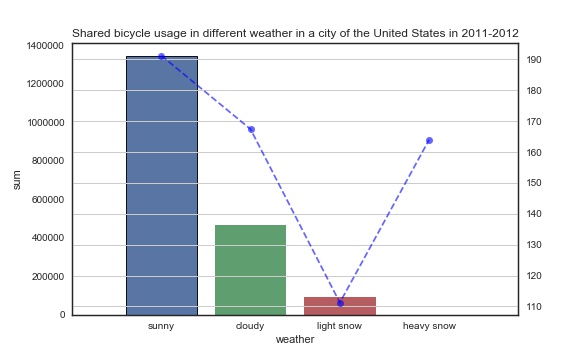
 1 #天气的影响
 2 fig,ax6=plt.subplots(figsize=(8,5))
 3 weather_1=train_2.groupby('weather')['count'].sum()
 4 weather_2=train_2.groupby('weather')['count'].mean()
 5 weather_=pd.concat([weather_1,weather_2],axis=1).reset_index()
 6 weather_.columns = ['weather', 'sum', 'mean']
 7 #weather_['sum'].plot(kind='bar', width=0.6, ax=ax6,color='green')
 8 sns.barplot(x=weather_['weather'],y=weather_['sum'],data=weather_,edgecolor='black',linewidth=0.9)#edgecolor柱形边缘颜色
 9 weather_['mean'].plot(style='b--o', alpha=0.6, ax=ax6,secondary_y=True)
10 plt.grid()
11 plt.xlim(-1,4)
12 ax6.set_xlabel('weather')
13 ax6.set_ylabel('sum')
14 ax6.set_xticks(range(4))
15 ax6.set_xticklabels(['sunny','cloudy','light snow','heavy snow'])
16 ax6.set_title('Shared bicycle usage in different weather in a city of the United States in 2011-2012')
17 plt.show()
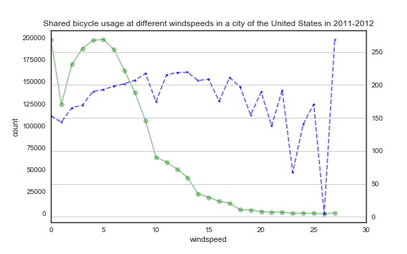
 1 fig,ax7=plt.subplots(figsize=(8,5))
 2 #ax8=ax7.twinx()
 3 wind_1=train_2.groupby('windspeed').sum()['count']
 4 wind_2=train_2.groupby('windspeed').mean()['count']
 5 wind_=pd.concat([wind_1,wind_2],axis=1).reset_index()
 6 wind_.columns = ['windspeed', 'sum', 'mean']
 7 wind_['sum'].plot(style='-o', ax=ax7, alpha=0.4,color='g')
 8 wind_['mean'].plot(style='b--.', alpha=0.6, ax=ax7, secondary_y=True, label='平均值')
 9 ax7.set_label('windspeed')
10 plt.xlim(0,30)
11 plt.grid()
12 ax7.set_xlabel('windspeed')
13 ax7.set_ylabel('count')
14 ax7.set_title('Shared bicycle usage at different windspeeds in a city of the United States in 2011-2012')
15 plt.show()
第一幅图反映出天气状况对租车数量的影响,柱状图是租车总量,天气越好租车总量越多,但天气好的时候多毫无疑问也造成了这个结果。
折线图反映的是平均值,目的就是消除各种天气的天数不同的影响,然而反常的是大雨大雪大雾天气情况下租车数量的平均值居然大幅提升,这一反常现象同样出现在右图中,当风速越高,租车总量趋近于0的时候,平均数反而最高,我们来查看一下原始数据:
1 train_1[train_1['weather']==4]
2 train_1[train_1['windspeed']>50]

通过查阅原始数据,我们发现这种极端天气出现的次数很少,所以导致这种极端情况。
- 温度及湿度对租赁的影响
1 #湿度月平均变化
2 humidity_m= train_2.groupby(['Year','Month']).mean()['humidity']
3 fig,ax8=plt.subplots(figsize=(15,5))
4 humidity_m.plot(marker='o',color='r')
5 plt.grid()
6 plt.legend()
7 ax8.set_title('Change trend of average humidity per day in 2011-2012')
8 plt.savefig('wen.jpg')
9 plt.show()

1 humidity_c = train_1.groupby(['humidity'], as_index=True).agg({'casual':'mean', 'registered':'mean', 'count':'mean'})
2 humidity_c.plot(style='-.',figsize=(15,5),title='Average number of rentals initiated  per hour in different humidity')
3 plt.grid()
4 plt.legend()
5 plt.savefig('wen2.jpg')
6 plt.show()
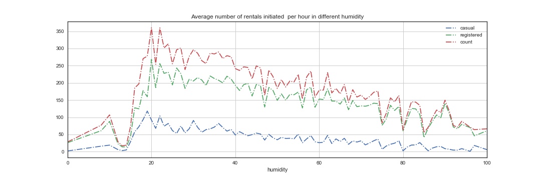
第一张图显示的是一年中湿度的变化,第二张图展示的是不同湿度对租赁的影响,可以看到,在湿度为20的时候,达到租赁最高峰,随着湿度增加,租赁的数量逐渐减小。
接下来,看看温度的影响。
 1 #温度月平均变化
 2 temp_m= train_2.groupby(['Year','Month']).mean()['temp']
 3 temp_m1 = train_2.groupby(['temp'], as_index=True).agg({'casual':'mean', 'registered':'mean', 'count':'mean'})
 4 temp_m.plot(marker='o',color='r',figsize=(15,3))
 5 plt.grid()
 6 plt.legend()
 7 temp_m1.plot(style='-.',figsize=(15,3),title='Average number of rentals initiated  per hour in different temp')
 8 plt.grid()
 9 plt.legend()
10 plt.savefig('wen3.jpg')
11 plt.show()
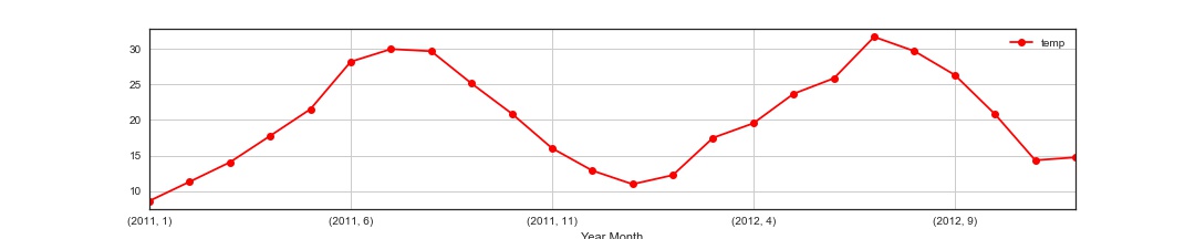
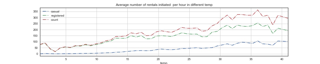
第一张图展示的是各个月份温度的变化,第二张表明在不同温度下,共享单车的租赁数量的变化,可以看到,当温度较低时,租赁较小,随着温度慢慢上升,租赁有所升高,30-38度左右为最好。
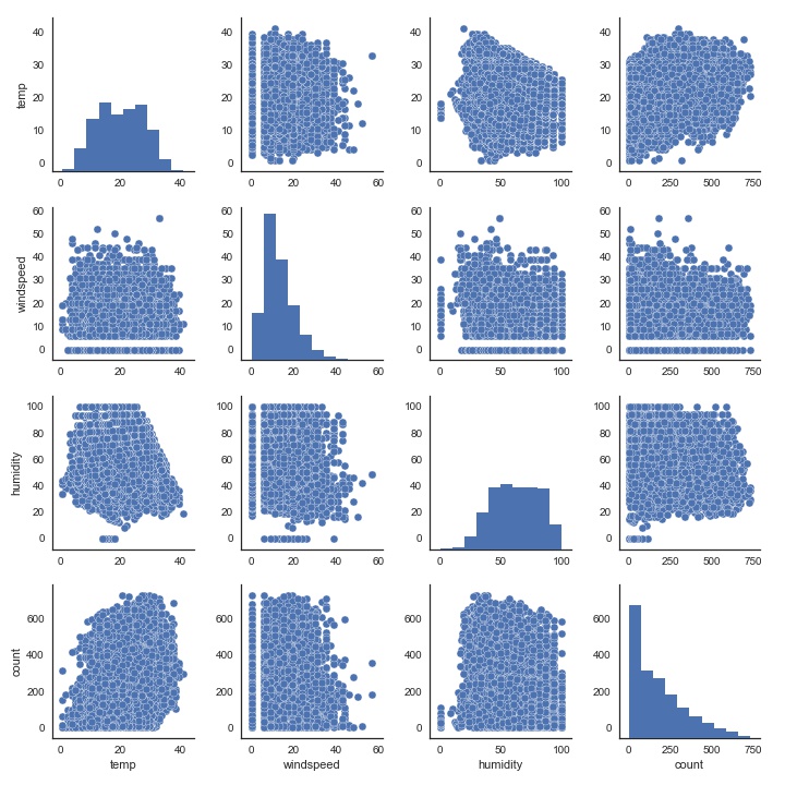
最后我们尝试一下多变量图
1 #多变量
2 sns.pairplot(train_2[['temp','windspeed','humidity','count']])
3 plt.show()