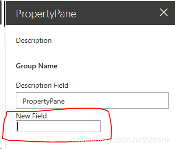
如果SharePoint Framework提供的开箱即用的属性控件无法满足需要怎么办?这个时候我们可以自定义一个属性控件来满足自己的需要。下面通过自定义一个带有标签的文本框作为例子,看一下如何自定义属性控件:
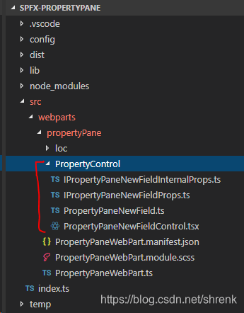
在webpart项目中创建一个文件夹以及四个文件如下:
首先我们定义这个属性控件的属性,就是在“getPropertyPaneConfiguration”添加属性控件时,需要指定的一些属性。
这个控件有一个label,需要用户指定label的文本(例如“New Field”),另外还需要绑定一个方法来处理textbox里文本的改变。
还有一个属性来表示是否禁用这个textbox。
创建文件"IPropertyPaneNewFieldProps.ts",定义如下接口:
export interface IPropertyPaneNewFieldProps {
    label: string;
    onPropertyChange: (propertyPath: string, oldValue: any, newValue: any) => void;
    disabled?: boolean;
}
这里定义了三个属性,一个是label,就是这个文本框的标题,一个是onPropertyChange的方法,在文本更改的时候执行,最后一个是disabled,是否禁用这个文本框。
除了上面自定义的属性之外,每一个自定义的属性控件都需要继承“IPropertyPaneCustomFieldProps"这个接口,才可以在webpart中使用,这个接口定义了例如key,onRender等必须实现的成员。
为了同时使用自定义接口和webpart规定的接口,我们创建文件”IPropertyPaneNewFieldInternalProps.ts",定义如下接口:
import { IPropertyPaneCustomFieldProps } from "@microsoft/sp-webpart-base";
import { IPropertyPaneNewFieldProps } from "./IPropertyPaneNewFieldProps";

export interface IPropertyPaneNewFieldInternalProps extends IPropertyPaneNewFieldProps, IPropertyPaneCustomFieldProps {

}
这个接口很简单,只是继承了我们自定义的属性接口和webpart要求的IPropertyPaneCustomFieldProps接口。
定义好了接口之后,就可以开始实现属性控件的UI和逻辑了,创建“PropertyPaneNewFieldControl.ts"文件,定义PropertyPaneNewFieldControl类如下所示:
import { IPropertyPaneNewFieldInternalProps } from './IPropertyPaneNewFieldInternalProps';
import {
    IPropertyPaneField,
    PropertyPaneFieldType
} from '@microsoft/sp-webpart-base';
import * as React from 'react';
import * as ReactDom from 'react-dom';

export class PropertyPaneNewFieldControl implements IPropertyPaneField<IPropertyPaneNewFieldInternalProps> {
    public type: PropertyPaneFieldType;
    public targetProperty: string;
    public properties: IPropertyPaneNewFieldInternalProps;
    public shouldFocus?: boolean;

    private storedValue: string;

    constructor(targetProperty: string, properties: IPropertyPaneNewFieldInternalProps) {
        this.type = PropertyPaneFieldType.Custom;
        this.targetProperty = targetProperty;
        this.properties = {
            label: properties.label,
            onPropertyChange: properties.onPropertyChange,
            disabled: properties.disabled,
            key: properties.key,
            onRender: this.onRender.bind(this)
        };
        this.storedValue = '';
    }

    private onRender(elem: HTMLElement): void {
        const elements =
                <div>
                    <div><span>{this.properties.label}</span></div>
                    <div><input type='text' onChange={this.onChange.bind(this)} disabled={this.properties.disabled}></input></div>
                </div>;
        ReactDom.render(elements, elem);
    }

    private onChange(e) {
        const newValue = e.target.value;
        const oldValue = this.storedValue;
        this.storedValue = newValue;
        this.properties.onPropertyChange(this.targetProperty, oldValue, newValue);
    }
}每一个自定义的属性控件都要实现IPropertyPaneField这个接口。这个接口有4个成员:
- type: 必需,自定义的控件的类型需要指定为Custom
- targetProperty: 必需,在webpart中定义的属性的名字
- properties: 必需,属性控件的属性,就是我们上面定义的IPropertyPaneNewFieldInternalProps
- shouldFocus: 可选,属性控件是否获得焦点,默认是false
在控件的构造函数中为这几个成员赋值,其中properties中的key和onRender来自于IPropertyPaneCustomFieldProps。
onRender方法是展示控件UI和逻辑的主要方法,使用React dom的render方法将一个react组件加载到页面。作为例子,这里简单地输出label属性,然后添加了一个文本框,用来接收用户的输入。实际上可以自定义一个react组件,完成更加复杂的逻辑。
在文本框上绑定了onChange事件,当文本发生改变的时候,调用属性中的onPropertyChange事件。
以上就是属性控件的定义。最后一步是将这个控件封装一下,只将我们最开始定义的属性接口IPropertyPaneNewFieldProps暴露给用户使用,所以创建“PropertyPaneNewField.ts"文件,定义如下:
import { IPropertyPaneField } from "@microsoft/sp-webpart-base";
import { IPropertyPaneNewFieldProps } from "./IPropertyPaneNewFieldProps";
import { IPropertyPaneNewFieldInternalProps } from "./IPropertyPaneNewFieldInternalProps";
import { PropertyPaneNewFieldControl } from "./PropertyPaneNewFieldControl";
import { Guid } from "@microsoft/sp-core-library";

export function PropertyPaneNewField(targetProperty: string, properties: IPropertyPaneNewFieldProps): IPropertyPaneField<IPropertyPaneNewFieldInternalProps> {

    // Builds the property based on the custom data
    var newProperties: IPropertyPaneNewFieldInternalProps = {
      label: properties.label,
      onPropertyChange: properties.onPropertyChange,
      disabled: properties.disabled,
      onDispose: null,
      onRender: null,
      key: Guid.newGuid().toString()
    };

    // Initialize and render the properties
    return new PropertyPaneNewFieldControl(targetProperty, newProperties);
}
.这个类是最终使用的类,接受两个参数targetProperty和properties,然后根据properties构造IPropertyPaneNewFieldInternalProps接口,补全必须的key和onRender成员,最后返回属性控件PropertyPaneNewFieldControl。
有了这个类,就可以在webpart中使用了,我们只需要指定label, onPropertyChange和disabled这三个属性即可:
//导入属性控件
import { PropertyPaneNewField } from './PropertyControl/PropertyPaneNewField';

//定义customText属性
export interface IPropertyPaneWebPartProps {
  description: string;
  customText: string;
}

export default class PropertyPaneWebPart extends BaseClientSideWebPart<IPropertyPaneWebPartProps> {

  public render(): void {
    //使用this.properties.customText在webpart上显示控件的值
    this.domElement.innerHTML = `
      <div class="${ styles.propertyPane }">
        <div class="${ styles.container }">
          <div class="${ styles.row }">
            <div class="${ styles.column }">
              <span class="${ styles.title }">Welcome to SharePoint!</span>
              <p class="${ styles.subTitle }">Customize SharePoint experiences using Web Parts.</p>
              <p class="${ styles.description }">${escape(this.properties.customText)}</p>
              <a href="https://aka.ms/spfx" class="${ styles.button }">
                <span class="${ styles.label }">Learn more</span>
              </a>
            </div>
          </div>
        </div>
      </div>`;
  }

  protected get dataVersion(): Version {
    return Version.parse('1.0');
  }

//自定义方法,当自定义属性控件值改变的时候执行,更新webpart属性,触发onPropertyPaneFieldChanged方法,最后重新渲染webpart
  private onCustomFieldChange(propertyPath: string, oldValue: string, newValue: string) {
    update(this.properties, propertyPath, (): any => { return newValue; });
    this.onPropertyPaneFieldChanged(propertyPath, oldValue, newValue);
    this.render();
  }

  protected getPropertyPaneConfiguration(): IPropertyPaneConfiguration {
    return {
      pages: [
        {
          header: {
            description: strings.PropertyPaneDescription
          },
          groups: [
            {
              groupName: strings.BasicGroupName,
              groupFields: [
                PropertyPaneTextField('description', {
                  label: strings.DescriptionFieldLabel
                }),
                //指定targetProperty和控件属性
                PropertyPaneNewField('customText', {
                  label: 'New Field',
                  onPropertyChange:this.onCustomFieldChange.bind(this),
                  disabled: false
                })
              ]
            }
          ]
        }
      ]
    };
  }
}以上就是自定义和使用属性控件的示例。如果需要异步操作,可以参考微软官方的示例异步下拉菜单。实际上也是自定义了一个react组件,然后在onRender方法中渲染出来的。
除此之外,微软也开发了很多其他的属性控件,例如人员选择器,颜色选择器等,请参见https://github.com/SharePoint/sp-dev-fx-property-controls