请听题:假设高度已知,请写出三栏布局,其中左栏、右栏宽度各为300px,中间自适应。
稍微有些前端经验的小伙伴可能会马上想出1-2种布局方案,并且觉得这就是送分题啊。其实不然,这算是一道经典的布局题目,如果只答出一种或两种,只能说是不及格;答出三种,差不多及格;说出四种或五种,才算是优秀。那么到底是哪几种呢?
先编写好head部分的代码:
<head>
  <meta charset="UTF-8">
  <meta name="viewport" content="width=device-width, initial-scale=1.0">
  <meta http-equiv="X-UA-Compatible" content="ie=edge">
  <title>Document</title>
  <style>
    html * {
      margin: 0;
      padding: 0;
    }
    .layout{
      margin-top: 40px;
    }
    .layout .left-center-right>div{
      min-height: 100px
    }
  </style>
</head>
具体来看一看,经常接触移动端开发的人首先映入脑海的应该是flexbox。flex布局现在非常流行,直接贴body部分的代码(后续代码均为body部分):
<section class="layout flexbox">
    <style>
      .layout.flexbox{
        margin-top: 140px;
      }
      .layout.flexbox .left-center-right{
        display: flex;
      }
      .layout.flexbox .left-center-right .left{
        width: 300px;
        background: red;
      }
      .layout.flexbox .left-center-right .right{
        width: 300px;
        background: yellow;
      }
      .layout.flexbox .left-center-right .center{
        flex: 1;
        background: green;
      }

    </style>
    <article class="left-center-right">
      <div class="left"></div>
      <div class="center">flex布局</div>
      <div class="right"></div>
    </article>
  </section>
这个比较简单,不过多解释。接下来比较容易想到的是浮动的方法。如下:
  <section class="layout float">
    <style>
      .layout.float .left-center-right {
        height: 100px;
      }
      .layout.float .left-center-right .left {
        width: 300px;
        float: left;
        background: red;
      }
      .layout.float .left-center-right .right {
        width: 300px;
        float: right;
        background: yellow;
      }
      .layout.float .left-center-right .center {
        background: green;
      }
    </style>
    <article class="left-center-right">
      <div class="left"></div>
      <div class="right"></div>
      <div class="center">
        float布局
      </div>
    </article>
  </section>
然后,绝对定位也是一个相对容易的想法。
 <section class="layout absolute">
    <style>
      .layout.absolute .left-center-right>div{
        position: absolute;
      }
      .layout.absolute .left-center-right .left{
        left: 0;
        width: 300px;
        background: red;
      }
      .layout.absolute .left-center-right .right{
        width: 300px;
        right: 0;
        background: yellow;
      }
      .layout.absolute .left-center-right .center{
        left: 300px;
        right: 300px;
        background: green;
      }
    </style>
    <article class="left-center-right">
      <div class="left"></div>
      <div class="center">absolute布局</div>
      <div class="right"></div>
    </article>
  </section>
三种常规方案想出来顺理成章,但是面试官又来了一句神之质问:“你还有别的方案吗?”
闭上眼睛回顾一下传统的布局,突然灵光乍现:table布局不也可以吗?于是挥洒出下面的代码:
<section class="layout table">
    <style>
      .layout.table .left-center-right{
        display: table;
        height: 100px;
        width: 100%;
      }
      .layout.table .left-center-right>div{
        display: table-cell;
      }
      .layout.table .left-center-right .left{
        width: 300px;
        background: red;
      }
      .layout.table .left-center-right .center{
        background: green;
      }
      .layout.table .left-center-right .right{
        width: 300px;
        background: yellow;
      }
    </style>
    <article class="left-center-right">
      <div class="left"></div>
      <div class="center">table布局</div>
      <div class="right"></div>
    </article>
  </section>
总容器display设为table,里面三个部分分别为table-cell,也能完美实现。
忽然之间,你又想起了布局的新起之秀:栅格(grid)布局。如下:
 <section class="layout grid">
    <style>
      .layout.grid .left-center-right{
        display: grid;
        grid-template-columns: 300px auto 300px;
        grid-template-rows: 100px;
      }
      .layout.grid .left-center-right .left{
        background: red;
      }
      .layout.grid .left-center-right .center{
        background: green;
      }
      .layout.grid .left-center-right .right{
        background: yellow;
      }

    </style>
    <article class="left-center-right">
      <div class="left"></div>
      <div class="center">grid布局</div>
      <div class="right"></div>
    </article>
  </section>
其中,grid-template-columns: 300px auto 300px即左右各300px,中间自适应。
grid-template-rows: 100px即把子元素的高度设为100px。
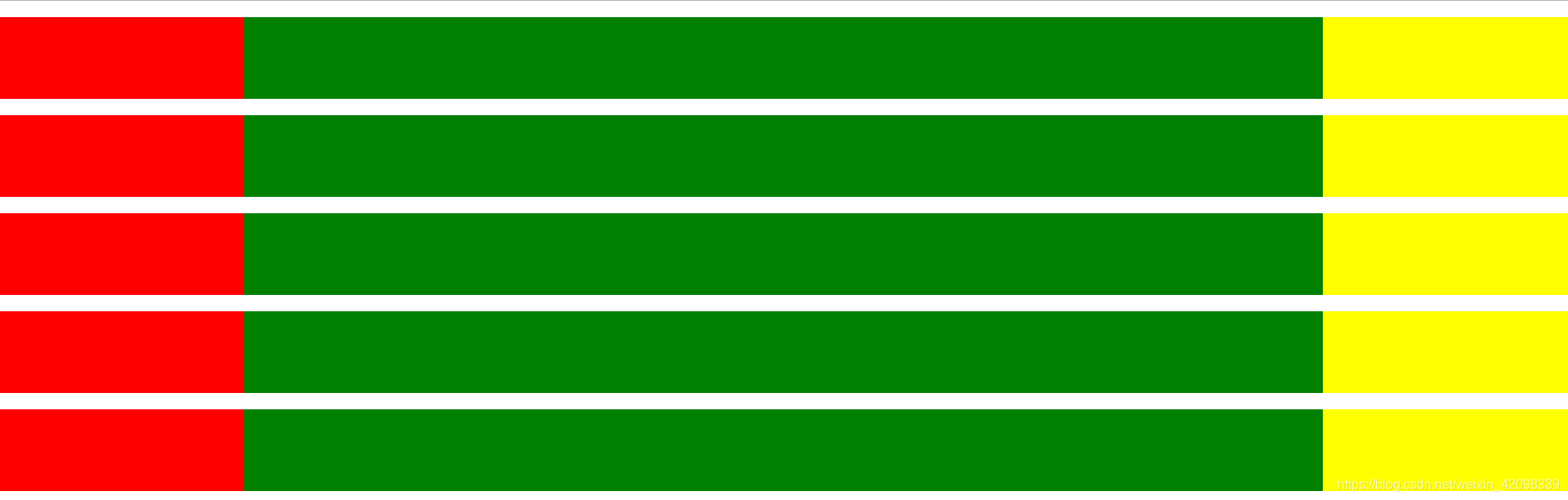
最后是五种布局方式的总体效果:
但是,这道题并没有结束。
一般正规的面试题会有非常多相关的延伸,主要有两个方向:
1.分别谈谈这五种布局方案的优缺点,这些方案你会怎么选择。
2.当中间部分内容比较多的时候,中间内容会撑开,那么我想要两边部分跟着撑开,哪些方案可以用,哪些不能?
梳理一下,上述五种布局方案分别有:float、绝对定位、flexbox、table和grid.
首先说浮动,浮动会脱离文档流,要清除浮动,这是缺点,但是兼容性很好。
对于绝对定位方案,同样脱离文档流。
对于flex布局,它的出现恰恰解决了前两个的问题,操作也很方便,移动端经常用。
接下来说表格布局,优点是兼容性很好,比如说IE8不能兼容flex,可以拿table布局实现,缺点是对于seo并不友好。
网格布局是一个比较新的布局,操作非常方便,代码写起来比较简洁,但是兼容性不好。
综上所述,我更愿意用flex布局,在flex不兼容的浏览器中使用float。
然后看第二个扩展方向,尝试后效果如下:
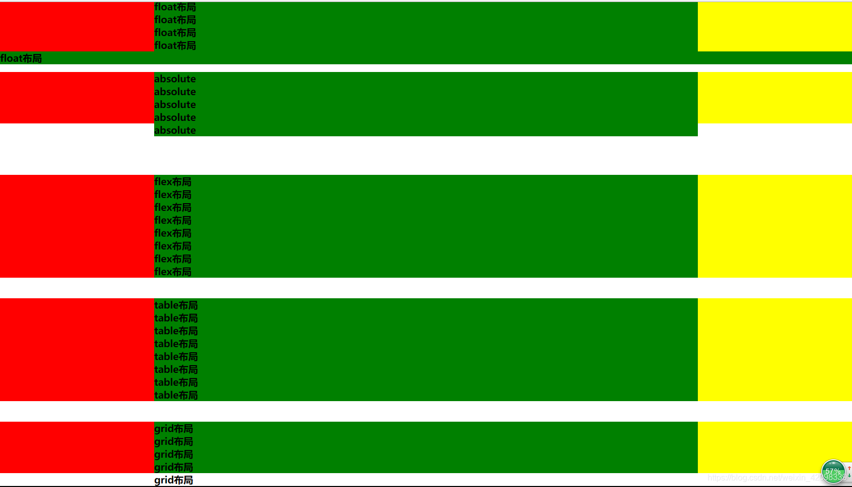
可见,能完美胜任的只有flex布局和table布局。但是你似乎发现了一个比较奇怪的现象,absolute和grid都还好,只是文字溢出去了,比较好理解,但是float是什么鬼?其实很简单,中间部分设定float:left,子元素溢出来的时候会自然跑到父容器最左边,于是就出现了这样的情况。那么问题来了:如何把它摆到中间去呢?
这是一个比较深入的问题。直接对左中右三个盒子均创建一个BFC即可。
这里采用overflow:hidden的方式。
      .layout.float .left-center-right>div {
        overflow: hidden;
      }
效果如下:

BFC不懂的自行百度吧。这部分内容足以再写一篇文章了,也并不是本文的重点。
好,回到那个题目。看似简单几句话,其实可以考察非常多的细节点,非常容易考出一个前端开发者的布局基本功。因此一方面我们不要轻视放过任何一道看似简单的面试题,始终保持敬畏之心,另一方面要把基本概念吃透并且养成总结的好习惯,要能张口就来,以扎实的基本功应对万变的考验形式。