html布局-管理系统布局
如图
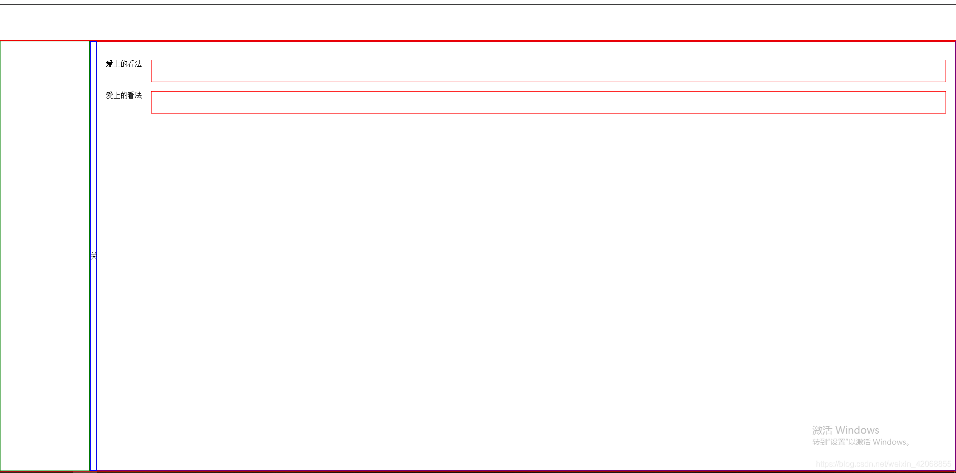
这种头部固定,下边内容,内容区域包括左侧menu和右侧content,中间有开关控制menu的显示隐藏。
<!--html-->
<div class="header"></div>
    <div class="content">
        <div class="leftMenu">
        </div>
        <div class="rightContent">
            <div id="control">关</div>
            <div class="rightContentContent">
                <div class="rowInfomation">
                    <span>爱上的看法</span>
                    <input type="text">
                </div>
                <div class="rowInfomation">
                    <span>爱上的看法</span>
                    <input type="text">
                </div>
            </div>
        </div>
    </div>
    <script src="jquery-3.2.1.min.js"></script>
    <script>
        $('#control').click(function(){
            if($(this).text() == '关'){
              $(this).text('开').parent().siblings('.leftMenu').animate({width:0});
            }else{
              $(this).text('关').parent().siblings('.leftMenu').animate({width:'200px'});
            }
        })
    </script>
/*css*/
*{
  padding:0;
  margin:0;
  box-sizing: border-box;
}
html,body{
  width:100%;
  height:100%;
  overflow-x: hidden;
}
.header{
  width: 100%;
  height:80px;
  border:1px solid black;
}
.content{
  width:100%;
  height:calc(100% - 80px);
  border:1px solid red;
  display: flex;
}
.leftMenu{
  width:200px;
  height:100%;
  border:1px solid green;
  display: flex;
  align-items: center;
}
.rightContent{
  flex:1;
  width:calc(100% - 200px);
  height:100%;
  border:1px solid blue;
  display: flex;
}
.rightContent>#control{
  width:15px;
  height:100%;
  border:1px solid blue;
  display: flex;
  align-items: center;
  cursor: pointer;
}
.rightContentContent{
  flex:1;
  width:calc(100% - 15px);
  height:100%;
  border:1px solid red;
  padding:20px;

}
.rowInfomation{
  width:100%;
  display: flex;
  margin:20px 0;
}
.rowInfomation>span{
  width:100px;
}
.rowInfomation>input{
  flex:1;/*flex:1了就没有必要设width*/
  border:1px solid red;
  width:calc(100% - 100px);
  height:50px;
}
总结:
1、flex布局。容器display:flex;右侧flex;1;
2、calc布局。左侧固定宽度,右侧width:calc(100% - 固定宽度);