显示方式
元素的display显示方式有多种,隐藏、块级、内联、内联-块级
关键字 简介 示例代码
display:none 隐藏
display:block 块级
display:inline 内联
display:inline-block 内联-块级
display:none; 使得被选择的元素隐藏,并且不占用原来的位置
display:block; 表示块级元素
块级元素会自动在前面和后面加上换行,并且在其上的width和height也能够生效
display:inline; 表示内联元素
内联元素前后没有换行,并且在其上的width和height也无效。 其大小由其中的内容决定
内联是不换行,但是不能指定大小
块级时能制定大小,但是会换行
有时候,需要元素处于同一行,同时还能指定大小,这个时候,就需要用到内联-块级 inline-block
<style>
span{
   display:inline-block;
   border: 1px solid lightgray;
   margin:10px;
   width:100px;
}
</style>
像这样 ,每个都能设置宽度 ,同时还能在同一行。
<br>

<span>盖伦</span>
<span>梦多医生</span>
<span>奈德丽</span>
<span>蒸汽机器人</span>
水平居中
内容居中
两种方式
<style>
div{
  border:1px solid lightgray;
  margin:10px;
}
</style>
<div align="center">
通过设置属性align="center" 居中的内容
</div>

<div  style="text-align:center">
通过样式style="text-align:center" 居中的内容
</div>
元素居中
<style>
  div{
     border: solid 1px lightgray;
     margin: 10px;
  }
  span{
     border: solid 1px lightskyblue;
  }
</style>
<div> 默认情况下div会占用100%的宽度,所以无法观察元素是否居中</div>

<div style="width:300px;margin:0 auto">
  设置本div的宽度,然后再使用样式 margin: 0 auto来使得元素居中</div>

<span style="width:300px;margin:0 auto">
  span 是内联元素,无法设置宽度,所以不能通过margin:0 auto居中</span>

<div style="text-align:center">
  <span>span的居中可以通过放置在div中,然后让div text-align实现居中</span>
</div>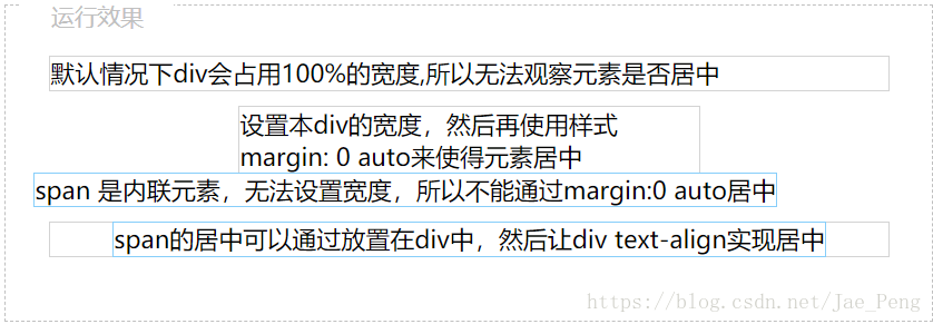
左侧固定
float:left;固定在左侧
overflow:hidden; 内容溢出隐藏
<style>
 .left{
   width:200px;
   float:left;
   background-color:pink
  }
  .right{
    overflow:hidden;
    background-color:lightskyblue;
  }
</style>

<div class="left">左边固定宽度</div>

<div class="right">右边自动填满</div>
垂直居中
line-height 适合单独一行垂直居中
100px为上下的距离
<style>
#d {
line-height: 100px;
}
div{
  border:solid 1px lightskyblue;
}
</style>

<div id="d">line-height 适合单独一行垂直居中</div>
方法二
<style>
#d {
    padding: 30 0;
}
div{
    border:solid 1px lightskyblue;
}
</style>

<div id="d">多行内容 多行内容 多行内容 多行内容 多行内容 多行内容 多行内容 多行内容 多行内容 多行内容 多行内容 多行内容 多行内容 多行内容 多行内容 多行内容 多行内容 多行内容 多行内容 多行内容 多行内容 多行内容 多行内容 多行内容 多行内容 多行内容 多行内容 多行内容 多行内容 多行内容 多行内容 多行内容 多行内容 多行内容 多行内容 多行内容 多行内容 多行内容 多行内容 多行内容  </div>
如果想要在div中居中图片,使用table方式
首先通过display: table-cell;显示为表, 把div用单元格的形式显示,然后借用单元格的垂直居中vertical-align: middle; 来达到效果。
这样对图片也可以居中,上一步 line-height就不能对图片居中。
<style>
#d {
display: table-cell;
vertical-align: middle;
height:200px;
}

div{
  border:solid 1px lightskyblue;
}
</style>

<div id="d">
<img src="http://how2j.cn/example.gif">
</div>
左右固定,中间自适应
float:left;
float:right;
<style>
 .left{
   width:200px;
   float:left;
   background-color:pink
  }
  .right{
   width:200px;
   float:right;
   background-color:pink
  }
  .center {margin:0 200px;   background-color:lightblue}
</style>

<div class="left">左边固定宽度</div>
<div class="right">左边固定宽度</div>
 <div class="center">中间自适应</div>

</head>

<body>

</html>
贴在下方
首先把蓝色div设置为相对定位
然后把内部的绿色div设置为绝对定位, bottom: 0表示贴在下面
<style>
#div1
        {
            position: relative;
            height: 300px;
            width: 90%;
            background-color: skyblue;
        }
   #div2
        {
            position: absolute;
            bottom: 0;
            height: 30px;
            width: 100%;
            background-color: lightgreen;
        }
    </style>

<div id="div1">
    <div id="div2"> 无论蓝色div高度如何变化,绿色div都会贴在下面
    </div>
</div>
块之间的空格
如果多个span连续编写,像这样:
<span>连续的span</span><span>连续的span</span>是不会有空格的
但是真正开发代码的时候,一般不会连续书写span,而是不同的span之间有回车换行,比如这样:
<span>有换行的span</span>
<span>有换行的span</span>
<span>有换行的span</span>而这样编写代码,就会导致之间出现空格
可以用float取消掉回车span的换行
使用float来解决。
float使用完毕之后,记得在下面加上
<style>
div.nocontinue span{
border-bottom:2px solid lightgray;
  float:left;
}
</style>

<div class="nocontinue">
<span>有换行的span</span>
<span>有换行的span</span>
<span>有换行的span</span>
</div>

<div style="clear:both"></div>

<div>后续的内容</div>