Wpf常见的5种布局
栈面板(StackPanel)
栈面板可以将元素排列成一行或者一列,它的特点是:每个元素各占一行或者一列,
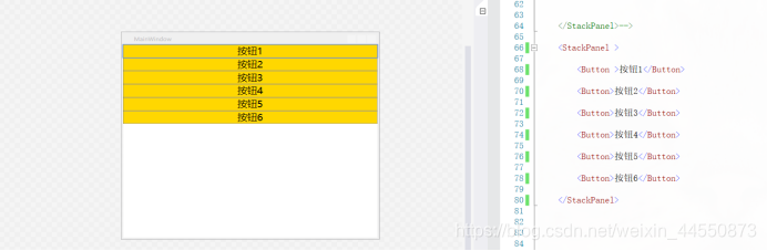
当设置Orientation="Vertical"时,按钮按垂直方向排列显示,默认值也是Orientation=“Vertical”
代码:
<Window x:Class="Wpf.MainWindow"
        xmlns="http://schemas.microsoft.com/winfx/2006/xaml/presentation"
        xmlns:x="http://schemas.microsoft.com/winfx/2006/xaml"
        xmlns:d="http://schemas.microsoft.com/expression/blend/2008"
        xmlns:mc="http://schemas.openxmlformats.org/markup-compatibility/2006"
        xmlns:local="clr-namespace:Wpf"
        mc:Ignorable="d"
        Title="MainWindow" Height="450" Width="525">
    <Window.Resources>
        <!--依赖属性 本页面用的样式-->
        <Style TargetType="Button">
            <Setter Property="Background" Value="Gold"></Sette
            <Setter Property="Foreground" Value="Black"></Setter
            <Setter Property="FontSize" Value="20"></Setter>
        </Style>
    </Window.Resources>
    <StackPanel >
        <Button>按钮1</Button>

        <Button>按钮2</Button>

        <Button >按钮3</Button>

        <Button>按钮4</Button>
    </StackPanel>

   <Window>
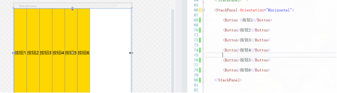
当设置 Orientation="Horizontal"时,按钮按水平方向排列显示,当把StackPanel的FlowDirection属性设置为RightToLeft,Orientation属性设置为Horizontal,StackPanel将从右向左排列元素
<Window x:Class="Wpf.MainWindow"
        xmlns="http://schemas.microsoft.com/winfx/2006/xaml/presentation"
        xmlns:x="http://schemas.microsoft.com/winfx/2006/xaml"
        xmlns:d="http://schemas.microsoft.com/expression/blend/2008"
        xmlns:mc="http://schemas.openxmlformats.org/markup-compatibility/2006"
        xmlns:local="clr-namespace:Wpf"
        mc:Ignorable="d"
        Title="MainWindow" Height="450" Width="525">
    <Window.Resources>
        <!--依赖属性 本页面用的样式-->
        <Style TargetType="Button">
            <Setter Property="Background" Value="Gold"></Sette
            <Setter Property="Foreground" Value="Black"></Setter
            <Setter Property="FontSize" Value="20"></Setter>
        </Style>
    </Window.Resources>
    <StackPanel   Orientation="Horizontal">
        <Button>按钮1</Button>

        <Button>按钮2</Button>

        <Button >按钮3</Button>

        <Button>按钮4</Button>
    </StackPanel>

   <Window>
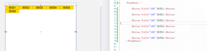
WrapPanel(环绕面板)
环绕面板将各个控件从左至右按照行或列的顺序罗列,当长度或高度不够时就会自动调整进行换行,后续排序按照从上至下或从右至左的顺序进行。
当Orientation属性的值设置为 Horizontal:元素是从左向右排列的,然后自上至下自动换行(默认值为是Orientation=“Horizontal”)
代码:
<Window x:Class="Wpf.MainWindow"
        xmlns="http://schemas.microsoft.com/winfx/2006/xaml/presentation"
        xmlns:x="http://schemas.microsoft.com/winfx/2006/xaml"
        xmlns:d="http://schemas.microsoft.com/expression/blend/2008"
        xmlns:mc="http://schemas.openxmlformats.org/markup-compatibility/2006"
        xmlns:local="clr-namespace:Wpf"
        mc:Ignorable="d"
        Title="MainWindow" Height="450" Width="525">
    <Window.Resources>
        <!--依赖属性 本页面用的样式-->
        <Style TargetType="Button">
            <Setter Property="Background" Value="Gold"></Sette
            <Setter Property="Foreground" Value="Black"></Setter
            <Setter Property="FontSize" Value="20"></Setter>
        </Style>
    </Window.Resources>
  <WrapPanel  >
        <Button Width="100">按钮1</Button>

        <Button Width="100">按钮2</Button>

        <Button  Width="100">按钮3</Button>

        <Button  Width="100">按钮4</Button>

        <Button  Width="100">按钮5</Button>

        <Button  Width="100">按钮6</Button>
   </WrapPanel>

   <Window>
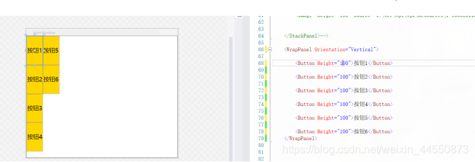
当Orientation属性的值设置为Vertical:元素是从上向下排列的,然后从左至右自动换行
代码:
<Window x:Class="Wpf.MainWindow"
        xmlns="http://schemas.microsoft.com/winfx/2006/xaml/presentation"
        xmlns:x="http://schemas.microsoft.com/winfx/2006/xaml"
        xmlns:d="http://schemas.microsoft.com/expression/blend/2008"
        xmlns:mc="http://schemas.openxmlformats.org/markup-compatibility/2006"
        xmlns:local="clr-namespace:Wpf"
        mc:Ignorable="d"
        Title="MainWindow" Height="450" Width="525">
    <Window.Resources>
        <!--依赖属性 本页面用的样式-->
        <Style TargetType="Button">
            <Setter Property="Background" Value="Gold"></Sette
            <Setter Property="Foreground" Value="Black"></Setter
            <Setter Property="FontSize" Value="20"></Setter>
        </Style>
    </Window.Resources>
 <WrapPanel  Orientation="Vertical">
        <Button Height="100">按钮1</Button>

        <Button Height="100">按钮2</Button>

        <Button  Height="100">按钮3</Button>

        <Button  Height="100">按钮4</Button>

        <Button  Height="100">按钮5</Button>

        <Button  Height="100">按钮6</Button>
    </WrapPanel>

   <Window>
DockPanel(停靠面板)
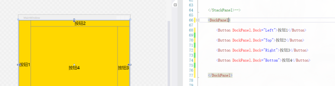
DockPanel对每个子元素进行排序,并将根据指定的边进行停靠,如果多个停靠在同侧的元素则按顺序排序
由图可以看到,按钮的停靠的顺序左,上,右,下。是先左停靠后,是在剩下的区域再上停靠,以此类推,剩下的也是这样停靠。
注意:无论对DockPanel的最后一个子元素设置任何停靠值,该子元素都将始终填满剩余的空间
代码:
<Window x:Class="Wpf.MainWindow"
        xmlns="http://schemas.microsoft.com/winfx/2006/xaml/presentation"
        xmlns:x="http://schemas.microsoft.com/winfx/2006/xaml"
        xmlns:d="http://schemas.microsoft.com/expression/blend/2008"
        xmlns:mc="http://schemas.openxmlformats.org/markup-compatibility/2006"
        xmlns:local="clr-namespace:Wpf"
        mc:Ignorable="d"
        Title="MainWindow" Height="450" Width="525">
    <Window.Resources>
        <!--依赖属性 本页面用的样式-->
        <Style TargetType="Button">
            <Setter Property="Background" Value="Gold"></Sette
            <Setter Property="Foreground" Value="Black"></Setter
            <Setter Property="FontSize" Value="20"></Setter>
        </Style>
    </Window.Resources>
 <DockPanel>
        <Button DockPanel.Dock="Left">按钮1</Button>

        <Button DockPanel.Dock="Top">按钮2</Button>

        <Button DockPanel.Dock="Right">按钮3</Button>

        <Button DockPanel.Dock="Top">按钮4</Button>
    </DockPanel>

   <Window>
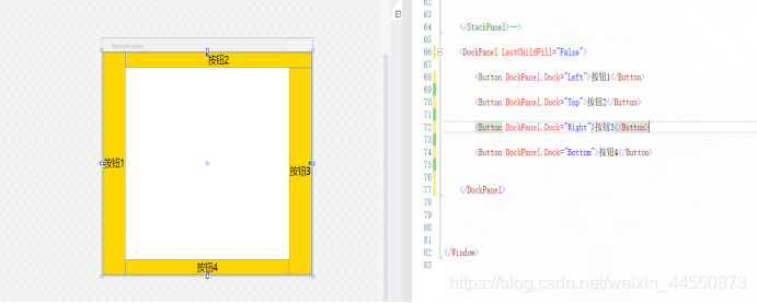
如果不想最后那个停靠会填满剩余的区域,就把DockPanel属性LastChildFill设置为false,还必须为最后一个子元素显式指定停靠方向
代码:
<Window x:Class="Wpf.MainWindow"
        xmlns="http://schemas.microsoft.com/winfx/2006/xaml/presentation"
        xmlns:x="http://schemas.microsoft.com/winfx/2006/xaml"
        xmlns:d="http://schemas.microsoft.com/expression/blend/2008"
        xmlns:mc="http://schemas.openxmlformats.org/markup-compatibility/2006"
        xmlns:local="clr-namespace:Wpf"
        mc:Ignorable="d"
        Title="MainWindow" Height="450" Width="525">
    <Window.Resources>
        <!--依赖属性 本页面用的样式-->
        <Style TargetType="Button">
            <Setter Property="Background" Value="Gold"></Sette
            <Setter Property="Foreground" Value="Black"></Setter
            <Setter Property="FontSize" Value="20"></Setter>
        </Style>
    </Window.Resources>
 <DockPanel  LastChildFill="False">
        <Button DockPanel.Dock="Left">按钮1</Button>

        <Button DockPanel.Dock="Top">按钮2</Button>

        <Button DockPanel.Dock="Right">按钮3</Button>

        <Button DockPanel.Dock="Top">按钮4</Button>
    </DockPanel>

   <Window>
Canvas(画布面板)
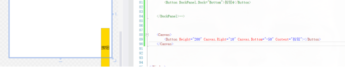
画布,用于完全控制每个元素的精确位置。他是布局控件中最为简单的一种,直接将元素放到指定位置,主要来布置图面。使用Canvas,必须指定一个子元素的位置(相对于画布),否则所有元素都将出现在画布的左上角。
Canvas允许子元素的部分或全部超过其边界,默认不会裁剪子元素,同时可以使用负标,即溢出的内容会显示在Canvas外面
1.子元素超出边界
代码:
<Window x:Class="Wpf.MainWindow"
        xmlns="http://schemas.microsoft.com/winfx/2006/xaml/presentation"
        xmlns:x="http://schemas.microsoft.com/winfx/2006/xaml"
        xmlns:d="http://schemas.microsoft.com/expression/blend/2008"
        xmlns:mc="http://schemas.openxmlformats.org/markup-compatibility/2006"
        xmlns:local="clr-namespace:Wpf"
        mc:Ignorable="d"
        Title="MainWindow" Height="450" Width="525">
    <Window.Resources>
        <!--依赖属性 本页面用的样式-->
        <Style TargetType="Button">
            <Setter Property="Background" Value="Gold"></Sette
            <Setter Property="Foreground" Value="Black"></Setter
            <Setter Property="FontSize" Value="20"></Setter>
        </Style>
    </Window.Resources>
  <Canvas >
        <Button Canvas.Left="415" Canvas.Bottom="-80" Height="227">按钮1</Button>
    </Canvas>
   <Window>
2.元素不超出边界
如果不想子元素超出边界,那就把ClipToBounds属性设为true
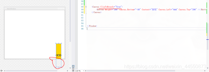
代码:
<Window x:Class="Wpf.MainWindow"
        xmlns="http://schemas.microsoft.com/winfx/2006/xaml/presentation"
        xmlns:x="http://schemas.microsoft.com/winfx/2006/xaml"
        xmlns:d="http://schemas.microsoft.com/expression/blend/2008"
        xmlns:mc="http://schemas.openxmlformats.org/markup-compatibility/2006"
        xmlns:local="clr-namespace:Wpf"
        mc:Ignorable="d"
        Title="MainWindow" Height="450" Width="525">
    <Window.Resources>
        <!--依赖属性 本页面用的样式-->
        <Style TargetType="Button">
            <Setter Property="Background" Value="Gold"></Sette
            <Setter Property="Foreground" Value="Black"></Setter
            <Setter Property="FontSize" Value="20"></Setter>
        </Style>
    </Window.Resources>
  <Canvas  ClipToBounds="True">
        <Button Canvas.Left="415" Canvas.Bottom="-80" Height="227">按钮1</Button>
    </Canvas>
   <Window>
Grid(网格面板)
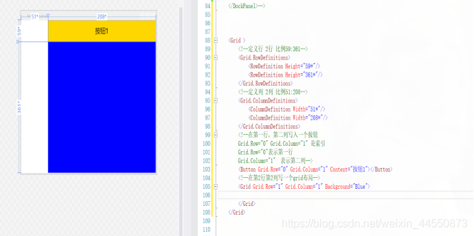
Grid以表格形式布局元素,对于整个面板上的元素进行布局,它的子控件被放在一个一个事先定义好的小格子里面,整齐配列。要使用Grid,首先要向RowDefinitions和ColumnDefinitions属性中添加一定数量的RowDefinitions和 ColumnDefinitions元素,从而定义行数和列数。而放置在Grid面板中的控件元素都必须显示采用Row和Column附加属性定义其放置所在的行和列,这两个属性的值都是从0开始的索引数,如果没有显式设置任何行或列,Grid将会隐式地将控件加入在第0行第0列。 列宽和行高,分别可以在ColumnDefinition、RowDefinition里面指定Width、Height的值。
代码:
<Window x:Class="Wpf.MainWindow"
        xmlns="http://schemas.microsoft.com/winfx/2006/xaml/presentation"
        xmlns:x="http://schemas.microsoft.com/winfx/2006/xaml"
        xmlns:d="http://schemas.microsoft.com/expression/blend/2008"
        xmlns:mc="http://schemas.openxmlformats.org/markup-compatibility/2006"
        xmlns:local="clr-namespace:Wpf"
        mc:Ignorable="d"
        Title="MainWindow" Height="450" Width="525">
    <Window.Resources>
        <!--依赖属性 本页面用的样式-->
        <Style TargetType="Button">
            <Setter Property="Background" Value="Gold"></Setter>
            <Setter Property="Foreground" Value="Black"></Setter>
            <Setter Property="FontSize" Value="20"></Setter>
        </Style>
    </Window.Resources>
    <Grid >
        <!--定义行 2行 比例59:361-->
        <Grid.RowDefinitions>
            <RowDefinition Height="59*"/>
            <RowDefinition Height="361*"/>
        </Grid.RowDefinitions>
        <!--定义列 2列 比例51:208-->
        <Grid.ColumnDefinitions>
            <ColumnDefinition Width="51*"/>
            <ColumnDefinition Width="208*"/>
        </Grid.ColumnDefinitions>
        <!--在第一行,第二列写入一个按钮
        Grid.Row="0" Grid.Column="1" 是索引
        Grid.Row="0"表示第一行
        Grid.Column="1"  表示第二列-->
        <Button Grid.Row="0" Grid.Column="0" Content="按钮1" ></Button>
        <Grid Grid.Column="1" Grid.Row="1" Background="Red">
        </Grid>
    </Grid>
</Window>
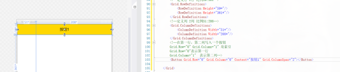
而如果想要占多行或者多列,就用 Grid.ColumnSpan 和Grid.RowSpan ,表示跨行和列
如:
代码:
<Window x:Class="Wpf.MainWindow"
        xmlns="http://schemas.microsoft.com/winfx/2006/xaml/presentation"
        xmlns:x="http://schemas.microsoft.com/winfx/2006/xaml"
        xmlns:d="http://schemas.microsoft.com/expression/blend/2008"
        xmlns:mc="http://schemas.openxmlformats.org/markup-compatibility/2006"
        xmlns:local="clr-namespace:Wpf"
        mc:Ignorable="d"
        Title="MainWindow" Height="450" Width="525">
    <Window.Resources>
        <!--依赖属性 本页面用的样式-->
        <Style TargetType="Button">
            <Setter Property="Background" Value="Gold"></Setter>
            <Setter Property="Foreground" Value="Black"></Setter>
            <Setter Property="FontSize" Value="20"></Setter>
        </Style>
    </Window.Resources>
    <Grid >
        <!--定义行 2行 比例59:361-->
        <Grid.RowDefinitions>
            <RowDefinition Height="59*"/>
            <RowDefinition Height="361*"/>
        </Grid.RowDefinitions>
        <!--定义列 2列 比例51:208-->
        <Grid.ColumnDefinitions>
            <ColumnDefinition Width="51*"/>
            <ColumnDefinition Width="208*"/>
        </Grid.ColumnDefinitions>
        <!--在第一行,第二列写入一个按钮
        Grid.Row="0" Grid.Column="1" 是索引
        Grid.Row="0"表示第一行
        Grid.Column="1"  表示第二列-->
        <Button Grid.Row="0" Grid.Column="1" Content="按钮1" ></Button>
    </Grid>
</Window>
上图表示占了2行。
注意:如果不知道Grid.Row属性,Grid面板会假定该属性的值为0。对于Grid.Column属性也是如此。因此,在Grid面板的第一个单元格中放置元素时可不指定这两个属性值。
设置ColumnDefinition对象的Width属性或者RowDefinition对象的Height属性的方式有3种
(1)设置100设备无关单位的绝对宽度:
(2)使用自动尺寸设置方式,需要使用Auto值
(3)使用按比例尺寸设置方式,需要使用星号(*)
如果希望不均匀的分割剩余空间,可指定权重,权重必须放在星号之前。例如,如果有两行是按比例设置尺寸,并希望第一行的高度是第二行高度的一半,那么可以使用如下设置来分配剩余空间: