为什么要实现响应式布局?
目的:为了网页能够兼容不同的终端
参考各种手机型号的分辨率
http://screensiz.es/phone 是一个前端开发者必备的一个网站,上面列出了市面上大部分常见机型的分辨率大小。
实现方法:
1.设置meta标签,禁止用户缩放
使用 viewport meta 标签在手机浏览器上控制布局,user-scalable属性能够解决ipad切换横屏之后触摸才能回到具体尺寸的问题。
<meta name="viewport" content="width=device-width,initial-scale=1,maximum-scale=1" user-scalable=no" />

通过快捷方式打开时全屏显示
<meta name="apple-mobile-web-app-capable" content="yes" />

隐藏状态栏
<meta name="apple-mobile-web-app-status-bar-style" content="blank" />

iPhone会将看起来像电话号码的数字添加电话连接,应当关闭
<meta name="format-detection" content="telephone=no" />

<meta http-equiv="X-UA-Compatible" content="IE=edge,chrome=1">
<meta name="HandheldFriendly" content="true">
2.通过媒介查询来设置样式Media Queries
Media Queries 是响应式设计的核心
它根据条件告诉浏览器如何为指定视图宽度渲染页面。假定一个终端的分辨率<980px,可以这样写:
直接在css文件上使用
@media screen and (max-width:980px) {
    #head {...}
    #content{ ... }
    #footer {...}
}
或者
<style media="screen and (min-width:340px) and (max-width:720px)">
body{
background:rgb(16,136,65);
}
</style>

或者导入外文件
<link rel = "stylesheet" href = " " meida ="screen and (min-width:340px) and (max-width:720px)">
3.设置多种视图宽度
假设要兼容ipad和iphone视图,我们可以这样设置:
/**ipad**/
@media only screen and (min-width:768px)and(max-width:1024px){}
/**iphone**/
 @media only screen and (width:320px)and (width:768px){}
4.设置字体
rem是相对于根元素的,之前先重置根元素的大小
html{font-size:100%;}
完成后,你可以定义响应式字体:
@media (min-width:640px){body{font-size:1rem;}}
@media (min-width:960px){body{font-size:1.2rem;}}
@media (min-width:1200px){body{font-size:1.5rem;}}
5.宽度不固定,使用百分比
#head{width:100%;}
#content{width:50%;}
6.图片处理
 #wrap img{
        max-width:100%;
        height:auto;
    }
    如此设置后ID为wrap内的图片会根据wrap的宽度改变已达到等宽扩充,height为auto的设置是为了保证图片原始的高宽比例,以至于图片不会失真。
设置背景图
 #log a{display:block;
            width:100%;
            height:40px;
            text-indent:55rem;//缩进
            background-img:url(logo.png);
            background-repeat:no-repeat;
            background-size:100% 100%;
            }
    background-size是css3的新属性,用于设置背景图片的大小,有两个可选值,第一个值用于指定背景图的width,第2个值用于指定背景图的height,如果只指定一个值,那么另一个值默认为auto。
    background-size:cover; 等比扩展图片来填满元素
    background-size:contain; 等比缩小图片来适应元素的尺寸
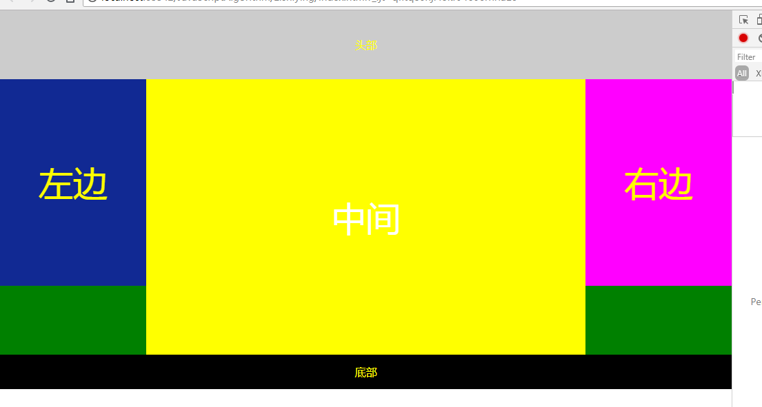
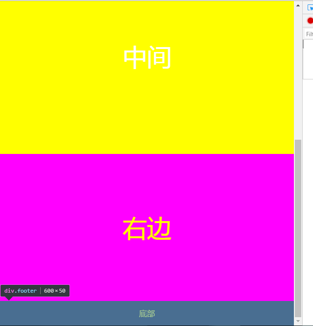
举个例子
// index.html
<!DOCTYPE html>
<html lang="en">
<head>
    <meta charset="UTF-8">
    <title>Title</title>
    <link rel="stylesheet" type="text/css" href="index.css"/>
    <link rel="stylesheet" type="text/css" href="index01.css" media="screen and (max-width:1024px) and (min-width:720px)"/>
    <link rel="stylesheet" type="text/css" href="index02.css" media="screen and (max-width:720px)"/>
</head>
<body>
<div class="header">头部</div>
<div class="main clearfix">
    <div class="left">左边</div>
    <div class="center">中间</div>
    <div class="right">右边</div>
</div>
<div class="footer">底部</div>
</body>
</html>
// index.css
*{
    margin:0;
    padding:0;
    text-align:center;
    color:yellow;
}

.header{
    width:100%;
    height:100px;
    background:#ccc;
    line-height:100px;
}
.main{
    background:green;
    width:100%;
}
.clearfix:after{
    display:block;
    height:0;
    content:"";
    visibility:hidden;
    clear:both;
}
.left,.center,.right{
    float:left;
}
.left{
    width:20%;
    background:#112993;
    height:300px;
    font-size:50px;
    line-height:300px;
}
.center{
    width:60%;
    background:#ff0;
    height:400px;
    color:#fff;
    font-size:50px;
    line-height:400px;
}
.right{
    width:20%;
    background:#f0f;
    height:300px;
    font-size:50px;
    line-height:300px;
}
.footer{
    width:100%;
    height:50px;
    background:#000;
    line-height:50px;
}
//index01.css
.right{
    float:none;
    width:100%;
    background:#f0f;
    clear:both;
}
.left{
    width:30%;
}
.center{
    width:70%;
}
.main{
    height:800px;
}
//index02.css
.left,.center,.right{
    float:none;
    width:100%;
}
结果运行如下