首先我们要在页面上引用bootstraps
引用bootstrap或者bootstrap.min都可以的,如果有需要查看源代码,那么可以引用bootstrap,一般都建议用boostrap.min。同样的效果,bootstrap.min占的内存小,意味着能加载的更快一点,哪怕只是快0.1秒,感觉也是很不一样的。怎样引用就不用我说了吧?

<link rel="stylesheet" href="../bootstrap-4.1.3-dist/css/bootstrap.min.css">
嗯,link然后tab键,找到所在文件夹,点击引用就行了。
Bootstrap里定义好的类和样式有非常非常的多。
接下来只是说它这个布局里的一个响应式

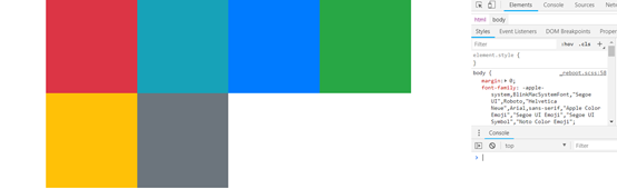
<div class="container" style="height: 400px; width: 800px;">
<div class="row w-100 h-100">
<div class="col-lg-3 bg-danger col-md-4 col-sm-6"></div>
<div class="col-lg-3 bg-info col-md-4 col-sm-6"></div>
<div class="col-lg-3 bg-primary col-md-4 col-sm-6"></div>
<div class="col-lg-3 bg-success col-md-4 col-sm-6"></div>
<div class="col-lg-3 bg-warning col-md-4 col-sm-6"></div>
<div class="col-lg-3 bg-secondary col-md-4 col-sm-6"></div>
</div>
</div>
Bootstrap里已经把响应不同屏幕大小的类都定义好了,你只需要动动手指就可以用了。
col-lg-3,我给它在>=992px的情况下一排显示4份。(注:col默认一排可分成12等份。)
col-md-4,我给它在大于等于768px小于992px的情况下一排显示3份。
col-sm-6,我给它在大于等于576px小于768px的情况下一排显示2份
这样就可以在屏幕大小不同的情况下,也能实现完美的布局了。