CSS3提供的Animation是一个强大的动画功能
定义Animation的格式:
@keyframes 关键帧名称{
    百分比/from/to{
    属性1:value1;
    属性2:value2;
    属性3:value3;
    ......
   }
   ......
}
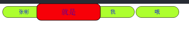
所以就尝试了一下鱼眼效果
下面是实现代码:
css:
a:link{
                text-decoration: none;
            }
            div>a{
                display: inline-block;
                width: 120px;
                padding: 8px;
                background: greenyellow;
                text-align: center;
                border: 1px solid black;
                border-radius: 20px;
            }
            @keyframes fisheye{
                0%{
                    transform: scale(1);
                    background-color: blue;
                    border-radius: 10px;
                }
                40%{
                    transform: scale(1.5);
                    background-color: red;
                    border-radius: 10px;
                }
                100{
                    transform: scale(1);
                    background-color: blue;
                    border-radius: 10px;
                }

            }
            div>a:hover{
                animation-name: fisheye;
                animation-duration: 2s;
                animation-iteration-count: infinite;
            }
html:
<div>
        <a href="#">张彬</a>
        <a href="#">就是</a>
        <a href="#">我</a>
        <a href="#">哦</a>
        </div>