版权声明:本文为博主原创文章,未经博主允许不得转载。 https://blog.csdn.net/zhaihaohao1/article/details/88762684
官方文档:https://reactnative.cn/docs/modal.html#docsNav
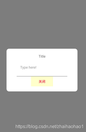
效果图:
由于Alert https://blog.csdn.net/zhaihaohao1/article/details/88632787
不能自己定义样式,所以使用Modal可以自己定义样式
代码(复制即可运行):
ModalExample.js
import React, {Component} from 'react';
import {
    Modal,
    Text,
    TouchableHighlight,
    TouchableOpacity,
    View,
    StyleSheet,
    Image,
    TextInput
} from 'react-native';

export default class ModalExample extends Component {

    constructor(props) {
        super(props);
        //false表示显示和消失了
        this.state = {modalVisible: false};
    }

    iShow() {
        this.setState({modalVisible: true});
    }

    // 关闭对话框
    iClose() {
        this.setState({modalVisible: false});
    }

    render() {
        return (
            <View>
                {/*对话框*/}
                <Modal
                    //淡入淡出动画
                    animationType={"fade"}
                    //设置有背景层
                    transparent={true}
                    // 设置是否显示(只要修改这个值,就可以显示和消失了)
                    visible={this.state.modalVisible}
                    // 按后退键,去掉对话框
                    onRequestClose={() => {
                        this.iClose();
                    }}
                >
                    {/*整个全屏遮罩层*/}
                    <TouchableOpacity style={styles.container}>
                        {/*弹出框*/}
                        <View style={styles.innerContainer}>
                            {/*标题*/}
                            <Text>Title</Text>
                            {/*输入框*/}
                            <TextInput
                                style={styles.inputtext}
                                placeholder="Type here!"
                            />
                            {/*关闭按钮*/}
                            <View style={styles.btnContainer}>
                                <TouchableHighlight onPress={() => this.iClose()}>
                                    <Text style={styles.hidemodalTxt}>关闭</Text>
                                </TouchableHighlight>
                            </View>
                        </View>

                    </TouchableOpacity>
                </Modal>

                {/*按钮点击显示对话框*/}
                <TouchableHighlight onPress={() => this.iShow()}>
                    <Text>弹出对话框</Text>
                </TouchableHighlight>

            </View>
        );
    }
}

const styles = StyleSheet.create({
    //这招层的上面的整个页面,铺满整个屏幕
    container: {
        flex: 1,
        justifyContent: 'center',
        padding: 40,
        backgroundColor: 'rgba(0, 0, 0, 0.5)'
    },
    //对话框
    innerContainer: {
        borderRadius: 10,
        alignItems: 'center',
        backgroundColor: '#fff',
        padding: 20

    },
    //对话框里面的按钮
    btnContainer: {
        width: 200,
        borderTopWidth: 1,
        borderTopColor: '#777',
        alignItems: 'center'
    },
    //对话框里面的输入框
    inputtext: {
        width: 180,
        margin: 10,
    },
    //对话框中的关闭按钮
    hidemodalTxt: {
        color:'#FF0033',
        paddingHorizontal:30,
        paddingVertical:10,
        backgroundColor:'#FFFFCC',
    },
});
ok,完了