Plot the function
over the interval [0, 2]. Add proper axis labels, a title, etc.
numpy.exp
numpy.exp(x, /, out=None, *, where=True, casting='same_kind', order='K', dtype=None, subok=True[, signature, extobj]) = <ufunc 'exp'>
Calculate the exponential of all elements in the input array.
Parameters: |
x : array_like Input values. out : ndarray, None, or tuple of ndarray and None, optional A location into which the result is stored. If provided, it must have a shape that the inputs broadcast to. If not provided or None, a freshly-allocated array is returned. A tuple (possible only as a keyword argument) must have length equal to the number of outputs. where : array_like, optional Values of True indicate to calculate the ufunc at that position, values of False indicate to leave the value in the output alone. **kwargs For other keyword-only arguments, see the ufunc docs. |
Returns: |
out : ndarray Output array, element-wise exponential of x. |
numpy.sin
numpy.sin(x, /, out=None, *, where=True, casting='same_kind', order='K', dtype=None, subok=True[, signature, extobj]) = <ufunc 'sin'>
Trigonometric sine, element-wise.
Parameters: |
x : array_like Angle, in radians ( rad equals 360 degrees). out : ndarray, None, or tuple of ndarray and None, optional A location into which the result is stored. If provided, it must have a shape that the inputs broadcast to. If not provided or None, a freshly-allocated array is returned. A tuple (possible only as a keyword argument) must have length equal to the number of outputs. where : array_like, optional Values of True indicate to calculate the ufunc at that position, values of False indicate to leave the value in the output alone. **kwargs For other keyword-only arguments, see the ufunc docs. |
Returns: |
y : array_like The sine of each element of x. |
import numpy as np
import matplotlib.pyplot as plt
# Plotting a function

# over the interval [0, 2]
x = np.linspace(0, 2, 20)

# f(x) = sin 2(x − 2)e − x 2
y = np.power(np.sin(x-2), 2) * np.exp(-1*(x**2))

plt.plot(x, y, 'r-')

# Add proper axis labels, a title, etc
plt.xlabel("x label")
plt.ylabel("y label")
plt.title("Plotting a function")

plt.show()
结果输出:

Exercise 11.2:Data
Create a data matrix X with 20 observations of 10variables.
Generate a vector b with parameters
Then generate theresponse vector y = Xb+z where z is a vector with standard normally distributed variables.
Now (by only using y and X), find an estimator for b, by solving

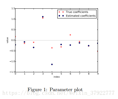
Plot the true parameters b and estimated parameters ˆb. See Figure 1 for an example plot.
根据线性最小二乘的基本公式:

程序实现:
import numpy as np
import matplotlib.pyplot as plt
import scipy.optimize

# Create a data matrix X with 20 observations of 10 variables
X = np.random.rand(20, 10)
# Generate a vector b with parameters
b = np.random.rand(10, 1)
# z is a vector with standard normally distributed variables.
z = np.random.normal(loc=0, scale=1.0, size=(20, 1))
# generate the response vector y = Xb+z
y = np.dot(X, b) + z

I = np.dot(X.T, X)
I = np.linalg.inv(I)
A = np.dot(I, X.T)
b_ = np.dot(A, y)

plt.title('Parameter plot')
plt.xlabel('index')
plt.ylabel('value')
x = np.arange(0,10)
plt.scatter(x, b, c='r', marker='x', label='$true b$')
plt.scatter(x, b_, c='b', marker='o', label='$estimated b$')
plt.legend()
plt.show ()
结果输出:

Exercise 11.3: Histogram and density estimation
Generate a vector z of 10000 observations from your favorite exotic distribution. Then make a plot that shows a histogram of z (with 25 bins), along with an estimate for the density, using a Gaussian kernel density estimator (see scipy.stats). See Figure 2 for an example plot.

scipy.stats.gaussian_kde
-
class
scipy.stats.gaussian_kde( dataset, bw_method=None ) [source] -
Representation of a kernel-density estimate using Gaussian kernels.
Kernel density estimation is a way to estimate the probability density function (PDF) of a random variable in a non-parametric way.
gaussian_kdeworks for both uni-variate and multi-variate data. It includes automatic bandwidth determination. The estimation works best for a unimodal distribution; bimodal or multi-modal distributions tend to be oversmoothed.Parameters: - dataset : array_like
-
Datapoints to estimate from. In case of univariate data this is a 1-D array, otherwise a 2-D array with shape (# of dims, # of data).
- bw_method : str, scalar or callable, optional
-
The method used to calculate the estimator bandwidth. This can be ‘scott’, ‘silverman’, a scalar constant or a callable. If a scalar, this will be used directly as kde.factor. If a callable, it should take a
gaussian_kdeinstance as only parameter and return a scalar. If None (default), ‘scott’ is used. See Notes for more details. -
参考demo网址:
https://glowingpython.blogspot.com/2012/08/kernel-density-estimation-with-scipy.html
https://plot.ly/scikit-learn/plot-kde-1d/
(可能需要科学上网)
程序实现:
import numpy as np
import matplotlib.pyplot as plt
import scipy.stats
# Exercise 11.3: Histogram and density estimation

# Generate a vector z of 10000 observations from your favorite exotic distribution.
z = np.random.normal(loc=0, scale=5.0, size=10000) # creating data with one peaks

# Then make a plot that shows a histogram of z (with 25 bins)
plt.hist(z , bins=25, density = True, color='b')

# along with an estimate for the density
# using a Gaussian kernel density estimator (see scipy.stats)
# Gaussian KDE
kernel = scipy.stats.gaussian_kde(z)
# obtaining the pdf (kernel is a function!)

x = np.linspace(-20, 20, 10000)
plt.plot(x, kernel(x), 'k') # distribution function

plt.show()
结果输出:
