版权声明:觉得有帮助到你的话,请在右边点个赞吧! https://blog.csdn.net/u011215669/article/details/88019545
代码
<!DOCTYPE html>
<html lang="zh-hans">
<head>
<meta charset="UTF-8" />
<title>移动布局</title>
<style>
* {
margin: 0;
padding: 0;
box-sizing: border-box;
}
ul {
list-style: none;
}
.container {
/* 整个容器占据全屏幕 */
height: 100vh;
display: flex;
flex-direction: column;
}
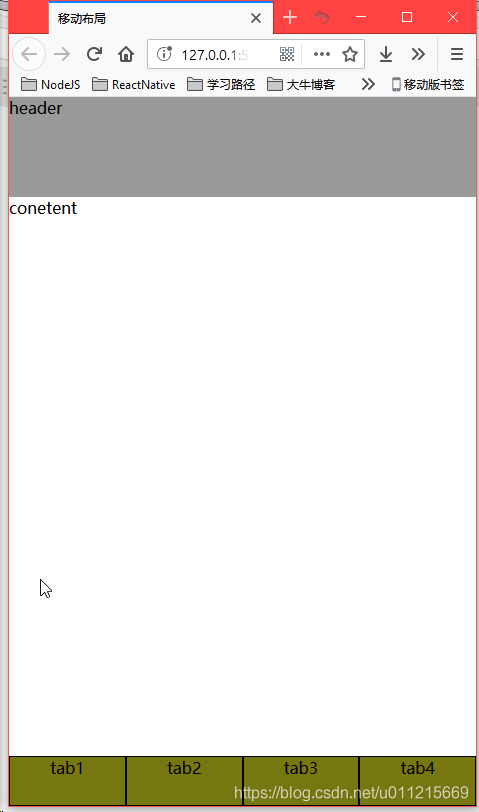
header {
background: #999;
height: 100px;
}
footer ul {
background: #771;
height: 50px;
/* 这里对ul使用flex是为了让li直接水平排放 */
display: flex;
}
main {
flex-grow: 1;
/* 使用overflow:auto可以让主体部分超出屏幕时使用滚动条 */
overflow: auto;
}
footer > ul > li {
border: 1px solid black;
width: 25%;
text-align: center;
}
</style>
</head>
<body>
<div class="container">
<header>header</header>
<main>
<p>conetent</p>
</main>
<footer>
<ul>
<li>tab1</li>
<li>tab2</li>
<li>tab3</li>
<li>tab4</li>
</ul>
</footer>
</div>
</body>
</html>
效果图