Flutter控件本身通常由许多小型、单用途的控件组成,结合起来产生强大的效果,例如,Container是一种常用的控件,由负责布局、绘画、定位和大小调整的几个控件组成,具体来说,Container是由LimitedBox、ConstrainedBox、 Align、Padding、DecoratedBox和Transform控件组成,而不是将Container子类化来产生自定义效果,您可以用这种新颖的方式组合这些以及其他简单的控件。
类的层次结构是扁平的,以最大化可能的组合数量。
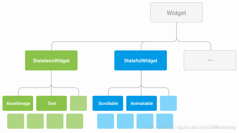
在写应用程序时,经常会使用StatelessWidget和StatefulWidget编写新控件,两者的差别在于你是否要管理控件的状态。一个控件的主要任务是实现build函数,定义控件中其他较低层次的控件。build函数将依次构建这些控件,直到底层渲染对象。
基本组件
Container
容器,一个常用的控件,由基本的绘制、位置和大小控件组成。负责创建矩形的可视元素,可以用BoxDecoration来设计样式,比如背景、边框和阴影,Container也有边距、填充和大小限制,另外,还可以在三维空间利用矩阵进行变换。
没有子控件的容器尽可能大,除非传入的大小约束是无限的,在这种情况下,它们尽可能小。有子控件的容器将自己的尺寸给他们的孩子。我们可以通过width、height和 constraints属性控制size。
 1 new Container(
 2   constraints: new BoxConstraints.expand(
 3     height: Theme.of(context).textTheme.display1.fontSize * 1.1 + 200.0,
 4   ),
 5   padding: const EdgeInsets.all(8.0),
 6   color: Colors.teal.shade700,
 7   alignment: Alignment.center,
 8   child: new Text('Hello World', style: Theme.of(context).textTheme.display1.copyWith(color: Colors.white)),
 9   foregroundDecoration: new BoxDecoration(
10     image: new DecorationImage(
11       image: new NetworkImage('https://www.example.com/images/frame.png'),
12       centerSlice: new Rect.fromLTRB(270.0, 180.0, 1360.0, 730.0),
13     ),
14   ),
15   transform: new Matrix4.rotationZ(0.1),
16 )
Row
flex水平布局控件,能够将子控件水平排列,是基于Web的flexbox的布局模式设计的。
Row子控件有灵活与不灵活的两种,Row首先列出不灵活的子控件,减去它们的总宽度,计算还有多少可用的空间。然后Row按照Flexible.flex属性确定的比例在可用空间中列出灵活的子控件。要控制灵活子控件,需要使用Expanded控件。
注意该控件不支持滑动,如果子控件超过剩余空间,会报错,如果想支持水平滑动,考虑使用ListView。
如果只有一个子控件,可以使用 Align or Center控件定义该子控件位置。
 1 new Row(
 2   children: <Widget>[
 3     new Expanded(
 4       child: new Text('Deliver features faster', textAlign: TextAlign.center),
 5     ),
 6     new Expanded(
 7       child: new Text('Craft beautiful UIs', textAlign: TextAlign.center),
 8     ),
 9     new Expanded(
10       child: new FittedBox(
11         fit: BoxFit.contain, // otherwise the logo will be tiny
12         child: const FlutterLogo(),
13       ),
14     ),
15   ],
16 )
Column
flex垂直布局控件,能够将子控件垂直排列。
用法与Row控件一样。
 1 new Column(
 2   crossAxisAlignment: CrossAxisAlignment.start,
 3   mainAxisSize: MainAxisSize.min,
 4   children: <Widget>[
 5     new Text('We move under cover and we move as one'),
 6     new Text('Through the night, we have one shot to live another day'),
 7     new Text('We cannot let a stray gunshot give us away'),
 8     new Text('We will fight up close, seize the moment and stay in it'),
 9     new Text('It’s either that or meet the business end of a bayonet'),
10     new Text('The code word is ‘Rochambeau,’ dig me?'),
11     new Text('Rochambeau!', style: DefaultTextStyle.of(context).style.apply(fontSizeFactor: 2.0)),
12   ],
13 )
Image
显示图像的控件,Image控件有多种构造函数:
-
new Image,用于从ImageProvider获取图像。
-
new Image.asset,用于使用key从AssetBundle获取图像。
-
new Image.network,用于从URL地址获取图像。
-
new Image.file,用于从File获取图像。
为了自动执行像素密度感知资源分辨率,使用AssetImage指定图像,需要确保在控件树中的图片控件上方存在MaterialApp、WidgetsApp和MediaQuery控件。
不同的手机有不同的像素比率,这时就需要根据手机的像素比率来加载不同图片,做法很简单,只需要在图片同级目录下创建2.0x/…和3.0x/…的目录就可以了。
我们在pubspec.yaml这个文件里指定本地图片路径
# To add assets to your application, add an assets section, like this:
# assets:
# - images/a_dot_burr.jpeg
# - images/a_dot_ham.jpeg
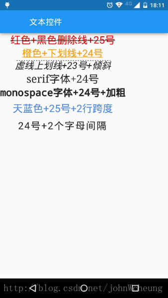
Text
用来显示文本的控件
下面的实例有7个不同样式的文本控件:
 1 import 'package:flutter/material.dart';
 2 class TextDemo extends StatelessWidget {
 3   @override
 4   Widget build(BuildContext context) {
 5     return new Scaffold(
 6       appBar: new AppBar(
 7         title: new Text('文本控件'),
 8       ),
 9       body: new Column(
10         children: <Widget>[
11           new Text(
12             '红色+黑色删除线+25号',
13             style: new TextStyle(
14               color: const Color(0xffff0000),
15               decoration: TextDecoration.lineThrough,
16               decorationColor: const Color(0xff000000),
17               fontSize: 25.0,
18             ),
19           ),
20           new Text(
21             '橙色+下划线+24号',
22             style: new TextStyle(
23               color: const Color(0xffff9900),
24               decoration: TextDecoration.underline,
25               fontSize: 24.0,
26             ),
27           ),
28           new Text(
29             '虚线上划线+23号+倾斜',
30             style: new TextStyle(
31               decoration: TextDecoration.overline,
32               decorationStyle: TextDecorationStyle.dashed,
33               fontSize: 23.0,
34               fontStyle: FontStyle.italic,
35             ),
36           ),
37           new Text(
38             'serif字体+24号',
39             style: new TextStyle(
40               fontFamily: 'serif',
41               fontSize: 26.0,
42             ),
43           ),
44           new Text(
45             'monospace字体+24号+加粗',
46             style: new TextStyle(
47               fontFamily: 'monospace',
48               fontSize: 24.0,
49               fontWeight: FontWeight.bold,
50             ),
51           ),
52           new Text(
53             '天蓝色+25号+2行跨度',
54             style: new TextStyle(
55               color: const Color(0xff4a86e8),
56               fontSize: 25.0,
57               height: 2.0,
58             ),
59           ),
60           new Text(
61             '24号+2个字母间隔',
62             style: new TextStyle(
63               fontSize: 24.0,
64               letterSpacing: 2.0,
65             ),
66           ),
67         ]
68       ),
69     );
70   }
71 }
72 void main() {
73   runApp(
74     new MaterialApp(
75       title: 'Flutter教程',
76       home: new TextDemo(),
77     ),
78   );
79 }
Icon
图标控件,按照IconData中所描述的规则绘制,如Material中预定义的IconDatas。
该控件不可交互,要实现可交互的图标,可以考虑使用Material中的 IconButton。
该控件必须在 Directionality控件里使用,通常这是由WidgetsApp或 MaterialApp自动引入的。
详见:https://docs.flutter.io/flutter/widgets/Icon-class.html
RaisedButton
Material Design 风格的浮动按钮,以方形纸片样式悬停在界面上,点击后会产生墨水扩散效果。
避免在dialog和card控件里使用,一般弹出式的控件建议使用扁平化按钮,减少布局层次叠加。
使用时,要实现onPressed回调方法,否则按钮处于禁用状态,默认显示disabledColor样式的扁平化按钮,并且此时更改按钮的颜色不会生效。
注意该控件的父控件必须是Material控件。
如果你只需要点击后产生墨水扩散效果,但不想使用按钮,请考虑直接使用InkWell控件。
如有必要,该按钮将拉伸以适应子控件大小。
详见:https://docs.flutter.io/flutter/material/RaisedButton-class.html
Scaffold
Scaffold 实现了基本的Material Design布局结构。也就是说, MaterialApp 的 child 是 Scaffold Widget。
在Material设计中定义的单个界面上的各种布局元素,在 Scaffold 中都有支持,比如 左边栏(Drawers)、snack bars、以及 bottom sheets。
Scaffold 有下面几个主要属性:
-
appBar:显示在界面顶部的一个 AppBar,也就是 Android 中的 ActionBar 、Toolbar
-
body:当前界面所显示的主要内容 Widget
-
floatingActionButton:Material设计中所定义的 FAB,界面的主要功能按钮
-
persistentFooterButtons:固定在下方显示的按钮,比如对话框下方的确定、取消按钮
-
drawer:侧边栏控件
-
backgroundColor: 内容的背景颜色,默认使用的是 ThemeData.scaffoldBackgroundColor 的值
-
bottomNavigationBar: 显示在页面底部的导航栏
-
resizeToAvoidBottomPadding:类似于 Android 中的 android:windowSoftInputMode=”adjustResize”,控制界面内容 body 是否重新布局来避免底部被覆盖了,比如当键盘显示的时候,重新布局避免被键盘盖住内容。默认值为 true。
显示 snackbar 或者 bottom sheet 的时候,需要使用当前的 BuildContext 参数调用 Scaffold.of 函数来获取 ScaffoldState 对象,然后使用 ScaffoldState.showSnackBar 和 ScaffoldState.showBottomSheet 函数来显示。
要特别注意 Scaffold.of 的参数 BuildContext, 如果包含该 BuildContext 的 Widget 是 Scaffold 的父 Widget,则 Scaffold.of 是无法查找到对应的 ScaffoldState 对象的,Scaffold.of 返回的是父对象中最近的 Scaffold 中的 ScaffoldState 对象。 比如,如果在 Scaffold 的 build 函数中,使用 build 的 BuildContext 参数是可以的:
 1 @override
 2 Widget build(BuildContext context) {
 3   return new RaisedButton(
 4     child: new Text('SHOW A SNACKBAR'),
 5     onPressed: () {
 6       Scaffold.of(context).showSnackBar(new SnackBar(
 7         content: new Text('Hello!'),
 8       ));
 9     },
10   );
11 }
如果 build 函数返回一个 Scaffold 对象,则由于 Scaffold 对象是这个 Widget 的子对象,所以使用这个 build 的 BuildContext 参数是不能查找到 ScaffoldState 对象的,这个时候,通过在 Scaffold 中使用一个 Builder 来提供一个新的 BuildConext :
 1 @override
 2 Widget build(BuildContext context) {
 3   return new Scaffold(
 4     appBar: new AppBar(
 5       title: new Text('Demo')
 6     ),
 7     body: new Builder(
 8       // Create an inner BuildContext so that the onPressed methods
 9       // can refer to the Scaffold with Scaffold.of().
10       builder: (BuildContext context) {
11         return new Center(
12           child: new RaisedButton(
13             child: new Text('SHOW A SNACKBAR'),
14             onPressed: () {
15               Scaffold.of(context).showSnackBar(new SnackBar(
16                 content: new Text('Hello!'),
17               ));
18             },
19           ),
20         );
21       },
22     ),
23   );
24 }
另外还可以把 build 函数中的 Widget 分别创建,分别引入新的 BuildContext 来获取 Scaffold。
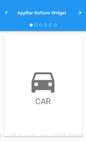
Appbar
AppBar 和 SliverAppBar 是Material Design中的 App Bar,也就是 Android 中的 Toolbar,关于 Toolbar 的设计指南请参考Material Design中 Toolbar 的内容。
AppBar 和 SliverAppBar 都是继承StatefulWidget 类,都代表 Toobar,二者的区别在于 AppBar 位置的固定的应用最上面的;而 SliverAppBar 是可以跟随内容滚动的。
他们的主要属性如下:
-
leading:在标题前面显示的一个控件,在首页通常显示应用的 logo;在其他界面通常显示为返回按钮
-
title: Toolbar 中主要内容,通常显示为当前界面的标题文字
-
actions:一个 Widget 列表,代表 Toolbar 中所显示的菜单,对于常用的菜单,通常使用 IconButton 来表示;对于不常用的菜单通常使用 PopupMenuButton 来显示为三个点,点击后弹出二级菜单
-
bottom:一个 AppBarBottomWidget 对象,通常是 TabBar。用来在 Toolbar 标题下面显示一个 Tab 导航栏
-
elevation:纸墨设计中控件的 z 坐标顺序,默认值为 4,对于可滚动的 SliverAppBar,当 SliverAppBar 和内容同级的时候,该值为 0, 当内容滚动 SliverAppBar 变为 Toolbar 的时候,修改 elevation 的值
flexibleSpace:一个显示在 AppBar 下方的控件,高度和 AppBar 高度一样,可以实现一些特殊的效果,该属性通常在 SliverAppBar 中使用 -
backgroundColor:APP bar 的颜色,默认值为 ThemeData.primaryColor。改值通常和下面的三个属性一起使用
-
brightness:App bar 的亮度,有白色和黑色两种主题,默认值为 ThemeData.primaryColorBrightness
-
iconTheme:App bar 上图标的颜色、透明度、和尺寸信息。默认值为 ThemeData.primaryIconTheme
-
textTheme: App bar 上的文字样式。默认值为 ThemeData.primaryTextTheme
-
centerTitle: 标题是否居中显示,默认值根据不同的操作系统,显示方式不一样
  1 import 'package:flutter/material.dart';
  2
  3 class AppBarBottomSample extends StatefulWidget {
  4   @override
  5   _AppBarBottomSampleState createState() => new _AppBarBottomSampleState();
  6 }
  7
  8 class _AppBarBottomSampleState extends State<AppBarBottomSample> with SingleTickerProviderStateMixin {
  9   TabController _tabController;
 10
 11   @override
 12   void initState() {
 13     super.initState();
 14     _tabController = new TabController(vsync: this, length: choices.length);
 15   }
 16
 17   @override
 18   void dispose() {
 19     _tabController.dispose();
 20     super.dispose();
 21   }
 22
 23   void _nextPage(int delta) {
 24     final int newIndex = _tabController.index + delta;
 25     if (newIndex < 0 || newIndex >= _tabController.length)
 26       return;
 27     _tabController.animateTo(newIndex);
 28   }
 29
 30   @override
 31   Widget build(BuildContext context) {
 32     return new MaterialApp(
 33       home: new Scaffold(
 34         appBar: new AppBar(
 35           title: const Text('AppBar Bottom Widget'),
 36           leading: new IconButton(
 37             tooltip: 'Previous choice',
 38             icon: const Icon(Icons.arrow_back),
 39             onPressed: () { _nextPage(-1); },
 40           ),
 41           actions: <Widget>[
 42             new IconButton(
 43               icon: const Icon(Icons.arrow_forward),
 44               tooltip: 'Next choice',
 45               onPressed: () { _nextPage(1); },
 46             ),
 47           ],
 48           bottom: new PreferredSize(
 49             preferredSize: const Size.fromHeight(48.0),
 50             child: new Theme(
 51               data: Theme.of(context).copyWith(accentColor: Colors.white),
 52               child: new Container(
 53                 height: 48.0,
 54                 alignment: Alignment.center,
 55                 child: new TabPageSelector(controller: _tabController),
 56               ),
 57             ),
 58           ),
 59         ),
 60         body: new TabBarView(
 61           controller: _tabController,
 62           children: choices.map((Choice choice) {
 63             return new Padding(
 64               padding: const EdgeInsets.all(16.0),
 65               child: new ChoiceCard(choice: choice),
 66             );
 67           }).toList(),
 68         ),
 69       ),
 70     );
 71   }
 72 }
 73
 74 class Choice {
 75   const Choice({ this.title, this.icon });
 76   final String title;
 77   final IconData icon;
 78 }
 79
 80 const List<Choice> choices = const <Choice>[
 81   const Choice(title: 'CAR', icon: Icons.directions_car),
 82   const Choice(title: 'BICYCLE', icon: Icons.directions_bike),
 83   const Choice(title: 'BOAT', icon: Icons.directions_boat),
 84   const Choice(title: 'BUS', icon: Icons.directions_bus),
 85   const Choice(title: 'TRAIN', icon: Icons.directions_railway),
 86   const Choice(title: 'WALK', icon: Icons.directions_walk),
 87 ];
 88
 89 class ChoiceCard extends StatelessWidget {
 90   const ChoiceCard({ Key key, this.choice }) : super(key: key);
 91
 92   final Choice choice;
 93
 94   @override
 95   Widget build(BuildContext context) {
 96     final TextStyle textStyle = Theme.of(context).textTheme.display1;
 97     return new Card(
 98       color: Colors.white,
 99       child: new Center(
100         child: new Column(
101           mainAxisSize: MainAxisSize.min,
102           crossAxisAlignment: CrossAxisAlignment.center,
103           children: <Widget>[
104             new Icon(choice.icon, size: 128.0, color: textStyle.color),
105             new Text(choice.title, style: textStyle),
106           ],
107         ),
108       ),
109     );
110   }
111 }
112
113 void main() {
114   runApp(new AppBarBottomSample());
115 }
FlutterLogo
定义flutter应用的logo,该控件受IconTheme约束。
 1 import 'package:flutter/material.dart';
 2
 3 void main() {
 4   runApp(new FadeAppTest());
 5 }
 6
 7 class FadeAppTest extends StatelessWidget {
 8   // This widget is the root of your application.
 9   @override
10   Widget build(BuildContext context) {
11     return new MaterialApp(
12       title: 'Fade Demo',
13       theme: new ThemeData(
14         primarySwatch: Colors.blue,
15       ),
16       home: new MyFadeTest(title: 'Fade Demo'),
17     );
18   }
19 }
20
21 class MyFadeTest extends StatefulWidget {
22   MyFadeTest({Key key, this.title}) : super(key: key);
23   final String title;
24   @override
25   _MyFadeTest createState() => new _MyFadeTest();
26 }
27
28 class _MyFadeTest extends State<MyFadeTest> with TickerProviderStateMixin {
29   AnimationController controller;
30   CurvedAnimation curve;
31
32   @override
33   void initState() {
34     controller = new AnimationController(duration: const Duration(milliseconds: 2000), vsync: this);
35     curve = new CurvedAnimation(parent: controller, curve: Curves.easeIn);
36   }
37
38   @override
39   Widget build(BuildContext context) {
40     return new Scaffold(
41       appBar: new AppBar(
42         title: new Text(widget.title),
43       ),
44       body: new Center(
45           child: new Container(
46               child: new FadeTransition(
47                   opacity: curve,
48                   child: new FlutterLogo(
49                     size: 100.0,
50                   )))),
51       floatingActionButton: new FloatingActionButton(
52         tooltip: 'Fade',
53         child: new Icon(Icons.brush),
54         onPressed: () {
55           controller.forward();
56         },
57       ),
58     );
59   }
60 }
Placeholder
占位控件,该控件绘制一个框,表示将来会在该位置添加其他控件。
这个控件在开发过程中很有用,可提示该处接口还没完成。
默认情况下,控件的大小自适应其容器。如果该控件处于无界空间,它将根据给定的fallbackWidth和fallbackHeight自行调整大小。
详见:https://docs.flutter.io/flutter/widgets/Placeholder-class.html
Flutter和原生Android控件对比
| Flutter控件 | Android控件 |
|---|---|
| AppBar | ActionBar/ToolBar |
| ListView | ListView/RecyclerView |
| Text | TextView |
| Center | ViewGroup |
| Container | RelativeLayout |
| FloatingActionButton | FloatingActionButton(design库里面的) |
| BottomNavigationBar | BottomNavigation(design库里面的) |
| RaisedButton/Button | Button |
| Column | LinearLayout的android:orientation="vertical" |
| Row | android:orientation="horizontal" |
| DecorationImage | ImageView |
| Image | ImageView |
| Stack | FrameLayout/RelativeLayout |
| Algin | alginParentXXX属性 |
| resizeToAvoidBottomPadding | android:windowSoftInputMode=”adjustResize属性 |
| SingleChildScrollView | ScrollView |
| CustomScrollerView | Recyclerview |
Image里面的BoxFit参数介绍:(相当于Android的ImageView的scaleType参数)
// fill 通过篡改原始宽高比来填充目标box

/// contain 在尽可能大的情况下,仍然将源完全包含在目标框中。

/// cover 尽可能小,同时仍然覆盖整个目标框。

/// fitWidth 确保显示源的全部宽度,而不管这是否意味着源垂直溢出目标框。

/// fitHeight 确保显示源的全部高度,而不管这是否意味着源水平地溢出目标框。

/// none 在目标框中对齐源(默认为居中),并放弃位于框外的源的任何部分。源图像未调整大小。

/// scaleDown 在目标框中对齐源(默认为居中),如果需要,将源缩小以确保源适合该框。这与contain的内容相同,如果该内容会收缩图像,那么它就是none。
