浮动效果01
<!DOCTYPE HTML>
<html>
<head>
<meta http-equiv="Content-Type" content="text/html; charset=utf-8">
<title>无标题文档</title>
<style>
.clear{zoom:1;}
.clear:after{content:"";display:block;clear:both;}
.wrap{width:500px;margin:0 auto;border:10px solid #ccc;}
.left{width:200px;height:400px;background:#7a1;float:left;}
.right{width:300px;float:right;}
.right_top{height:80px;background:#f90;}
.right_center div{width:150px;height:160px;float:left;background:#f69;}
.right_center .right_center2{background:#4fc;}
.right_foot{height:160px;background:#369;}
</style>
</head>
<body>
<div class="wrap clear">
    <div class="left"></div>
    <div class="right">
        <div class="right_top"></div>
        <div class="clear right_center">
            <div class="right_center1"></div>
            <div class="right_center2"></div>
        </div>
        <div class="right_foot"></div>
    </div>
</div>
</body>
</html>
效果:

02.。
<!DOCTYPE HTML>
<html>
<head>
<meta http-equiv="Content-Type" content="text/html; charset=utf-8">
<title>无标题文档</title>
<style>
body,ul{margin:0;padding:0;}
li{ list-style:none;}
.list{width:500px;padding:10px;background:#ccc; margin:0 auto;}
.list li{padding:5px 0;height:17px;font-size:0;}
.list span{float:left;height:17px;font-size:0;}
.left{width:300px;background:#369;}
.right{background:#f90;width:200px;}
</style>
</head>
<body>
<!--
    一般情况 一个元素里边所有子元素结构和样式都是一样 那咱们就把这看成是1个列表
-->
<ul class="list">
    <li>
        <span class="left"></span>
        <span class="right"></span>
    </li>
    <li>
        <span class="left"></span>
        <span class="right"></span>
    </li>
    <li>
        <span class="left"></span>
        <span class="right"></span>
    </li>
    <li>
        <span class="left"></span>
        <span class="right"></span>
    </li>
    <li>
        <span class="left"></span>
        <span class="right"></span>
    </li>
    <li>
        <span class="left"></span>
        <span class="right"></span>
    </li>
</ul>
</body>
</html>
效果:

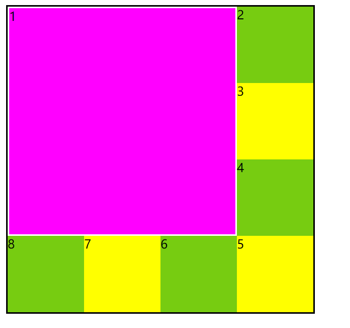
03.
<!DOCTYPE HTML>
<html>
<head>
<meta http-equiv="Content-Type" content="text/html; charset=utf-8">
<title>无标题文档</title>
<style>
.wrap{ width:400px;border:2px solid #000;margin:0 auto;}
.wrap:after{content:"";display:block;clear:both;}
.div1{width:296px;height:296px;float:left;background:#f0f;border:2px solid #fff;}
.div2{ width:100px;height:100px;float:right;background:#7c1;}
.div3{background:#ff0;}
</style>
</head>
<body>
<div class="wrap">
    <div class="div1">1</div>
    <div class="div2">2</div>
    <div class="div2 div3">3</div>
    <div class="div2">4</div>
    <div class="div2 div3">5</div>
    <div class="div2">6</div>
    <div class="div2 div3">7</div>
    <div class="div2">8</div>
</div>
</body>
</html>
效果:
04.
<!DOCTYPE HTML>
<html>
<head>
<meta http-equiv="Content-Type" content="text/html; charset=utf-8">
<title>无标题文档</title>
<style>
body,ul{margin:0;padding:0;}
li{ list-style:none;}
.list{width:300px;margin:30px auto;border-left:1px solid #000;border-top:1px solid #000;height:300px;}
.list li{width:99px;height:99px;float:left;border-right:1px solid #000;border-bottom:1px solid #000;background:#ffc;}
</style>
</head>
<body>
<ul class="list">
    <li>1</li>
    <li>2</li>
    <li>3</li>
    <li>4</li>
    <li>5</li>
    <li>6</li>
    <li>7</li>
    <li>8</li>
    <li>9</li>
</ul>
</body>
</html>
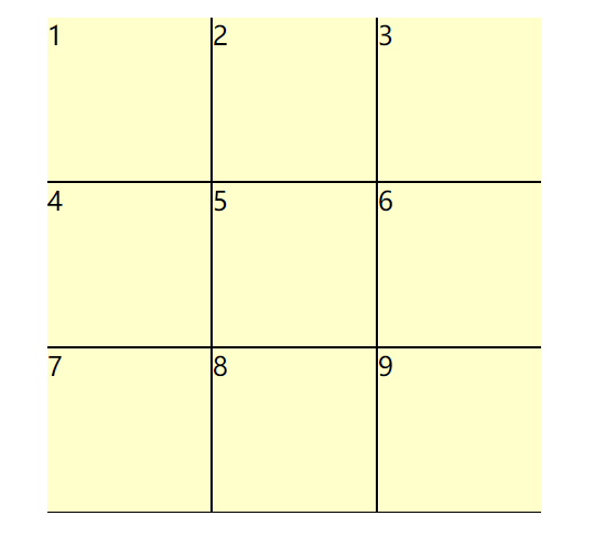
05.
<!DOCTYPE HTML>
<html>
<head>
<meta http-equiv="Content-Type" content="text/html; charset=utf-8">
<title>无标题文档</title>
<style>
body,ul{margin:0;padding:0;}
li{ list-style:none;}
.wrap{width:299px;height:299px;margin:30px auto;overflow:hidden;}
.list{width:300px;height:300px;}
.list li{width:99px;height:99px;float:left;border-right:1px solid #000;border-bottom:1px solid #000;background:#ffc;}
</style>
</head>
<body>
<div class="wrap">
    <ul class="list">
        <li>1</li>
        <li>2</li>
        <li>3</li>
        <li>4</li>
        <li>5</li>
        <li>6</li>
        <li>7</li>
        <li>8</li>
        <li>9</li>
    </ul>
</div>
</body>
</html>
效果:
06.
<!DOCTYPE HTML>
<html>
<head>
<meta http-equiv="Content-Type" content="text/html; charset=utf-8">
<title>无标题文档</title>
<style>
body,ul{margin:0;padding:0;}
li{ list-style:none;}
.list{width:732px;margin:30px auto; overflow:auto;border-top:1px solid #999;border-left:1px solid #999;}
.list li{width:60px;height:180px;float:left;border-right:1px solid #999;border-bottom:1px solid #999;}
.list div{height:100px;background:#000; color:#fff;}
/*.list li:nth-of-type(2n) div{ height:50px;}*/
.list .div2{ height:50px;}
</style>
</head>
<body>
<ul class="list">
    <li>
        <div>1</div>
    </li>
    <li>
        <div class="div2">2</div>
    </li>
    <li>
        <div>3</div>
    </li>
    <li>
        <div class="div2">4</div>
    </li>
    <li>
        <div>5</div>
    </li>
    <li>
        <div class="div2">6</div>
    </li>
    <li>
        <div>7</div>
    </li>
    <li>
        <div class="div2">8</div>
    </li>
    <li>
        <div>9</div>
    </li>
    <li>
        <div class="div2">10</div>
    </li>
    <li>
        <div>11</div>
    </li>
    <li>
        <div class="div2">12</div>
    </li>
</ul>
</body>
</html>
效果:

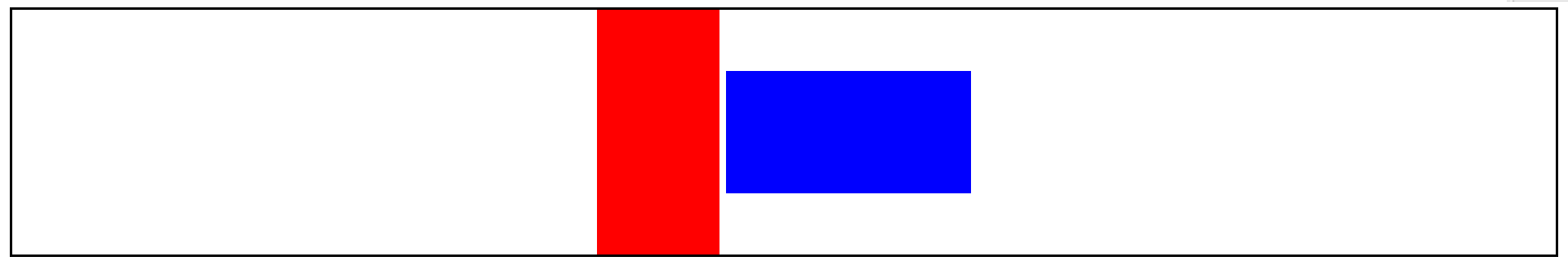
07.
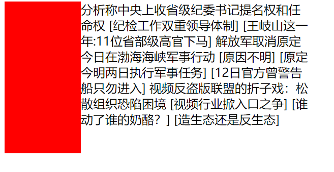
<!DOCTYPE HTML>
<html>
<head>
<meta http-equiv="Content-Type" content="text/html; charset=utf-8">
<title>无标题文档</title>
<style>
.box{ width:400px;}
.left{width:100px;height:200px;float:left;background:red;}
.right{ width:300px;float:left;}
/*元素浮动,要并在同一行的元素都要加浮动*/
</style>
</head>
<body>
<div class="box">
    <div class="left"></div>
    <div class="right">分析称中央上收省级纪委书记提名权和任命权
[纪检工作双重领导体制] [王岐山这一年:11位省部级高官下马]
解放军取消原定今日在渤海海峡军事行动
[原因不明] [原定今明两日执行军事任务] [12日官方曾警告船只勿进入]
视频反盗版联盟的折子戏:松散组织恐陷困境
[视频行业掀入口之争] [谁动了谁的奶酪?] [造生态还是反生态]</div>
</div>
</body>
</html>
效果:
8_IE6下的双边距BUG
<!DOCTYPE HTML>
<html>
<head>
<meta http-equiv="Content-Type" content="text/html; charset=utf-8">
<title>无标题文档</title>
<style>
body{margin:0;}
.wrap{float:left;border:2px solid #000;}
.box{width:100px;height:100px;background:red;margin:0 100px;float:left; }
/*
    IE6下的双边距BUG
    在IE6下,块元素有浮动和横向margin的时候,横向的margin值会被放大成两倍

    解决办法: display:inline;
*/
</style>
</head>
<body>
<div class="wrap">
<div class="box"></div>
</div>
</body>
</html>
效果:
9_IE67下li的4px间隙
<!DOCTYPE HTML>
<html>
<head>
<meta http-equiv="Content-Type" content="text/html; charset=utf-8">
<title>无标题文档</title>
<style>
.list{ width:300px;margin:0;padding:0;}
.list li{ list-style:none;height:30px;border:1px solid #000; font-size:12px; line-height:30px; vertical-align:top;}
.list a{float:left;}
.list span{float:right;}
/*
    IE6,7下li的间隙

    在IE6,7下li本身没浮动,但是li内容有浮动的时候,li下边就会产生几px的间隙

    解决办法: 1.给li加浮动
        2.给li加vertical-align:top;
*/
</style>
</head>
<body>
<ul class="list">
    <li>
        <a href="#">文字文字文字文字文字</a>
        <span>作者</span>
    </li>
    <li>
        <a href="#">文字文字文字文字文字</a>
        <span>作者</span>
    </li>
    <li>
        <a href="#">文字文字文字文字文字</a>
        <span>作者</span>
    </li>
    <li>
        <a href="#">文字文字文字文字文字</a>
        <span>作者</span>
    </li>
</ul>
</body>
</html>
效果:

10_垂直对齐方式
<!DOCTYPE HTML>
<html>
<head>
<meta http-equiv="Content-Type" content="text/html; charset=utf-8">
<title>无标题文档</title>
<style>
.box{height:200px;border:2px solid #000; text-align:center;}
.span1{ width:100px;height:200px;background:Red; display:inline-block; vertical-align:middle;}
.span2{ width:200px;height:100px;background:blue; display:inline-block; vertical-align:middle;}
</style>
</head>
<body>
<div class="box">
    <span class="span1"></span>
    <span class="span2"></span>
</div>
</body>
</html>
效果: