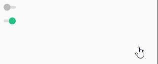
之前看到有人还是用textview或imageview来实现开关功能,确实可以实现,但是有点落后了,谷歌提供了两个开关控件Switch和ToggleButton,下面介绍用法
结构
首先两个控件都是继承CompoundButton,和CheckBox出自一家,都是有切换效果
public class Switch extends CompoundButton

java.lang.Object
   ↳	android.view.View
 	   ↳	android.widget.TextView
 	 	   ↳	android.widget.Button
 	 	 	   ↳	android.widget.CompoundButton
 	 	 	 	   ↳	android.widget.Switch
public class ToggleButton extends CompoundButton

java.lang.Object
   ↳	android.view.View
 	   ↳	android.widget.TextView
 	 	   ↳	android.widget.Button
 	 	 	   ↳	android.widget.CompoundButton
 	 	 	 	   ↳	android.widget.ToggleButton
基本属性
ToggleButton
android:disabledAlpha:不可用时的透明度android:textOff:关闭时的文字android:textOn:打开时的文字
Switch
android:showText:设置on/off的时候是否显示文字,booleanandroid:splitTrack:是否设置一个间隙,让滑块与底部图片分隔,booleanandroid:switchMinWidth:设置开关的最小宽度android:switchPadding:设置滑块内文字的间隔android:switchTextAppearance:设置开关的文字外观android:textOff:关闭时的文字android:textOn:打开时的文字android:textStyle:文字风格,粗体,斜体写划线那些android:thumb:背景android:thumbTextPadding:设置背景和文字之间的距离android:thumbTint:滑动块颜色android:thumbTintMode:滑动块颜色模式android:track:切换图片android:trackTint:切换颜色android:trackTintMode:切换模式android:typeface:设置字体
xml定义
<?xml version="1.0" encoding="utf-8"?>
<LinearLayout xmlns:android="http://schemas.android.com/apk/res/android"
    xmlns:app="http://schemas.android.com/apk/res-auto"
    xmlns:tools="http://schemas.android.com/tools"
    android:layout_width="match_parent"
    android:layout_height="match_parent"
    android:orientation="vertical"
    tools:context=".MainActivity">

    <ToggleButton
        android:layout_width="wrap_content"
        android:layout_height="wrap_content"
        android:textOff="关"
        android:textOn="开"
        />

    <Switch
        android:layout_width="wrap_content"
        android:layout_height="wrap_content"
        android:textOff="关"
        android:textOn="开"
        />
</LinearLayout>

监听事件
ToggleButton toggleButton = findViewById(R.id.togglebutton);
        toggleButton.setOnCheckedChangeListener(new CompoundButton.OnCheckedChangeListener() {
            @Override
            public void onCheckedChanged(CompoundButton buttonView, boolean isChecked) {
                if (isChecked){

                }else {

                }
            }
        });

        Switch aSwitch = findViewById(R.id.aswitch);
        aSwitch.setOnCheckedChangeListener(new CompoundButton.OnCheckedChangeListener() {
            @Override
            public void onCheckedChanged(CompoundButton buttonView, boolean isChecked) {
                if (isChecked){

                }else {

                }
            }
        });
自定义样式
功能是实现了,但是实际开发还需要改变一下样式
ToggleButton
    <ToggleButton
        android:layout_width="wrap_content"
        android:layout_height="wrap_content"
        android:checked="false"
        android:textOff=""
        android:textOn=""
        android:background="@android:color/transparent"
        android:button="@drawable/switch_selector"
         />
Switch
    <Switch
        android:layout_width="wrap_content"
        android:layout_height="wrap_content"
        android:switchMinWidth="30dp"
        android:checked="true"
        android:thumb="@android:color/transparent"
        android:track="@drawable/switch_selector"
        />
switch_selector.xml
<selector xmlns:android="http://schemas.android.com/apk/res/android">
    <item android:drawable="@drawable/switch_close" android:state_checked="false" />
    <item android:drawable="@drawable/switch_open" android:state_checked="true" />
</selector>
注意事项:
- 使用switch自定义样式时需要设置
android:switchMinWidth,不设置会不显示