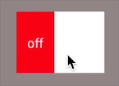
什么是开关?先看一下Switch的实现效果
和手机上开启移动数据的按钮很像
属性:
- android:showText:设置on/off的时候是否显示文字,boolean
- android:splitTrack:是否设置一个间隙,让滑块与底部图片分隔,boolean
- android:switchMinWidth:设置开关的最小宽度
- android:switchPadding:设置滑块内文字的间隔
- android:switchTextAppearance:设置开关的文字外观,暂时没发现有什么用...
- android:textOff:按钮没有被选中时显示的文字
- android:textOn:按钮被选中时显示的文字
- android:textStyle:文字风格,粗体,斜体写划线那些
- android:track:底部的图片
- android:thumb:滑块的图片
- android:typeface:设置字体
使用这个控件比较简单,只要在布局文件中引用,然后设置相关的属性就可以了
<?xml version="1.0" encoding="utf-8"?>
<LinearLayout xmlns:android="http://schemas.android.com/apk/res/android"
    xmlns:app="http://schemas.android.com/apk/res-auto"
    xmlns:tools="http://schemas.android.com/tools"
    android:layout_width="match_parent"
    android:layout_height="match_parent"
    android:gravity="center"
    tools:context="com.contentprovide.liuliu.togglebutton_test.MainActivity">


   <Switch
       android:id="@+id/swh"
       android:layout_width="wrap_content"
       android:layout_height="wrap_content"
       android:track="@drawable/tra"
       android:thumb="@drawable/a3"
       android:textOff="off"
       android:textOn="on"
       />

</LinearLayout>
我这里的track和thumb引用的两个drawable资源文件是我自己定义的
tra.xml
<?xml version="1.0" encoding="utf-8"?>
<selector xmlns:android="http://schemas.android.com/apk/res/android">
<item android:state_checked="true" android:drawable="@drawable/a2"></item>
<item android:state_checked="false" android:drawable="@drawable/a1"></item>
</selector>
a1.xml、a2.xml、a3.xml是自定义图形,比较简单,这里就不记录了