Props 属性
简而言之就是属性 , 栗子 : Image中的source就是一个Props 像ImageView中的src一样 只是叫的名字不一样而已 ;
State 属性
相较Props属性而言 , State属性是可变的 , 可以在程序中通过setState来动态改变值的属性 , Props属性 , 只要在js||xml||html等静态页面中写死的 , 就无法改变 , 而State属性是可以改变的 ;
Style 样式 <样式需要引入StyleSheet >
和CSS一样 , 只是声明的方式变为了
const styleName = StyleSheet.create({
style1:{
color:#FFFFFF;
font-size:30px;
},
style2:{
... : ...,
... : ...
}
});
同时 , 引用方式变为了 :
<Text style="{styleName.style1}"/>
// 或者
<Text style="{[styleName.style1 styleName.style2] }">
尺寸
React_Native 中的尺寸没有单位<例如 px dp rem> , 尺寸只有数字 , 这个数字适合密度相关的逻辑数字 &^%^&()*!&!@... 总之一堆解释 , 就是说尺寸没有单位
Flex布局方式
Flex 自适应 类似LinearLayout中的Weigh(权重) , 指定Flex :num , 就可以指定权重了...
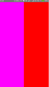
FlexDirection属性 类似LinearLayout中的orientation(row= horizontal, column= vertical ) ,当Flex被指定时 , 对应的另一个方向如果不指定尺寸, 会默认占满屏幕, 例如 :
<View style={{flexDirection : "row" , flex : 1}}>
<View style={{flex:1,backgroundColor:"#FF00FF"}}></View>
<View style={{flex:1,backgroundColor:"#FF0000"}}></View>
</View>
形成的界面就是左右平分 , 且上下充满屏幕的界面 :
在此状态下 高度只可以指定的 但是flex和width不能共存, row状态的flex会使width不生效, 当flexDirection为column时 , 道理也一样;
JustifyContent 是指在子元素没有填充满父元素的情况下 , 决定对其方式的一个属性 , 该属性一共有5个属性值 , 以下代码在不同属性值得情况下 , 布局效果 :
<View style={{flexDirection : "row" , flex : 1,justifyContent:"flex-start"}}>
<View style={{flex:0.1,height:100,backgroundColor:"#0000FF"}}></View>
<View style={{flex:0.1,height:100,backgroundColor:"#FF0000"}}></View>
<View style={{flex:0.1,height:100,backgroundColor:"#00FF00"}}></View>
</View>
| JustifyContent属性值 |
flex-start(默认) |
center |
flex-end |
space-around | space-between |
| 样式演示 |
|
|
|
|
|


AlignItems 是指在次轴方向上 子元素的排列方式 , 例如 flexDirection为 row 时 , 主轴为X轴 , 次轴为Y轴 , 也就是说 指定alignItems属性 , 就可以指定子元素沿Y轴的排列方式了...有点绕 , 代码例子 :
// center flex-start flex-end stretch
<View style={{flexDirection : "row" , flex : 1,justifyContent:"space-between",alignItems: 'flex-start'}}>
<View style={{flex:0.1,height:100, backgroundColor:"#0000FF"}}></View>
<View style={{flex:0.1,height:100, backgroundColor:"#FF0000"}}></View>
<View style={{flex:0.1,height:100, backgroundColor:"#00FF00"}}></View>
</View>
| AlignItems属性值 |
flex-start(默认①) |
center |
flex-end |
stretch(默认②) |
| 样式演示 |
|
|
|
|


AlignItems 说明 :
-
flex-start center flex-end 属性值生效条件为次轴上的尺寸设置为死值 , 此处为 height:100 ;
-
在子元素次轴尺寸为死值时 , 默认的AlignItems属性为flex-start 为默认①
-
stretch (拉伸) 属性值的生效条件为子元素次轴尺寸不设置 , 也就是说 代码应该变为
// center flex-start flex-end stretch
<View style={{flexDirection : "row" , flex : 1,justifyContent:"space-between",alignItems: ' stretch'}}>
<View style={{flex:0.1, backgroundColor:"#0000FF"}}></View>
<View style={{flex:0.1, backgroundColor:"#FF0000"}}></View>
<View style={{flex:0.1, backgroundColor:"#00FF00"}}></View>
</View>
-
才能出现对应的效果 ,
-
在子元素次轴尺寸不设置时 , 默认的AlignItems属性为stretch 为默认②