在android开发中经常会使用shape来美化视图,它能够代替图片,节约内存,有助于内存的优化。
那么我现在就来详细介绍一下android下shape进行简单的UI开发,首先我们要创建shape文件,注意shape文件要放到Drawable目录下,创建shape方法我有一篇文章已经提到过了:创建shape.xml文件。
其实这个很有意思的,其中有很多属性,能够做出很多样式和图案
下面我就先给出一个简单的例子:
<?xml version="1.0" encoding="utf-8"?>
<shape xmlns:android="http://schemas.android.com/apk/res/android"
android:shape="rectangle" > //设置形状,这里我设置的是矩形
<solid android:color="#1E7EE3" /> //设置颜色
<size android:height="1dp" android:width="500dp"/> //设置宽度和高度
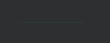
</shape>演示结果:

没错就是这一条蓝色的线,这如果说找图片来代替这图片挺不好找的吧,但是shape能轻松实现。
然后还有几种其他形状
  android:shape="rectangle" >                          //设置形状,这里我设置的是矩形
  android:shape="oval" >                               //设置形状,设置的是椭圆形
  android:shape="line" >                               //设置形状,设置的是线形
  android:shape="ring" >                               //设置形状,设置的是环形
每个形状都有自己详细的属性:
1、矩形
solid: 设置形状填充的颜色,只有android:color一个属性 android:color 填充的颜色
padding: 设置内容与形状边界的内间距,可分别设置左右上下的距离
- android:left 左内间距
- android:right 右内间距
- android:top 上内间距
- android:bottom 下内间距
gradient: 设置形状的渐变颜色,可以是线性渐变、辐射渐变、扫描性渐变
- android:type 渐变的类型
- linear 线性渐变,默认的渐变类型
- radial 放射渐变,设置该项时,android:gradientRadius也必须设置
- sweep 扫描性渐变
- android:startColor 渐变开始的颜色
- android:endColor 渐变结束的颜色
- android:centerColor 渐变中间的颜色
- android:angle 渐变的角度,线性渐变时才有效,必须是45的倍数,0表示从左到右,90表示从下到上
- android:centerX 渐变中心的相对X坐标,放射渐变时才有效,在0.0到1.0之间,默认为0.5,表示在正中间
- android:centerY 渐变中心的相对X坐标,放射渐变时才有效,在0.0到1.0之间,默认为0.5,表示在正中间
- android:gradientRadius 渐变的半径,只有渐变类型为radial时才使用
- android:useLevel 如果为true,则可在LevelListDrawable中使用
corners: 设置圆角,只适用于rectangle类型,可分别设置四个角不同半径的圆角,当设置的圆角半径很大时,比如200dp,就可变成弧形边了
- android:radius 圆角半径,会被下面每个特定的圆角属性重写
- android:topLeftRadius 左上角的半径
- android:topRightRadius 右上角的半径
- android:bottomLeftRadius 左下角的半径
- android:bottomRightRadius 右下角的半径
stroke: 设置描边,可描成实线或虚线。
- android:color 描边的颜色
- android:width 描边的宽度
- android:dashWidth 设置虚线时的横线长度
- android:dashGap 设置虚线时的横线之间的距离
下面是示例代码
<!-- android:shape指定形状类型,默认为rectangle -->
<shape xmlns:android="http://schemas.android.com/apk/res/android"
    android:shape="rectangle">
    <!-- solid指定形状的填充色,只有android:color一个属性 -->
    <solid android:color="#4097e6" />
    <!-- padding设置内容区域离边界的间距 -->
    <padding
        android:bottom="15dp"
        android:left="15dp"
        android:right="15dp"
        android:top="15dp" />

    <!--渐变设置-->
    <gradient
        android:endColor="#4097e6"
        android:startColor="#FFFFFF"
        android:angle="270"
        android:type="linear" />

    <!-- corners设置圆角,只适用于rectangle
         数值较大时,就变成了弧边形状例如>=200时
     -->
    <corners android:radius="15dp" />
    <!-- stroke设置描边 -->
    <stroke
        android:width="2dp"
        android:color="#ff8900"
        android:dashGap="4dp"
        android:dashWidth="4dp" />
</shape>
演示效果:

2、oval
oval用来画椭圆,而在实际应用中,更多是画正圆,比如消息提示,圆形按钮等,下图是一些例子:
size: 设置形状默认的大小,可设置宽度和高度
android:width 宽度 android:height 高度
其他属性也是存在的。这里就不列举了上边也都有写到了 。
如果你使用TextView之类的设置椭圆,size默认会是View的宽度和高度
下面举个例子
<!--椭圆-->
<shape xmlns:android="http://schemas.android.com/apk/res/android"
    android:shape="oval">

    <!--设置图形的尺寸
        不过默认获取的还是View的宽度和高度-->
    <size android:width="60dp"
        android:height="60dp" />

    <solid android:color="#4097e6" />

    <!--渐变效果
        注意此处使用了gradientRadius这个属性值
        只有type="radial"时才有效
    -->
    <gradient
        android:endColor="#4097e6"
        android:startColor="#FFFFFF"
        android:gradientRadius="50dp"
        android:type="radial"/>

</shape>
演示结果:

3、line
通过Shape我们还可以设置分割线。不过一般我使用线都是直接View的。通过设置stroke我们可以设置线的样式(颜色、虚线还是实线等)。
注意点:画线时,有几点特性必须要知道的:
- 只能画水平线,画不了竖线;
- 线的高度是通过stroke的android:width属性设置的;
- size的android:height属性定义的是整个形状区域的高度;
- size的height必须大于stroke的width,否则,线无法显示;
- 线在整个形状区域中是居中显示的;
- 线左右两边会留有空白间距,线越粗,空白越大;
- 引用虚线的view需要添加属性android:layerType,值设为"software",否则显示不了虚线。
下面是示例代码:
<shape xmlns:android="http://schemas.android.com/apk/res/android"
    android:shape="line">
    <!-- 实际显示的线 -->
    <stroke
        android:width="1dp"
        android:color="#2F90BD"
        android:dashGap="2dp"
        android:dashWidth="4dp" />
    <!-- 形状的高度 -->
    <size android:height="4dp" />
</shape>
演示结果:
4、ring
首先,shape根元素有些属性只适用于ring类型,先过目下这些属性吧:
- android:innerRadius 内环的半径
- android:innerRadiusRatio 浮点型,以环的宽度比率来表示内环的半径,默认为3,表示内环半径为环的宽度除以3,该值会被android:innerRadius覆盖
- android:thickness 环的厚度
- android:thicknessRatio 浮点型,以环的宽度比率来表示环的厚度,默认为9,表示环的厚度为环的宽度除以9,该值会被android:thickness覆盖
- android:useLevel 一般为false,否则可能环形无法显示,只有作为LevelListDrawable使用时才设为true
下面是代码示例:
<!--圆环-->
<shape xmlns:android="http://schemas.android.com/apk/res/android"
    android:shape="ring"
    android:innerRadius="100dp"
    android:thickness="20dp"
    android:useLevel="false">

    <!--填充色-->
    <solid android:color="#4097e6" />

    <!--渐变色-->
    <gradient
        android:endColor="#4097e6"
        android:startColor="#FFFFFF"
        android:type="sweep" />

    <!--描边会让内圆和外圆都有边框-->
    <stroke
        android:width="1dp"
        android:color="#ff8900" />

</shape>
演示结果:

以上就是shape的各种属性,感兴趣可以去试一试其他各种颜色形状。