Shape Drawable
- file location:
-
res/drawable/filename.xml
The filename is used as the resource ID.(这个文件名作为资源id,被当做图片资源使用) - compiled resource datatype:(复杂资源的数据类型)
-
Resource pointer to a
GradientDrawable. - resource reference(资源参考):
-
In Java:
R.drawable.filename
In XML:@[package:]drawable/filename
- <?xml version="1.0" encoding="utf-8"?>
- <shape
- xmlns:android="http://schemas.android.com/apk/res/android"
- android:shape=["rectangle" | "oval" | "line" | "ring"] >
- //长方形/矩形 椭圆形 线性 圈/环
- <corners
- android:radius="integer"
- android:topLeftRadius="integer"
- android:topRightRadius="integer"
- android:bottomLeftRadius="integer"
- android:bottomRightRadius="integer" />
- <gradient
- android:angle="integer"
- android:centerX="integer"
- android:centerY="integer"
- android:centerColor="integer"
- android:endColor="color"
- android:gradientRadius="integer"
- android:startColor="color"
- android:type=["linear" | "radial" | "sweep"]
- android:useLevel=["true" | "false"] />
- <padding
- android:left="integer"
- android:top="integer"
- android:right="integer"
- android:bottom="integer" />
- <size
- android:width="integer"
- android:height="integer" />
- <solid
- android:color="color" />
- <stroke
- android:width="integer"
- android:color="color"
- android:dashWidth="integer"
- android:dashGap="integer" />
- </shape>
<corners> Creates rounded corners for the shape. Applies only when the shape is a rectangle.创建圆角的形状。仅适用于当其形状是一个长方形。
-
android:radius - Dimension. The radius for all corners, as a dimension value or dimension resource. This is overridden for each corner by the following attributes.
-
android:topLeftRadius - Dimension. The radius for the top-left corner, as a dimension value or dimension resource.
-
android:topRightRadius - Dimension. The radius for the top-right corner, as a dimension value or dimension resource.
-
android:bottomLeftRadius - Dimension. The radius for the bottom-left corner, as a dimension value or dimension resource.
-
android:bottomRightRadius - Dimension. The radius for the bottom-right corner, as a dimension value or dimension resource.
<gradient> Specifies a gradient color for the shape.指定一个渐变颜色的形状。
-
android:angle - Integer. The angle for the gradient, in degrees. 0 is left to right, 90 is bottom to top. It must be a multiple of 45. Default is 0.
-
android:centerX - Float. The relative X-position for the center of the gradient (0 - 1.0).
-
android:centerY - Float. The relative Y-position for the center of the gradient (0 - 1.0).
-
android:centerColor - Color. Optional color that comes between the start and end colors, as a hexadecimal value or color resource.
-
android:endColor - Color. The ending color, as a hexadecimal value or color resource.
-
android:gradientRadius -
Float. The radius for the gradient. Only applied when
android:type="radial". -
android:startColor - Color. The starting color, as a hexadecimal value or color resource.
-
android:type -
Keyword. The type of gradient pattern to apply. Valid values are:
Value Description "linear"A linear gradient. This is the default. "radial"A radial gradient. The start color is the center color. "sweep"A sweeping line gradient. -
android:useLevel -
Boolean. "true" if this is used as a
LevelListDrawable.
<padding> Padding to apply to the containing View element (this pads the position of the View content, not the shape).适用于包含填充视图元素(这垫的位置,而不是观点内容的形状)
-
android:left - Dimension. Left padding, as a dimension value or dimension resource.
-
android:top - Dimension. Top padding, as a dimension value or dimension resource.
-
android:right - Dimension. Right padding, as a dimension value or dimension resource.
-
android:bottom - Dimension. Bottom padding, as a dimension value or dimension resource.
<size> The size of the shape.
-
android:height - Dimension. The height of the shape, as a dimension value or dimension resource.
-
android:width - Dimension. The width of the shape, as a dimension value or dimension resource.
扫描二维码关注公众号,回复:
2413900 查看本文章

<solid> A solid color to fill the shape.
-
android:color - Color. The color to apply to the shape, as a hexadecimal value or color resource.
<stroke> A stroke line for the shape.
-
android:width - Dimension. The thickness of the line, as a dimension value or dimension resource.
-
android:color - Color. The color of the line, as a hexadecimal value or color resource.
-
android:dashGap -
Dimension. The distance between line dashes, as a dimension value or
dimension resource. Only valid if
android:dashWidthis set. -
android:dashWidth -
Dimension. The size of each dash line, as a dimension value or
dimension resource. Only valid if
android:dashGapis set.
res/drawable/gradient_box.xml:
<?xml version="1.0" encoding="utf-8"?> <shape xmlns:android="http://schemas.android.com/apk/res/android" android:shape="rectangle"> <gradient android:startColor="#FFFF0000" android:endColor="#80FF00FF" android:angle="45"/> <padding android:left="7dp" android:top="7dp" android:right="7dp" android:bottom="7dp" /> <corners android:radius="8dp" /> </shape>
<TextView android:background="@drawable/gradient_box" android:layout_height="wrap_content" android:layout_width="wrap_content" />
Resources res =getResources(); Drawable shape = res.getDrawable(R.drawable.gradient_box); TextView tv = (TextView)findViewByID(R.id.textview); tv.setBackground(shape);
-------------------------------------------------------------------------
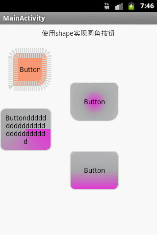
以下是我测试的列子:
- <?xml version="1.0" encoding="utf-8"?>
- <!-- visable 提供初始可见性状态,默认为false
- -->
- <shape xmlns:android="http://schemas.android.com/apk/res/android"
- android:visible="true"
- >
- <!-- 圆角
- bottomLeftRadius 右下角 ,bottomLeftRadius是右下角,而不是左下角,这点要注意
- bottomRightRadius 左下角
- radius 角的幅度,值越大,角越圆
- topLeftRadius 左上角
- topRightRadius 右上角
- -->
- <corners
- android:bottomLeftRadius="20dp"
- android:bottomRightRadius="2dp"
- android:radius="5dp"
- android:topLeftRadius="10dp"
- android:topRightRadius="10dp" >
- </corners>
- <!-- 倾斜度,渐变
- startColor 开始颜色
- centerColor中间颜色
- endColor结束颜色
- uselevel 值是true/false 为true表示将被用作levelListDrawable(关于此
- 用来管理一系列轮流交替使用的图片资源,比如电池的电量图标,用不同的图片来显示当前电量等级)
- angle 渐变角度(PS:默认为angle=0时,渐变色是从左向右。 然后逆时针方向转,当angle=90时为从下往上
- 。angle必须为45的整数倍)
- type渐变方式,默认为线形渐变,此外还有曲线渐变,放射渐变
- centerX 渐变中心X点坐标的相对位置(取值范围0-1.0)
- centerY 渐变中心Y点坐标的相对位置(取值范围0-1.0)
- gadientRadius 渐变色半径.当 android:type="radial" 放射渐变时才使用。单独使用
- android:type="radial"会报错。
- -->
- <gradient
- android:startColor="#DBDCDD"
- android:centerColor="#ADADAF"
- android:endColor="#B8B9BB"
- android:useLevel="false"
- android:angle="0"
- android:type="radial"
- android:centerX="0"
- android:centerY="0"
- android:gradientRadius="1">
- </gradient>
- <!--
- 内部边距,即内容与边的距离 ,
- shape内的填充内容距离shape的大小,而不是指shape相对于其他组件的距离 -->
- <padding
- android:left="2dp"
- android:top="2dp"
- android:right="2dp" android:bottom="2dp" />
- <!-- 描述:size: 大小
- 属性:
- android:width 表示形状的宽度
- android:height 表示形状的高度 -->
- <size
- android:width="100dp"
- android:height="80dp">
- </size>
- <!-- solid:实心,就是填充的意思
- android:color指定填充的颜色-->
- <solid
- android:color="#ff9d77"
- >
- </solid>
- <!-- 描述: stroke:描边 相当于html中的盒子模型的border
- 属性:
- android:width 描边的宽度
- android:color 描边的颜色
- android:dashWidth 表示描边的样式是虚线的宽度,
- 值为0时,表示为实线。值大于0则为虚线。
- android:dashGap 表示描边为虚线时,虚线之间的间隔 即“ - - - - ”
- 其中android:dashWidth表示'-'这样一个横线的宽度,android:dashGap表示之间隔开的距离。
- -->
- <stroke
- android:width="20dp"
- android:color="#dcdcdc"
- android:dashWidth="2dp"
- android:dashGap="2dp">
- </stroke>
- </shape>