版权声明: https://blog.csdn.net/qq_39207948/article/details/83627620
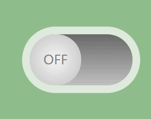
效果演示:
代码部分:
<input type="checkbox" class="toggle">
<div class="inner">
</div>
body{
  margin:0;
  height:100vh;
  background-color:#8FBC8B;
  display:flex;
  justify-content:center;
  align-items:center;/*不设置height的值,垂直居中没效果*/
}
.inner{
  position:relative;
  width:200px;
  height:100px;
  background:linear-gradient(dimgray, silver);
  border-radius:50px;
  box-shadow:0 0 0 15px rgba(255,255,255,0.7);
}
.inner::before{
  content:'OFF';
  font-size:25px;
  color:#808080;
  line-height:100px;
  text-align:center;
  position:absolute;
  left:0px;
  width:100px;
  height:100px;
  background:radial-gradient(whitesmoke ,silver );
  border-radius:48px;
  transition:left 0.5s ease-in-out;
}
.toggle{
  position:absolute;
  width:200px;
  height:100px;
  z-index:3;
  cursor:pointer;
  filter:opacity(0%);
}
.toggle:checked ~ .inner::before{
  content:"ON";
  color:limegreen;
  left:50%;
}
.toggle:checked ~ .inner{
  background:linear-gradient(green,limegreen);
}