我们经常会看到app有很多列表项,但是不同的列表项有不同的形式,今天就这一常用的形式为例,来制作一个改编的list效果图
具体效果如图所示:
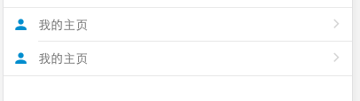
就是这种有隔断的列表,可以将不同的东西归为一类,但是彼此互补干扰,还能很协调的展示出来。
具体的代码如下:
html部分
 <div class="list-group">
    <div class="list-group-item">
      <div class="left">
        <ion-icon name="person"></ion-icon>
      </div>
      <div class="content">
        我的主页
        <div class="right">
          <ion-icon name="ios-arrow-forward"></ion-icon>
        </div>
      </div>
    </div>
    <div class="list-group-item">
      <div class="left">
        <ion-icon name="person"></ion-icon>
      </div>
      <div class="content">
        <!--<a href="#">我的信息</a>-->
        我的主页
        <div class="right">
          <ion-icon name="ios-arrow-forward"></ion-icon>
        </div>
      </div>
    </div>
  </div>
scss部分如下
//自定义列表显示内容
  $height:40px;           //list的总高度
  $content-height:2px;    //list-group-item相对list的差值
  .floatCommon {          //左右浮动元素的公共特性
    width: 10%;
    height: $height - $content-height;
    line-height: $height;    //行高与高度保持一致,使其垂直居中
    display: inline-block;
    text-align: center;
    vertical-align: center;
    color: #1a8bd4;
  }
  .list-group{
    width: 100%;
    height: auto;
    border-top: 1px solid #e8e8e8;  //列表项的整体框架边框
    border-bottom: 1px solid #e8e8e8;
    margin: 10px 0px;

    .list-group-item {
      &>.left{
        @extend .floatCommon;
        float: left;
      }
      &>.content{
        clear: left;
        display: inline-block;
        width: 90%;
        height: $height - $content-height;
        line-height: $height - $content-height;
        color: #666666;
        border-bottom: 1px solid #e8e8e8;
        .right{  //嵌套在里面的float-right
          display: inline-block;
          float: right;
          width: 10%;
          color: #d4d4d4;
          text-align: center;
        }
      }
      //外部浮动到right部分的内容
      &>.right{
        @extend .floatCommon;
        float: right;
      }
      //取消同一list-group-item中最后一个元素的底部边框
      &:last-child{
        .content{
          border-bottom: none;
        }
      }
    }
  }
此处补充一个垂直居中的小技巧,使用line-heightde方式。
即:使line-height与height的高度相等,或者略差分毫就能实现某一内容垂直居中。