code:
<!DOCTYPE html>
<html lang="en">
<head>
<meta charset="UTF-8">
<title>animation-play-state</title>
<style type="text/css">
body { background: #abcdef; }
div { position: relative; width: 760px; height: 760px; margin: auto;
-webkit-transform-style: preserve-3d;
-moz-transform-style: preserve-3d;
-ms-transform-style: preserve-3d;
-o-transform-style: preserve-3d;
transform-style: preserve-3d;
}
div > div { position: absolute; top: 0; right: 0; bottom: 0; left: 0; width: 100%; height: 100%; margin: auto; background-repeat: no-repeat; background-position: center; }
div > .inner { background-image: url(images/circle_inner.png);
-webkit-animation-name: circle_inner;
animation-name: circle_inner;
-webkit-animation-duration: 10s;
animation-duration: 10s;
-webkit-animation-timing-function: linear;
animation-timing-function: linear;
-webkit-animation-delay: 2s;
animation-delay: 2s;
-webkit-animation-iteration-count: infinite;
animation-iteration-count: infinite;
-webkit-animation-direction: alternate;
animation-direction: alternate;
-webkit-animation-fill-mode: forwards;
animation-fill-mode: forwards;
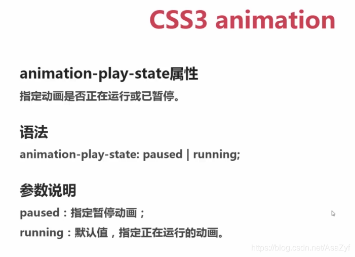
-webkit-animation-play-state: paused;
animation-play-state: paused;
}
div > .middle { background-image: url(images/circle_middle.png);
-webkit-animation-name: circle_middle;
animation-name: circle_middle;
-webkit-animation-duration: 10s;
animation-duration: 10s;
-webkit-animation-timing-function: linear;
animation-timing-function: linear;
-webkit-animation-delay: 2s;
animation-delay: 2s;
-webkit-animation-iteration-count: infinite;
animation-iteration-count: infinite;
-webkit-animation-direction: alternate;
animation-direction: alternate;
-webkit-animation-fill-mode: forwards;
animation-fill-mode: forwards;
-webkit-animation-play-state: paused;
animation-play-state: paused;
}
div > .outer { background-image: url(images/circle_outer.png);
-webkit-animation-name: circle_outer;
animation-name: circle_outer;
-webkit-animation-duration: 10s;
animation-duration: 10s;
-webkit-animation-timing-function: linear;
animation-timing-function: linear;
-webkit-animation-delay: 2s;
animation-delay: 2s;
-webkit-animation-iteration-count: infinite;
animation-iteration-count: infinite;
-webkit-animation-direction: alternate;
animation-direction: alternate;
-webkit-animation-fill-mode: forwards;
animation-fill-mode: forwards;
-webkit-animation-play-state: paused;
animation-play-state: paused;
}
div > .imooc { background-image: url(images/imooc.png); }
@keyframes circle_inner {
from { transform: rotateX(0deg); }
to { transform: rotateX(360deg); }
}
@keyframes circle_middle {
from { transform: rotateY(0deg); }
to { transform: rotateY(360deg); }
}
@keyframes circle_outer {
from { transform: rotateZ(0deg); }
to { transform: rotateZ(360deg); }
}
div:hover > div {
cursor: pointer;
-webkit-animation-play-state: running;
animation-play-state: running;
}
</style>
</head>
<body>
<div>
<div class="inner"></div>
<div class="middle"></div>
<div class="outer"></div>
<div class="imooc"></div>
</div>
</body>
</html>