一、前言
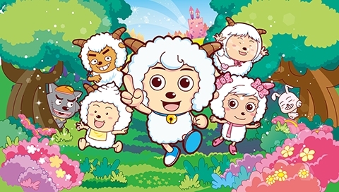
当谈到动画时,我相信大家对他都已经非常熟悉了.比如深受大家喜爱的《喜羊羊与灰太狼》,
还有陪伴过无数90后从童年到青春的《火影忍者》,

然而这些动画是怎么动起来的呢 ,没错,就是通过关键帧!那么关键帧到底是什么呢,各位看官别急,容我细细道来.不知道大家在小时候有没有玩过动画小本,它里面有很多页,每一页都有一张漫画,这些漫画看起来好像并没有什么关联,但是当你快速翻动这些页面的时候,嘿嘿,你就会发现很有意思的东西,就像下图一样

哇塞,他们居然构成了一幅动画,这个动画正好是从第一页逐渐变换到最后一页,想必到这里大家或许已经明白,小本的每一页就是这个动画的关键帧 .
.
二、先说说transform和transition
1.transform
transform是CSS中的转换,它是指元素从一种状态变换到另一种状态,包括rotate()旋转,translate()移动,scale()缩放,skew()倾斜,他们各自的使用如下.
transform:rotate(deg);它是指元素旋转一定的角度,其中的参数可以为正值,也可为负值,正值顺时针旋转,负值逆时针旋转,默认的旋转中心是元素的中心点,请看如下代码
.box{
	width:100px;
	height:100px;
	margin:100px auto 0;
	background-color:#f00;
}
<div class="box">旋转前</div>
.box{ transform:rotate(30deg); width:100px; height:100px; margin:100px auto 0; background-color:#f00; } <div class="box">旋转后</div>
结果如下:
盒子顺时针旋转30度后:
transform:translate(x,y),它是指元素按照给定的参数x和y,从当前位置向右(或向左),向下(或向上)移动,当x为正值时元素向右移动,负值向左移动,当y为正值时元素向下移动,负值向上移动.请看如下代码
.box{
	width:100px;
	height:100px;
	background-color:#f00;
}
.move{
	width:100px;
	height:100px;
	background-color:#0f0;
}
<div class="box">初始</div>
<div class="move">移动前</div>
.box{ width:100px; height:100px; background-color:#f00; } .move{ transform:translate(20px,10px); width:100px; height:100px; background-color:#0f0; } <div class="box">初始</div> <div class="move">移动后</div>
结果如下:
绿色盒子向右移动20px,向下移动10px:
transform:scale(x,y);它是指元素的宽度和高度按照给定的比例(宽度x,高度y)进行缩放,0~1缩小,等于1比例不变,大于1则放大.请看如下代码
.box{
	width:100px;
	height:100px;
	background-color:#f00;
}
<div class="box"></div>
.box{ transform:scale(2,1.5); width:100px; height:100px; background-color:#f00; } <div class="box"></div>
结果如下:
盒子的宽度变为原来的2倍,高度变为原来的1.5倍:
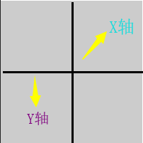
transform:skew(xdeg,ydeg);它是指元素按照给定的角度,围绕x轴和y轴翻转(xdeg是围绕x轴翻转的角度,ydeg是围绕y轴翻转的角度),咦
,那么他们到底是怎么样的呢,嘿嘿,我们可以联系生活中的场景
,请往下看:
rotatex()
看到上面的烤全羊大家是不是都流口水了
,在烤全羊的时候是不是要进行旋转,而其旋转的方式就是围绕上图中的红线,也就是X轴,其实元素的rotatex()也是如此,大家可以把上面的烤全羊想象成元素,那么他的rotatex()就像下图:
rotatey(()
上面的小姐姐在做什么,大家肯定都知道,不就是钢管舞吗
,小姐姐绕着钢管进行旋转,摆出各种各样优美的姿势
到这里,我相信大家都已经理解rotatex()和rotatey()了,那么skew跟rotate有什么不同呢,各位看官请接着往下看,
skewx()
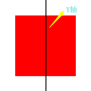
skewx()是元素围绕x轴倾斜给定的角度,但是这里的x轴却跟rotatex()的x轴却不一样,在rotatex()中,x轴是水平的,y轴是垂直的,但是在skewx()中,x轴却是垂直的,y轴是水平的,俗话说一图胜千言,为了更好地理解skewx(),请看下图:
当元素围绕X轴倾斜30度的时候,也就是skewx(30deg),请看他发生的变化:
在上图中灰色盒子是初始的状态,红色盒子是围绕X轴倾斜30度的状态,大家可以发现,元素原本与X轴平行的边都与X轴形成30度的角度,但是Y轴却保持不变,并且变换前和变换后盒子的面积是不变的,所以元素围绕X轴倾斜30度之后就是红色盒子的状态.
skewy()
skewy()和skewx()是相同的道理,只不过元素围绕X轴倾斜变成围绕Y轴倾斜,对于skewy(30deg),请看下图:
元素原本与Y轴平行的边都与Y轴形成30度的角度,但是X轴却保持不变,并且变换前和变换后盒子的面积不变,所以元素围绕Y轴倾斜30度之后就是红色盒子的状态.
2.transition
transition是动画过度的意思,在上面已经简单的讲了transform的一些属性和使用方法,你可能会发现上面所有的transform变换都是瞬间完成的,显得非常的干涩,那么如何让它具有一定的变换时间,让它变得柔滑,此时transition就派上用场了.
(1)没有transition属性的图片旋转效果
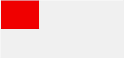
.box{
	width:290px;
	height:290px;
	margin:100px auto 0;
	background:url("images/1.jpg") no-repeat;
}
.box:hover{
	transform:rotate(180deg)
}
<div class="box"></div>
(2)具有transition过度属性的图片旋转效果
.box{
	transition-duration:2s;
	width:290px;
	height:290px;
	margin:100px auto 0;
	background:url("images/1.jpg") no-repeat;
	}
.box:hover{
	transform:rotate(180deg)
}
<div class="box"></div>
transition是一个复合属性,他的属性值如下:
transition-property:
规定设置过渡效果的 CSS 属性的名称.给你想要的属性设置过度,例如width,background-color等等.仅给元素宽度设置2s过度:
.box{
	transition-property:width;
	transition-duration:2s;
	width:100px;
	height:100px;
	background-color:#f00;
}
.box:hover{
	width:300px;
	height:200px;
}
<div class="box"></div>
在上图中,元素的宽度发生变化具有2s的过度,但是高度变化瞬间完成,没有过度,
transition-duration:
规定完成过渡效果需要多少秒或毫秒.设置过度的时间可以给元素设置不同的过度时间,单位可以是秒(s),也可以是毫秒(ms).
transition-delay:
定义过渡效果何时开始.设置过度的延迟时间给上图中的元素设置2s的过度延迟:
.box{
	transition-duration:2s;
	transition-delay:2s;
	width:100px;
	height:100px;
	background-color:#f00;
}
.box:hover{
	width:300px;
	height:200px;
}
<div class="box"></div>
transition-timing-function:
规定速度效果的速度曲线.规定元素从一种状态变换到另一种状态的完成方式.举个例子说吧.
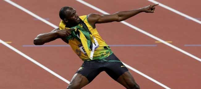
嘿嘿,闪电博尔特大家都知道吧
.我们可以把博尔特当成一个元素,把他从起点到终点看成是一个过渡,过渡属性是从起点到终点的位移,过渡时间是9秒58,他在起跑前是不是得准备一段时间,然后等待裁判的枪响后再起跑,没催,这个就是过渡的延迟,博尔特在起跑后是不是先需要加速一段时间,然后在匀速,最后到达终点呢,哼哼,这就是transition-timing-function啦!那么它具有哪些属性值呢,请往下看:
transition-timing-function:ease(默认值),它是指元素完成动画过度时慢速开始,然后变快,最后慢速结束,这就好比我们坐火车的时候,一开始缓慢出站,然后在途中变快,最后在缓慢进站.
.box{
	transition-duration:2s;
	transition-timing-function:ease;
	width:100px;
	height:100px;
	background-color:#f00;
}
.box:hover{
	width:300px;
	height:200px;
}
<div class="box"></div>
transition-timing-function:linear,它是指元素以匀速完成动画过度,这就跟物理里面的匀速运动是一回事.
.box{ transition-duration:2s; transition-timing-function:linear; width:100px; height:100px; background-color:#f00; } .box:hover{ width:300px; height:200px; } <div class="box"></div>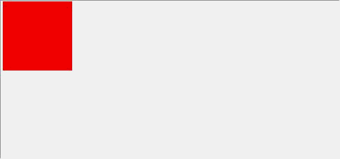 transition-timing-function:ease-in,它是指元素在动画过度时缓慢开始,这就好比火车缓慢出站.
.box{
	transition-duration:2s;
	transition-timing-function:ease-in;
	width:100px;
	height:100px;
	background-color:#f00;
}
.box:hover{
	width:300px;
	height:200px;
}
<div class="box"></div>
transition-timing-function:ease-out,它是指元素在动画过度时缓慢结束,这就好比火车缓慢进站..box{ transition-duration:2s; transition-timing-function:ease-out; width:100px; height:100px; background-color:#f00; } .box:hover{ width:300px; height:200px; } <div class="box"></div>
transition-timing-function:ease-in-out,它是指元素在动画过度时缓慢开始并且缓慢结束.
.box{
	transition-duration:2s;
	transition-timing-function:ease-in-out;
	width:100px;
	height:100px;
	background-color:#f00;
}
.box:hover{
	width:300px;
	height:200px;
}
<div class="box"></div>
最后是transition的复合写法:
单属性 transition:property duration timing-function delay;
多属性 transition:property1 duration timing-function delay,property2 duration timing-function delay;
全部属性 transition:all(默认,可省略) duration timing-function delay;
三、嘿嘿,终于到了animation
本文在开头就给大家讲了讲什么是动画,然后在中间又花了很大篇幅谈了谈transform和transition,大家可能会觉得这部分内容与本文半毛钱关系都没有,其实不然.不知道大家有没有发现transform和transition大部分情况都需要配合:hover这个伪类一起使用,于是问题就来了.动画过度只有用户在鼠标滑入的时候才有效果,但是如果想让元素的动画自动执行或者执行n次的话呢,transform和transition显然是不行的,于是乎,嘿嘿,animation就跳出来了(有种you can you up,no can no bb的感觉
好了,接下来言归正传,我们来看看animation到底是嘛玩意
.animation的属性跟transition类似,但多于transition.
- animation-name:动画名称
- animation-duration:规定完成动画所花费的时间,单位可以使秒(s)也可以是毫秒(ms)
- animation-timing-function:规定动画的速度曲线
- animation-delay:规定动画开始执行之前的延迟
- animation-iteration-count:规定动画播放的次数
- animation-direction:规定是否应该轮流反向播放动画
- animation-play-state:规定动画执行的状态
- animation-fill-mode:规定动画的第一帧和最后一帧
不过光有animation是不够的,还需要另一个东西--keyframes(关键帧).大家再回顾一下本文开头提及的动画小本,如果小本的每一页(关键帧)没有内容的话,也就是事先不给每一页(关键帧)添加(定义)内容,我们快速翻动动画小本是不是就看不到内容了呢(每一页都是空白的),原因就是虽然我们有animation(也就是快速翻动),但是小本里面没有内容!
好了,我们现在理清了keyframes和animation的关系(羁绊),那就来认识认识keyframes.
第一种写法:from to,定义第一帧和最后一帧(简易写法)
@keyframes myfirst{ from{} to{} }@keyframes后面接上动画名字(myfirst),花括号里面是定义动画从一种状态到另一种状态..box{ width:100px; height:100px; background-color:#f00; animation-name:myfirst; animation-duration:2s; animation-iteration-count:infinite; } @keyframes myfirst{ from{ width:100px; height:100px; } to{ width:300px; height:150px; } } <div class="box"></div>
第二种写法:百分比%,定义多个动画帧
.box{
	width:100px;
	height:100px;
	background-color:#f00;
	animation-name:myfirst;
	animation-duration:2s;
	animation-timing-function:linear;
	animation-iteration-count:infinite;
}
@keyframes myfirst{
	0%{
		width:100px;
		height:100px;
		background-color:#f00;
	}
	25%{
		width:150px;
		height:100px;
		background-color:#ccc;
	}
	50%{
		width:200px;
		height:150px;
		background-color:#ccc;
	}
	75%{
		width:250px;
		height:200px;
		background-color:#f0f;
	}
	75%{
		width:250px;
		height:200px;
		background-color:#f00;
	}
}
<div class="box"></div>
animation-name,动画名字应该见名之意,比如元素移动动画,animation-name命名为move.
animation-duration,animation-timing-function,animation-delay这几个属性跟transtion相同,就不赘述了.
animation-iteration-count,取值可以使整数,也可以是关键字infinite(无限次).
animation-play-state,默认running(播放),另一个值paused(暂停).
当鼠标滑入元素时动画暂停:
.box{
	width:100px;
	height:100px;
	background-color:#f00;
	animation-name:myfirst;
	animation-duration:2s;
	animation-timing-function:linear;
	animation-iteration-count:infinite;
}
.box:hover{
	animation-play-state:paused;
}
@keyframes myfirst{
	0%{
		width:100px;
		height:100px;
		background-color:#f00;
	}
	25%{
		width:150px;
		height:100px;
		background-color:#ccc;
	}
	50%{
		width:200px;
		height:150px;
		background-color:#ccc;
	}
	75%{
		width:250px;
		height:200px;
		background-color:#f0f;
	}
	75%{
		width:250px;
		height:200px;
		background-color:#f00;
	}
}
<div class="box"></div>
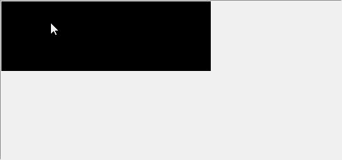
animation-fill-mode:none(默认值),元素从原始状态→动画→原始状态.box{ width:100px; height:100px; background-color:#f00; animation-name:myfirst; animation-duration:5s; animation-timing-function:linear; animation-delay:2s; animation-iteration-count:1; animation-fill-mode:none; } .box:hover{ animation-play-state:paused; } @keyframes myfirst{ 0%{ width:300px; height:100px; background-color:#000; } 25%{ width:150px; height:100px; background-color:#ccc; } 50%{ width:200px; height:150px; background-color:#ccc; } 75%{ width:250px; height:200px; background-color:#f0f; } 100%{ width:250px; height:200px; background-color:#ff0; } } <div class="box"></div> animation-fill-mode:forwards,元素从原始状态→动画→停留在动画最后一帧
将上面代码中的animation-fill-mode:none;改为animation-fill-mode:forwards;
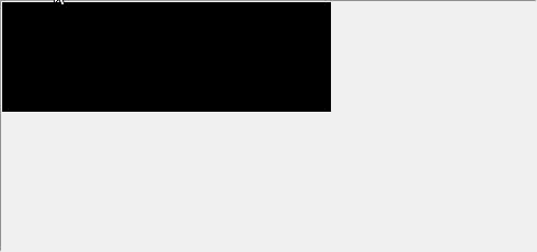
animation-fill-mode:backwards,元素从动画帧0%开始→动画→原始状态
将上面代码中的animation-fill-mode:none;改为animation-fill-mode:backwards;
大家注意它与animation-fill-mode的区别,在animation-fill:none中,元素从初始状态(背景颜色为红色),经过2s的延迟后进入动画帧0%(背景颜色为黑色),然后进入动画过程,最后停留在初始状态.而在animation-fill-mode:backwards中,元素从动画帧0%(背景颜色为黑色),经过2s延迟,进入动画过程,最后停留在初始状态.
最后一个就是animation-fill-mode:both,元素从动画帧0%开始→动画→停留在动画帧100%
将上面代码中的animation-fill-mode:none;改为animation-fill-mode:both;
四、最后
到这里,本文的内容已经写完了,衷心感谢大家能够耐心的读完
,由于本人能力有限,有什么不当之处恳请各位大佬指出
.