Animation
前言
好的前端工程师,会更注重用户的体验和交互。那么动画就是将我们的静态页面,变成具有灵动性,为我们的界面添加个性的一种方式。
下面是七喜的官方主页,它就是很好的富交互样例。鼠标移动到导航栏,就会播放多种动效,给用户一种酷炫的体验。我觉得用户体验,才是前端工程师更加关注的问题,而不是一味追求Javascript的编码技能。

Animation 组成
CSS3 Animation 是由三部分组成。
1.关键帧(@keyframes)
- 关键帧(keyframes) - 定义动画在不同阶段的状态。
- 动画属性(properties) - 决定动画的播放时长,播放次数,以及用何种函数式去播放动画等。(可以类比音视频播放器)
- css属性 - 就是css元素不同关键帧下的状态。
下面我们来看一个例子。
创建了一个@keyframes命名为dropdown。
- 关键帧主要分为3个阶段,0%、50%、100%。
- 动画播放时长为6s、循环播放(infinite)、以linear方式进行播放。
- 修改的元素属性为margin-top
.list div:first-child {
 animation: dropdown 8s linear infinite;
}
@keyframes dropdown {
    0% { margin-top: 0px;}
   /** 暂停效果 */
   10% { margin-top: 0px;}
   50% { margin-top: -100px;}
   60% { margin-top: -100px;}
   90% { margin-top: -200px;}
  100% { margin-top: -200px;}
}
需要注意!当属性的个数不确定时:
当我们在定义不同关键帧,元素属性的个数是一个变化的值。
如果一个关键帧的属性,没有出现在其他关键帧的时候,那么这些属性将会使用上一帧的默认值。
区别在于,缺省之后的渐变效果是不会出现的。比如下面两种写法,
  @keyframes dropdown {
    0% { top: 0; }
    30% { top: 300px; }
    50% { top: 150px; }
    70% { top: 300px; }
    80% { top: 0px;  left:-200px;}
    100% { top: 0px;  }
  }

  @keyframes dropdown {
    0% { top: 0; left:0px;}
    30% { top: 300px; left:0px;}
    50% { top: 150px; left:0px;}
    70% { top: 300px; left:0px;}
    80% { top: 0px;  left:-200px;}
    100% { top: 0px;  left:0px;}
  }
语法
@keyframes keyframes-name {
[ [ from | to | <百分比> ] [, from | to | <百分比> ]* block ]*
}
keyframes-name
帧列表的名称。 名称必须符合 CSS 语法中对标识符的定义。
from
等效于 0%.
to
等效于 100%.扫描二维码关注公众号,回复: 2365868 查看本文章
2.动画属性
动画属性可以理解为播放器的相关功能,一个最基本的播放器应该具有:播放/暂停、播放时长、播放顺序(逆序/正序/交替播放)、循环次数等。
主要也分为两大点:
- 指定播放的元素
- 定义播放信息的配置

简写属性形式:
animation:
[animation-name] [animation-duration] // 动画的名称、持续时间
[animation-timing-function][animation-delay] // 关于时间的函数(properties/t)、延迟时间
[animation-iteration-count] [animation-direction] // 播放次数、播放顺序
[animation-fill-mode] [animation-play-state]; // 播放前或停止后设置相应样式、控制动画运行或暂停
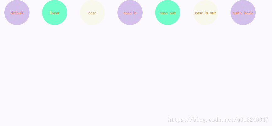
1.时间函数(animation-timing-function)
animation-timing-function属性定义了动画的播放速度曲线。
可选配置参数为:
ease、
ease-in、
ease-out、
ease-in-out、
linear、
cubic-bezier(number, number, number, number)
动画源码
默认值,如果没有显示写调用的函数,则默认为ease。
2.动画方向(animation-direction)
animation-direction属性表示CSS动画是否反向播放。
可选配置参数为:
single-animation-direction = normal | reverse | alternate | alternate-reverse
- animation-direction: normal 正序播放
- animation-direction: reverse 倒序播放
- animation-direction: alternate 交替播放
- animation-direction: alternate-reverse 反向交替播放
- animation-direction: normal, reverse
- animation-direction: alternate, reverse, normal

3.动画延迟(animation-delay)
animation-delay属性定义动画是从何时开始播放,即动画应用在元素上的到动画开始的这段时间的长度。
默认值0s,表示动画在该元素上后立即开始执行。
该值以秒(s)或者毫秒(ms)为单位。
4.动画迭代次数(animation-iteration-count)
animation-iteration-count该属性就是定义我们的动画播放的次数。次数可以是1次或者无限循环。
默认值只播放一次。
single-animation-iteration-count = infinite | number
5.动画填充模式(animation-fill-mode)
animation-fill-mode是指给定动画播放前后应用元素的样式。
single-animation-fill-mode = none | forwards | backwards | both
- animation-fill-mode: none 动画执行前后不改变任何样式
- animation-fill-mode: forwards 保持目标动画最后一帧的样式
- animation-fill-mode: backwards 保持目标动画第一帧的样式
- animation-fill-mode: both 动画将会执行 forwards 和 backwards 执行的动作。
6.动画播放状态(animation-timing-function)
animation-play-state: 定义动画是否运行或者暂停。可以确定查询它来确定动画是否运行。
默认值为running
single-animation-timing-function = running | paused
- running 动画正常播放
- paused 动画暂停播放
分享一些CSS3动效网站:
Animation.css 一个很全的CSS3的动效库,可以尝试看看源码进行学习。
CreateJS 里面的特效做得也很不错,有很多酷炫的样例。
国外css3网页 布局很优雅的网站
USAToday 也是一个很酷炫的国外网站
peekabeat 很清爽的界面
heartbeat 交互很棒的网站
dances 貌似是交响乐的网站主页
reative 很有时代感的网站
animation 在线animation编辑器