Plotting Graphic
Layout
par(mfrow=c(1,2))

plot( thickness, torsion_disp, xlab= "Steel Plate Thickness (mm)", ylab="Torsion Stiffness Scenario Displacement (mm)")
lines(lowess(thickness, torsion_disp), col = "red" )

plot( thickness, mass, xlab= "Steel Plate Thickness (mm)", ylab="BIW Mass (Kg)")
lines(lowess(thickness, mass), col = "red" )
Make a pdf graphic[3]
pdf("my_plot.pdf", width=6, height=4)
plot(1:10)
dev.off()
Organizing the plotting commands in a function
fig.myplot <- function() {
  plot(1:10)
  points(runif(100, 1, 10), runif(100, 1, 10), col=rainbow(100))
  abline(h=5)
  title(main="My lovely plot")
}
pdf("my_plot.pdf", width=6, height=4)
fig.myplot()
dev.off()
Save graphic as a jpg file
filename <- paste( "D:\\scatter", ".jpg" )
jpeg(  filename  );
plot( mass, disp, xlab= "Mass (Kg)", ylab="Displacement (mm)")
lines(lowess(mass, disp), col = "blue" )
abline( lm(disp~mass), col = "red")
Title and Axis Label
An example from [3]
    plot(1:10, xlab="", ylab="")
    xlab <- expression(paste("Photosynthetic rate (", mu, " mol ", m^-2, s^-1, ")"))
    ylab <- "Photosynthetic rate (u mol m^-2 s^-1)"
    mtext(xlab, 1, 3)
    mtext(ylab, 2, 3)
    title(main="Doesn't the x axis label look nice?")
Draw points
points( x, y,pch=19,col="red");直方图
在R语言环境中绘制直方图可以使用 hist, plot和ggplot2等
hist
语法
hist(x, breaks = "Sturges",
     freq = NULL, probability = !freq,
     include.lowest = TRUE, right = TRUE,
     density = NULL, angle = 45, col = NULL, border = NULL,
     main = paste("Histogram of" , xname),
     xlim = range(breaks), ylim = NULL,
     xlab = xname, ylab,
     axes = TRUE, plot = TRUE, labels = FALSE,
     nclass = NULL, warn.unused = TRUE, …)
参数
x – 数组, 包含histogram所要展示的数据(a vector of values for which the histogram is desired.)
breaks, 可为以下几种类型:
- 数组 – 包含histogram单元分隔点(a vector giving the breakpoints between histogram cells)
- 函数 – 用于计算分割点数组(a function to compute the vector of breakpoints)
- 数 – 设定histogram中单元数量(a single number giving the number of cells for the histogram)
- 字符串 – 指定计算histogram中单元数量的算法 (a character string naming an algorithm to compute the number of cells)
- 函数 – 计算histogram单元数量(a function to compute the number of cells)
freq – 逻辑(布尔型)变量.
- True – the histogram graphic is a representation of frequencies, the counts component of the result
- False – probability densities, component density, are plotted (so that the histogram has a total area of one)
probability
an alias for !freq, for S compatibility.include.lowest
logical; if TRUE, an x[i] equal to the breaks value will be included in the first (or last, for right = FALSE) bar. This will be ignored (with a warning) unless breaks is a vector.right
logical; if TRUE, the histogram cells are right-closed (left open) intervals.density
the density of shading lines, in lines per inch. The default value of NULL means that no shading lines are drawn. Non-positive values of density also inhibit the drawing of shading lines.angle
the slope of shading lines, given as an angle in degrees (counter-clockwise).扫描二维码关注公众号,回复: 3894791 查看本文章
col
a colour to be used to fill the bars. The default of NULL yields unfilled bars.border
the color of the border around the bars. The default is to use the standard foreground color.main, xlab, ylab
these arguments to title have useful defaults here.xlim, ylim
the range of x and y values with sensible defaults. Note that xlim is not used to define the histogram (breaks), but only for plotting (when plot = TRUE).axes
logical. If TRUE (default), axes are draw if the plot is drawn.plot
logical. If TRUE (default), a histogram is plotted, otherwise a list of breaks and counts is returned. In the latter case, a warning is used if (typically graphical) arguments are specified that only apply to the plot = TRUE case.labels
logical or character string. Additionally draw labels on top of bars, if not FALSE; see plot.histogram.nclass
numeric (integer). For S(-PLUS) compatibility only, nclass is equivalent to breaks for a scalar or character argument.warn.unused
logical. If plot = FALSE and warn.unused = TRUE, a warning will be issued when graphical parameters are passed to hist.default().
样例
样例 1 – 使用hist
# 准备数据
data<-rnorm(n=1000, m=24.2, sd=2.2)
# 绘制直方图
hist(data)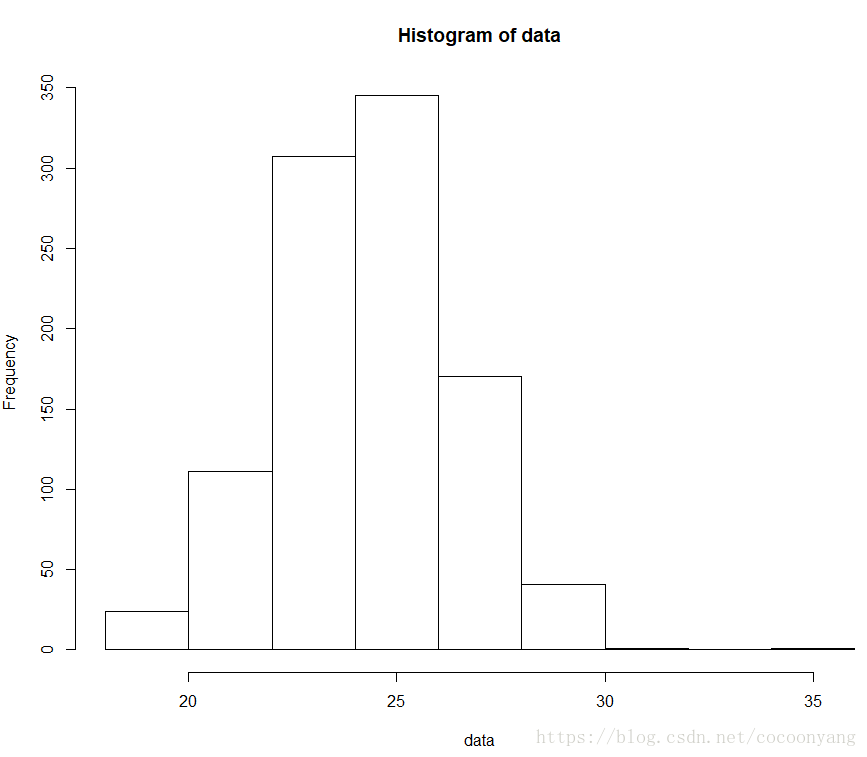
样例 2 – 使用hist - 调整数据间隔数量
# 准备数据
data<-rnorm(n=1000, m=24.2, sd=2.2)
# 绘制直方图
hist(data, breaks=30)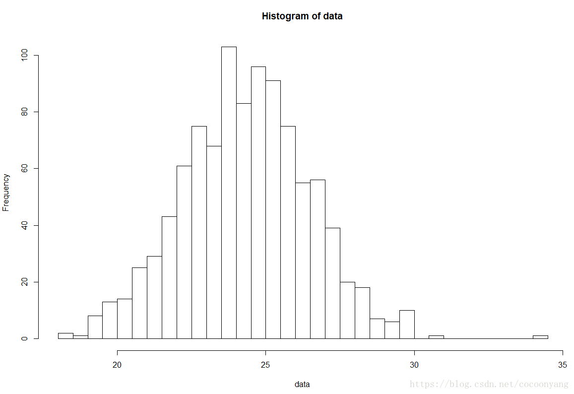
样例 3 – 使用hist - 分布密度直方图
# 准备数据
data<-rnorm(n=1000, m=24.2, sd=2.2)
# 绘制直方图
hist(data, freq=FALSE) 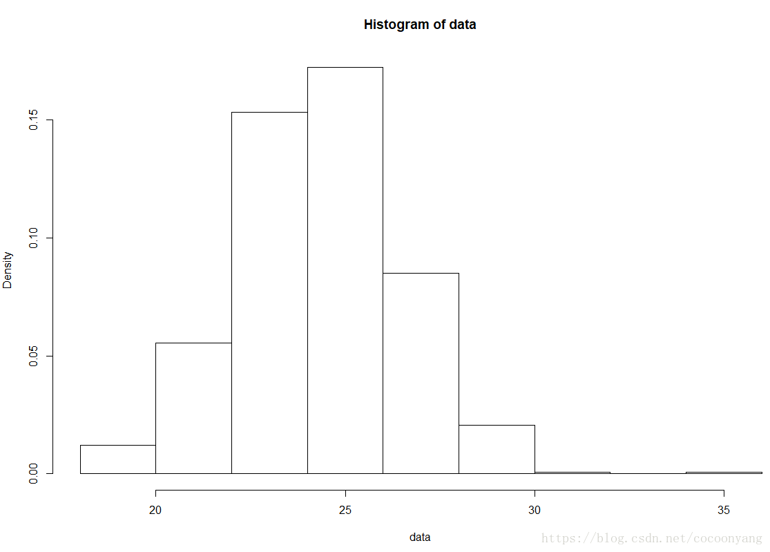
样例 4 – 使用hist - 分布密度直方图 + 密度分布曲线
# 准备数据
data<-rnorm(n=1000, m=24.2, sd=2.2)
# 绘制直方图
hist( data, freq = FALSE, ylim = c(0, 0.2))
curve(dnorm(x, mean=mean(data), sd=sd(data)), col = 2, lty = 2, lwd = 2, add = TRUE)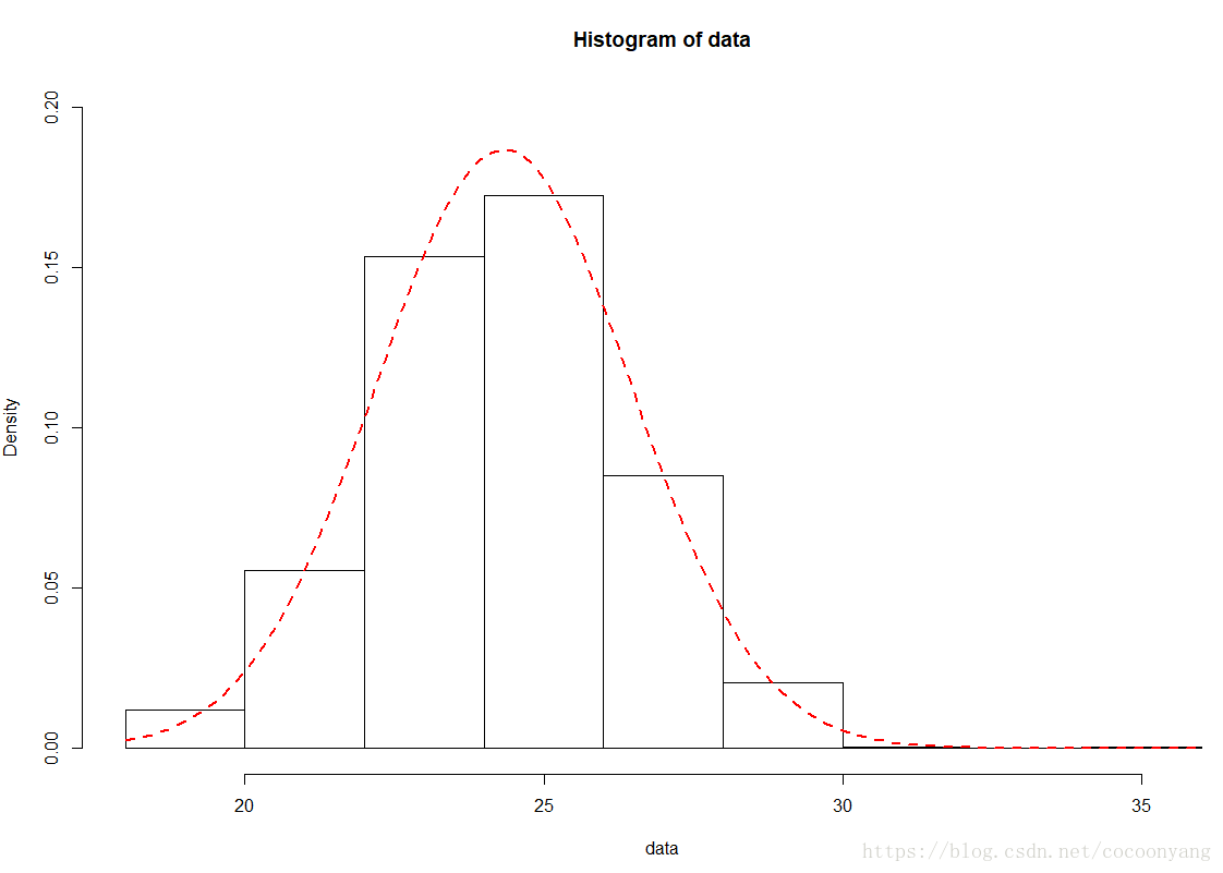
样例 5 – 使用hist - 分布频度直方图 + 色彩
# 准备数据
data<-rnorm(n=1000, m=24.2, sd=2.2)
# 绘制直方图
colors = c("red", "yellow", "green", "violet", "orange",  "blue", "pink", "cyan")
hist(data, right=FALSE, col=colors, main="Data Distrubution", xlab="x data") 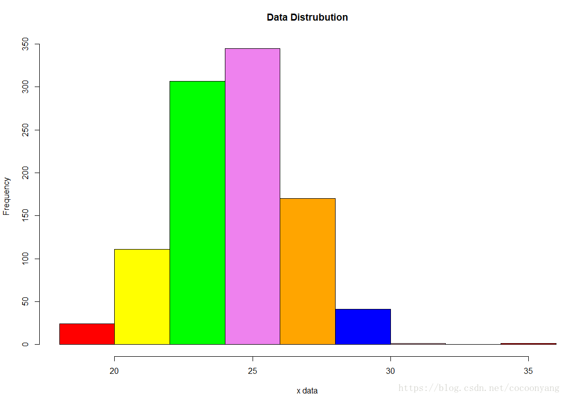
样例 6 – 使用hist - 分布频度直方图 + label
# 准备数据
data<-rnorm(n=1000, m=24.2, sd=2.2)
# 绘制直方图
colors = c("red", "yellow", "green", "violet", "orange",  "blue", "pink", "cyan")
h <-hist(data,  right=FALSE, col=colors, main="Data Distrubution",  xlab="x data")
text(h$mids,h$counts,labels=h$counts, adj=c(0.5, -0.5))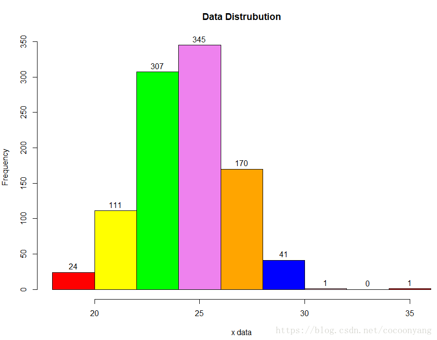
样例 7 – 使用hist - 两个分布频度直方图
# 准备数据
data1<-rnorm(n=1000, m=24.2, sd=2.2)
data2<-rnorm(n=1000, m=34.2, sd=2.2)
# 绘制直方图
hist( data1, freq = FALSE, ylim = c(0, 0.20), xlim=c(15, 45), col='skyblue', main="Histogram of Data",  xlab="data")
hist( data2, freq = FALSE, ylim = c(0, 0.20), add=T, col='red')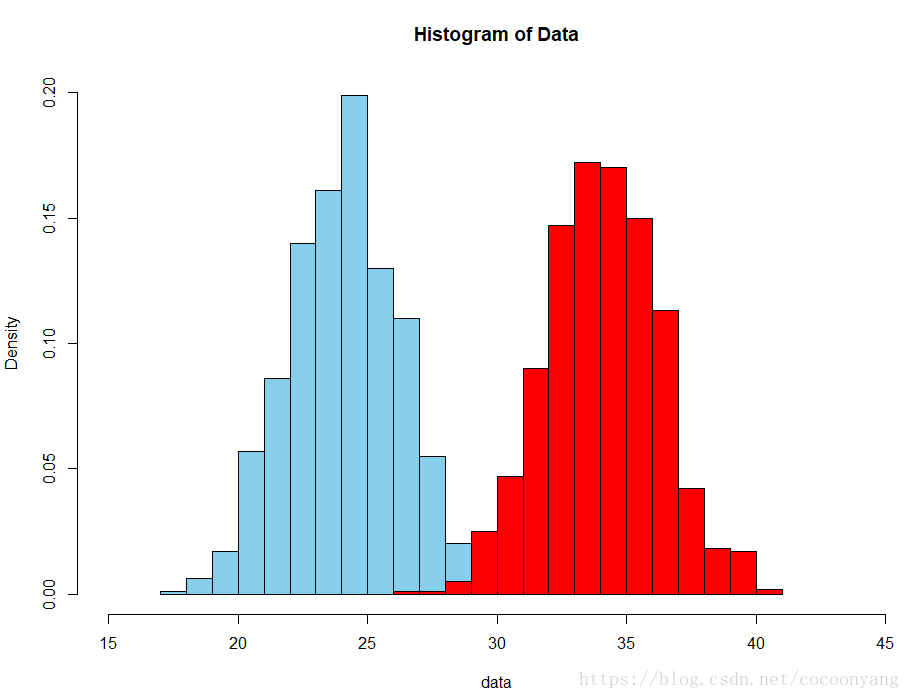
样例 8 – 使用hist - 两个分布频度直方图 + 透视色
# 准备数据
data1<-rnorm(n=1000, m=24.2, sd=2.2)
data2<-rnorm(n=1000, m=34.2, sd=2.2)
# 绘制直方图
hist( data1, freq = FALSE, ylim = c(0, 0.20), xlim=c(15, 45), border=T, col='skyblue', main="Histogram of Data",  xlab="data")
hist( data2, freq = FALSE, ylim = c(0, 0.20), add=T, border=T, col=rgb(0, 1, 0, 0.5))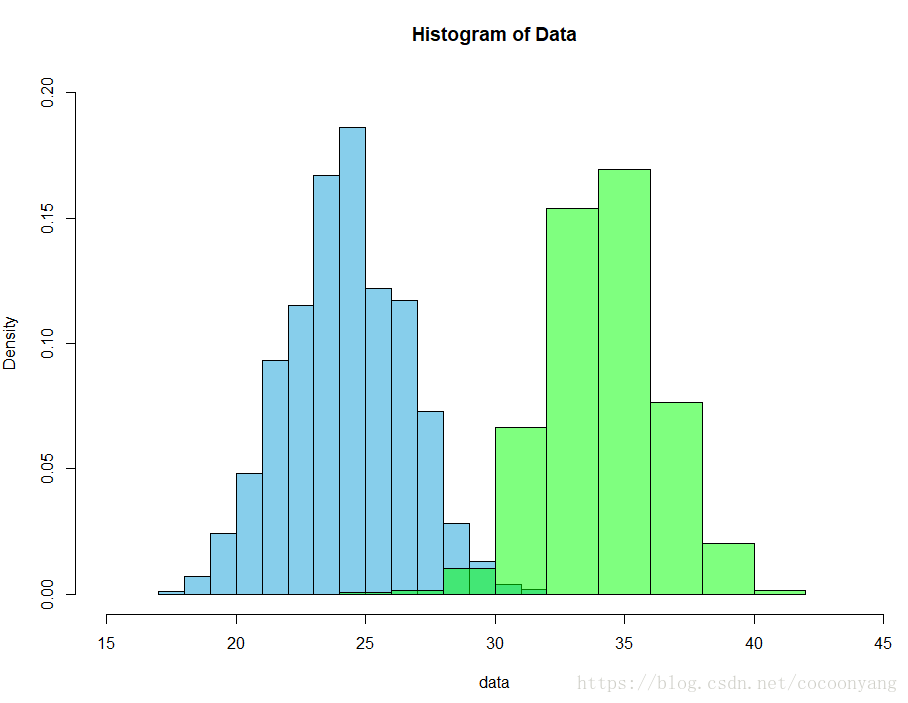
plot
样例
样例 9 – 使用plot - 两个分布频度直方图
# 准备数据
data1<-rnorm(n=1000, m=24.2, sd=2.2)
data2<-rnorm(n=1000, m=34.2, sd=2.2)

p1 <- hist(data1,  plot=FALSE)
p2 <- hist(data2,  plot=FALSE)
# 绘制直方图
plot(0,0,type="n",xlim=c(15,45),ylim=c(0,200),xlab="x",ylab="freq",main="Two histograms")
plot(p1,col="green",density=10,angle=135,add=TRUE)
plot(p2,col="blue",density=10,angle=45,add=TRUE)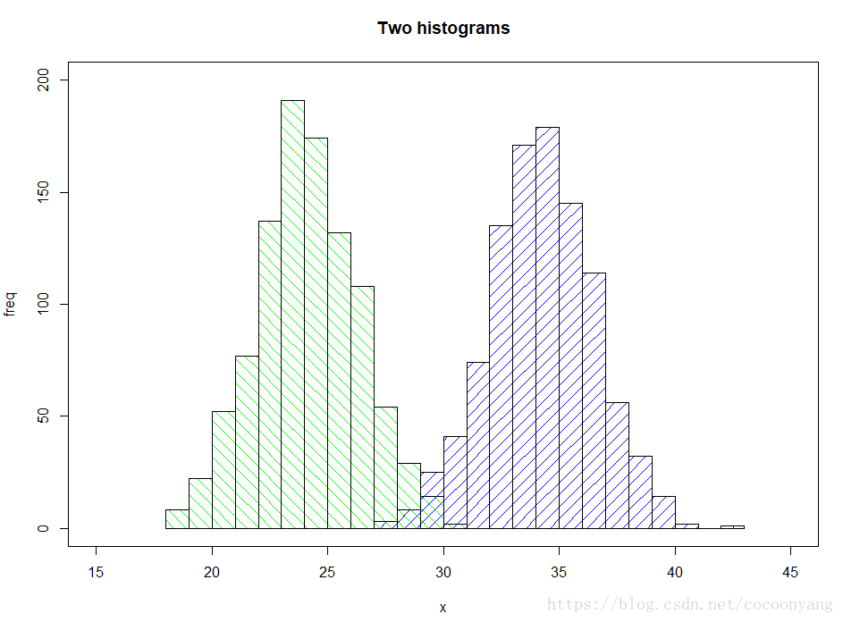
样例 10 – 使用plot - 两个分布密度曲线图
# 准备数据
data1<-rnorm(n=1000, m=24.2, sd=2.2)
data2<-rnorm(n=1000, m=34.2, sd=2.2)
## 计算分布密度
densdata1 <- density(data1)
densdata2 <- density(data2)
##
xlim <- range(densdata2$x,densdata1$x)
ylim <- range(0,densdata2$y, densdata1$y)
#pick the colours
data1Col <- rgb(1,0,0,0.2)
data2Col <- rgb(0,0,1,0.2)
##
plot(densdata1, xlim = xlim, ylim = ylim, xlab = 'data',
     main = 'Distribution of data2 and data2',
     panel.first = grid())
#
polygon(densdata1, density = -1, col = data1Col)
polygon(densdata2, density = -1, col = data2Col)
## 标题
legend('topleft',c('data1','data2'),
       fill = c(data1Col, data2Col), bty = 'n',
       border = NA)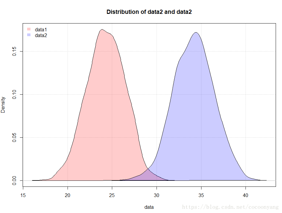
ggplot
样例
样例 11 – 使用ggplot2 - 分布密度曲线
安装
install.packages("ggplot2")library(ggplot2)
# 准备数据
data<-rnorm(n=1000, m=24.2, sd=2.2)
# 分布密度曲线
ggplot(data=NULL, aes(x=data)) + geom_density()
样例 12 – 使用ggplot2 - 两个分布密度曲线
library(ggplot2)
# 准备数据
data1 <- data.frame( length = rnorm(n=1000, m=24.2, sd=2.2) )
data2 <- data.frame( length = rnorm(n=1000, m=34.2, sd=2.2) )

data1$veg <- 'A'
data2$veg <- 'B'

vegLengths <- rbind(data1, data2)

ggplot(vegLengths, aes(length, fill = veg)) + geom_density(alpha = 0.2)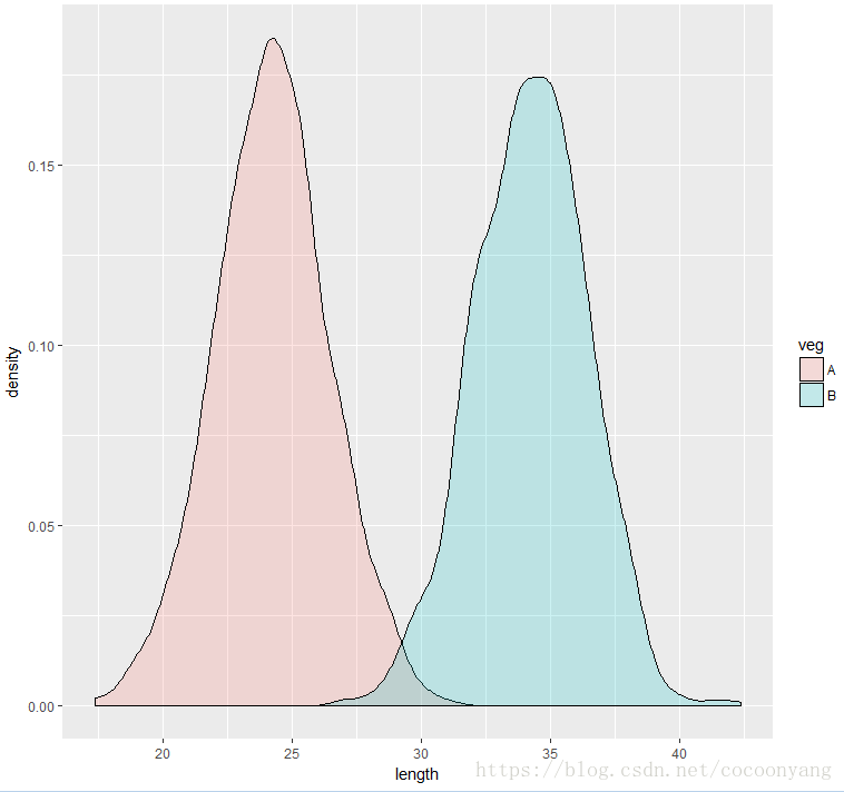
Functions in R Language
Defining functions
functionName <- function( parameter1, parameter2 )
{
#   code
    return ( results )
}

# Call the function
print( functionName( 1, 2, 3 ) )
Array
Iterating an array
As in many other programming languages, you repeat an action for every entry of a vector through a for loop[1].
for(i in values){
  ... do something ...
}
samples <- c(rep(1:10))
baseList <- c(1,2,3,4,5)
XList = list()
YList = list()
ZList = list()
for ( i in baseList)
{
x = baseList[i]
tmp = sin(x);
XList[i] = tmp
tmp = x*x
YList[i] = tmp
}seq_along creates a sequence from 1 up to the length of its input[2]:
pp <- c("Peter", "Piper", "picked", "a", "peck", "of", "pickled", "peppers")
for(i in seq_along(pp)) print(pp[i])
for (id in c(1,2,3,4,5)){
print(paste("This is", id))
}for (id in c(1:5)){
print(paste("This is", id))
}调用R程序
在node.js 环境中调用 R程序
//-----------------------------------
//   Modules
//-----------------------------------
const cp = require('child_process');


//
//  Variables
//
var r_script_file_path = './statis.r'
var resultPath = './result.txt';
const R_Path = "D:\\R\\R-3.4.1\\bin\\x64\\R.exe"


//-----------------------------------
//   Methods
//-----------------------------------

//  Run R jobs
//
function runRcode( thefilename )
{
    console.log( Date() )
    console.log( '      --  R statisitc analysis --    ' ) ;
    var command = R_Path + ' CMD BATCH --vanilla --slave ' + thefilename + ' ' + resultPath ;
    cp.execSync( command );
    console.log(  command ) ;
}


//-----------------------------------
// Main process
//-----------------------------------

try{
    runRcode( r_script_file_path );

} catch( exception )
{
    console.log( exception );
}
[1] R in Action, http://www.statmethods.net/graphs/
[2] https://www.stat.auckland.ac.nz/~paul/RG2e/
[3] https://nicercode.github.io/guides/plotting/
[4] http://bxhorn.com/r-graphics-plot-parameters/#anatomy-of-a-plot
[5] https://www.rdocumentation.org/packages/graphics/versions/3.4.3/topics/hist
[6] http://www.r-tutor.com/elementary-statistics/quantitative-data/histogram
[7] https://www.r-bloggers.com/basics-of-histograms/
[8] https://stackoverflow.com/questions/3541713/how-to-plot-two-histograms-together-in-r
[9] http://ggplot2.org/
[10] http://www.cookbook-r.com/Graphs/Plotting_distributions_(ggplot2)/
[11] http://www.dummies.com/programming/r/how-to-loop-through-values-in-r/
[12] https://www.safaribooksonline.com/library/view/learning-r/9781449357160/ch04.html