一、可视化
-
城市道路网络的珊瑚图 Coral-like cities to show road networks
https://flowingdata.com/2018/10/01/coral-like-cities-to-show-road-networks/
Craig Taylor from Ito World used a coral metaphor to visualize road networks in major cities around the world: For the past six months I have been fascinated by the concept of making city networks …
-
用绘制台风图的方式绘制足球传球路线
Football Wind Maps |
http://www.hilltop-analytics.com/2018/08/football-wind-maps/
Football Wind Maps admin Football , General , RStats No comments yet I’ve had this project in mind for quite a while because it merges some weather data visualisation that appeals to my inner paraglider pilot, with football stats. Wind maps like these have become quite common, starting with static images and progressing into genuinely useful tools like windy.com . I wondered if something similar might be possible using football passing data. The way that these visualisations work is to drop random particles onto the map and then move them in the direction the wind is blowing, to create a path. Do it with lots of particles and you get a pretty visual describing wind direction.
-
2018年6月最佳可视化合集
Best of the visualisation web... June 2018 - Visualising Data
http://www.visualisingdata.com/2018/09/best-of-the-visualisation-web-june-2018/
-
2018年5月最佳可视化合集
Best of the visualisation web... May 2018 - Visualising Data
http://www.visualisingdata.com/2018/07/best-visualisation-web-may-2018
-
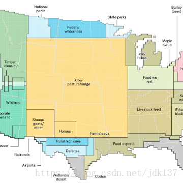
美国如何使用它的土地 非常有意思,1/3的国土用于饲养家畜
How America Uses its Land - Blog About Infographics and Data Visualization - Cool Infographics
http://coolinfographics.com/blog/2018/8/21/how-america-uses-its-land.html
America's land use is very diverse and scattered throughout the states. By using surveys, satel...
-
鸟声的可视化 收集数千种鸟叫
https://experiments.withgoogle.com/ai/bird-sounds/view/
BIRD SOUNDS Thousands of bird sounds visualized using machine learning. EXPLORE ABOUT THIS PROJECT
-
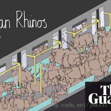
可放在一节车厢中的7种濒危物种
Seven endangered species that could (almost) fit in a single train carriage
https://www.theguardian.com/environment/gallery/2018/sep/17/endangered-species-on-a-train
Some species are so close to extinction, that every remaining member can fit on a New York subway carriage (if they squeeze)
-
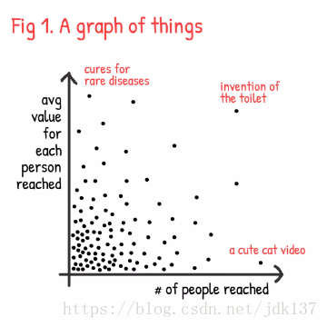
探讨我们作品的“价值”
Considering the “valuable-ness” of the things we make
https://flowingdata.com/2018/08/30/considering-the-valuable-ness-of-the-things-we-make/
Nicky Case ponders the “valuable-ness” of the things he makes as the product of the number of people reached and the average value for each person reached. Finding the balance is tricky…
-
各年龄段人的死因可视化 Shifting Causes of Death
https://flowingdata.com/2018/10/02/shifting-death/
The most common causes of death changed over the years. They vary across sex and age group. This animation shows the details of these changes.
-
种种曲线拟合,哈哈 xkcd: Curve-fitting messages
https://flowingdata.com/2018/09/20/xkcd-curve-fitting-messages/
xkcd tells it like it is.
二、 工具和资源
1. Morph, an open-source tool for data-driven art without code 制作数据抽象艺术的开源工具
Morph, by Datavized in collaboration with the Google News Initiative, is a tool to generate abstract images from data:
2. Google Dataset Search now in public beta 谷歌数据搜索
https://flowingdata.com/2018/09/06/google-dataset-search-now-in-public-beta/
Datasets are scattered across the web, tucked into cobwebbed corners where nobody can find them. Google Dataset Search aims to make the process easier: Similar to how Google Scholar works, Dataset …
三、教程
https://journalismcourses.org/DE0618.html
四、其他
1、谷歌地图的前世今生
乱象,印迹 » Keyhole, Google Maps前传
http://www.luanxiang.org/blog/archives/2348.html
Wired长文:苏联秘密地图的故事


