一、可视化
1. 2018年“信息之美奖” 公布,水平比往年又提升了很大一个档次。
https://mp.weixin.qq.com/s/NFJyFvzAl2SLA4_vXtiAbw
纽约时间12月4日晚,2018年“信息之美奖”揭晓。来自21个类别的33部作品,分别获得各类别的金银铜大奖和单项奖。“信息之美奖”的设立嘉奖了信息与数据可视化的优秀作品,也鼓励了将复杂信息简单化的操作方法,是此领域最知名的奖项之一。这些获奖作品无疑给大数据时代下的新闻业带来了新的启示,为新闻从业者提供了如何传递信息的新理念。 独家分析 RUC新闻坊独家分析获奖作品特点: 1.看重作品呈现的创意设计 获得金奖的作品在可视化技术的实现难度上未必比其他作品更复杂,但在创意上却匠心独运,给人带来惊喜。如艺术、娱乐和文化类的金奖作品对采用类似毕加索绘画风格的方式展现毕加索的作品,堪称“神”还原。获得地图、地点和空间类别金奖的作品将美国地图做背景,用结合地图背景的树图来展现美国人如何使用土地这一宏大主题,直观而令人印象深刻。而人类、语言和身份类别金奖作品则采用年轮的创意设计来展现美国移民数据的历史变化,创意让人惊喜。 2. 可视化的应用场景越来越 广阔,着重为人们在生活中展现和探索信息服务 如休闲、游戏和运动类别金奖作品将足球场的观众声浪作可视化来和赛场赛况结合分析,在技术应用上颇具新意,且提供了“听”比赛的独特视角。获得非寻常类别金奖的作品重在让人们从不同的角度观察城市,探索可视化能带来的不同可能。新兴之星类别获奖作品将可视化与城市空间结合,深入人们的日常生活,真正体味到其与生活结合的乐趣。
2. 2018年8月最佳可视化合集 Best of the visualisation web... August 2018 - Visualising Data
http://www.visualisingdata.com/2018/11/best-of-the-visualisation-web-august-2018/
At the end of each month I pull together a collection of links to some of the most relevant, interesting or thought-provoking web content I’ve come across during the previous month. Here’s the latest collection from August 2018.
3. 中期选举选举结果与2016年大选结果的对比,可视化的形式有了创新 Midterm shifts versus the 2016 election

![]() https://flowingdata.com/2018/11/07/midterm-shifts-versus-the-2016-election/
https://flowingdata.com/2018/11/07/midterm-shifts-versus-the-2016-election/
The Guardian goes with scaled, angled arrows to show the Republican and Democrat swings in these midterms for the House compared against those of 2016. It reminds me of the classic wind-like map by…
4. 一条meme如何成为一场运动的口号,社交媒体上meme的扩散过程 How a meme grew into a campaign slogan

traced the spread of the meme through social media
https://flowingdata.com/2018/11/05/how-a-meme-grew-into-a-campaign-slogan/
5. 手绘滑雪地图书,很美,工匠精神 Book of hand-painted ski maps

![]() https://flowingdata.com/2018/11/16/book-of-hand-painted-ski-maps/
https://flowingdata.com/2018/11/16/book-of-hand-painted-ski-maps/
When you go skiing or snowboarding, you get a map of the mountain that shows the terrain and where you can go. James Niehues is the man behind many of these hand-painted ski maps around the world, …
6. 呼吸脏空气导致的寿命缩短 Years of life lost due to breathing bad air

![]() https://flowingdata.com/2018/11/21/years-of-life-lost-due-to-breathing-bad-air/
https://flowingdata.com/2018/11/21/years-of-life-lost-due-to-breathing-bad-air/
Researchers at the University of Chicago’s Energy Policy Institute estimated the number of years lost and the number of people affected due to particulate matter in the air. They estimated pe…
7. 因特网男子乐队组合数据库, 动感十足 Internet Boy Band Database

![]() https://pudding.cool/2018/11/boy-bands/
https://pudding.cool/2018/11/boy-bands/
Every boy band to chart the Hot 100 since 1980.
8. 2040年你的最可能的死因 What Will Kill You in 2040 - Blog About Infographics and Data Visualization - Cool Infographics

![]() http://coolinfographics.com/blog/2018/11/28/what-will-kill-you-in-2040.html
http://coolinfographics.com/blog/2018/11/28/what-will-kill-you-in-2040.html
What Will Kill You in 2040 infographic takes the top 20 reasons for death in 2016 and compares ...
二、工具
1. Data.gui.js 最好的可视化参数调试工具

http://www.hangge.com/blog/cache/detail_1785.html
https://github.com/dataarts/dat.gui
2. stats.js, 查看fps, 每帧时间,内存消耗,等等的神器

https://github.com/mrdoob/stats.js/
三、其他
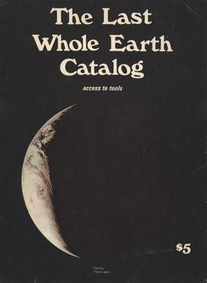
《The Whole Earth Catalog》是一本怎样的刊物?为什么在美国科技界有那么大影响力? - 知乎
https://www.zhihu.com/question/19560413
这本书似乎是一代思潮的缩影,嬉皮士,鲍勃迪兰,阿甘,乔布斯,谷歌,《失控》。。。。 那种想要反抗、描述、理解、展现世界的勇气,蔓延至今,令人激情澎湃。