一、什么是BFC
BFC全称Block Formatting Context ,翻译过来就是"块级格式化上下文",它是W3C CSS 2.1规范中的一个概念,它决定了元素如何对其内容进行定位,以及与其他元素的关系和相互作用。
二、BFC定义
它是一个独立的渲染区域,只有Block-level box 参与,它规定了内部的Block-level Box如何布局,并且与这个区域的外部毫不相干。
三、哪些元素会生成BFC?
1.根元素
2.float属性不为none
3.position为absolute或fixd
4.display为inline-block,table-cell,table-capition,flex,inline-flex
5.overflow不为visible
四、BFC的作用及理解
1.清除内部的浮动
<!DOCTYPE html>
<html lang="en">
<head>
<meta charset="UTF-8">
<meta name="viewport" content="width=device-width, initial-scale=1.0">
<meta http-equiv="X-UA-Compatible" content="ie=edge">
<title>Document</title>
<style>
.div1{
width: 100px;
height: 100px;
background: #ccc;
}
.div2{
width: 50px;
height: 50px;
background: red;
margin-top: 20px;
}
</style>
</head>
<body>
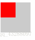
<div class="div1">
<div class="div2"></div>
</div>
</body>
</html>
效果图如下:
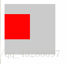
2.给父元素设置overflow:hidden;
 <!DOCTYPE html>
<html lang="en">
<head>
    <meta charset="UTF-8">
    <meta name="viewport" content="width=device-width, initial-scale=1.0">
    <meta http-equiv="X-UA-Compatible" content="ie=edge">
    <title>Document</title>
    <style>
    .div1{
        width: 100px;
        height: 100px;
        background: #ccc;
        overflow: hidden;
    }
    .div2{
        width: 50px;
        height: 50px;
        background: red;
        margin-top: 20px;
    }
    </style>
</head>
<body>
    <div class="div1">
        <div class="div2"></div>
    </div>
</body>
</html>
我们再看一下它发生了怎样的改变
2.自适应两栏布局
<!DOCTYPE html>
<html lang="en">
<head>
    <meta charset="UTF-8">
    <meta name="viewport" content="width=device-width, initial-scale=1.0">
    <meta http-equiv="X-UA-Compatible" content="ie=edge">
    <title>Document</title>
    <style>
    .div1{
        width: 100px;
        height: 100px;
        background: #ccc;
       float: left;
    }
    .div2{
        width: 300px;
        height: 300px;
        background: red;
        margin-top: 20px;

    }
    </style>
</head>
<body>
    <div class="div1"></div>
    <div class="div2"></div>
</body>
</html>
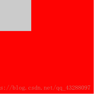
给div2加上overflow:hidden
<!DOCTYPE html>
<html lang="en">
<head>
    <meta charset="UTF-8">
    <meta name="viewport" content="width=device-width, initial-scale=1.0">
    <meta http-equiv="X-UA-Compatible" content="ie=edge">
    <title>Document</title>
    <style>
    .div1{
        width: 100px;
        height: 100px;
        background: #ccc;
       float: left;
    }
    .div2{
        width: 300px;
        height: 300px;
        background: red;
        margin-top: 20px;
       overflow: hidden;
    }
    </style>
</head>
<body>
    <div class="div1"></div>
    <div class="div2"></div>
</body>
</html>

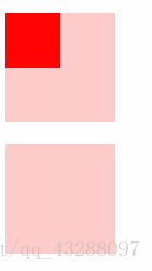
3.防止垂直margin重叠
<!DOCTYPE html>
<html lang="en">
<head>
    <meta charset="UTF-8">
    <title>Document</title>
</head>
<style>
    .div1{width: 100px;height: 100px;background: #fcc;margin-bottom: 10px; }
    .div2{width: 50px;height: 50px;margin-top: 20px;background: red;}
    .div3{margin-top: 10px;background: #fcc;width: 100px;height: 100px;position: absolute;}
</style>
<body>
        <div class="div1"><div class="div2"></div></div>
        <div class="div3"></div>
</body>
</html>
未完待续…