css中的BFC是什么呢?
1、概念:
BFC(Block Formatting Context)格式化上下文,是web页面中盒模型布局的css渲染模式,指一个独立的渲染区域或者说是一个隔离的独立容器。
2、形成BFC的条件
- 浮动元素,float除none以外的值;
- 定位元素,position(absolute,fixed);
- display为一下其中的值inline-block, table-cell, table-caption;
- overflow除了visible以外的值(hidden, auto, scroll);
3、BFC的特性
- 内部的元素会在垂直方向上一个接一个的放置;
- 垂直方向上的距离由margin决定(如果发生margin叠加的问题,怎么处理?);
- BFC的区域不会跟float的元素区域重叠;
- 计算BFC高度时候,浮动元素也参与计算;
- BFC就是页面上的一个独立的容器,容器里面的子元素不会影响外面元素。
废话不多说,上代码:
特性1:

<!DOCTYPE html>
<html lang="en">
<head>
  <meta charset="UTF-8">
  <meta name="viewport" content="width=device-width, initial-scale=1.0">
  <meta http-equiv="X-UA-Compatible" content="ie=edge">
  <title>Document</title>
  <style>
    /**/
    .container {
      position: absolute; /*触发BFC,创建BFC环境*/
      height: auto;
      background-color: #eee;
    }

    div {
      height: 20px;
    }

    .box1 {
      width: 500px;
      background-color: red;
    }
    .box2 {
      width: 300px;
      background-color: green;
    }
    .box3 {
      width: 50px;
      background-color: yellow;
      float: left;
    }
    .box4 {
      width: 100px;
      height: 50px;
      background-color: blueviolet;
    }

  </style>
</head>
<body>
  <div class="container">
    <div class="box1"></div>
    <div class="box2"></div>
    <div class="box3"></div>
    <div class="box4"></div>
  </div>
  <!-- 所有盒子向左对齐,垂直方向上,盒子都一个接一个排 -->
</body>
</html>
特性2:
<!DOCTYPE html>
<html lang="en">
<head>
<meta charset="UTF-8">
<meta name="viewport" content="width=device-width, initial-scale=1.0">
<meta http-equiv="X-UA-Compatible" content="ie=edge">
<title>Document</title>
<style>
/**/
.container {
position: absolute; /*触发BFC,创建BFC环境*/
height: auto;
background-color: #eee;
}
.box1 {
width: 500px;
height: 50px;
margin: 10px 0;
background-color: red;
}
.box2 {
width: 500px;
height: 50px;
margin: 30px 0;
background-color: red;
}
</style>
</head>
<body>
<div class="container">
<div class="box1"></div>
<div class="box2"></div>
</div>
<!-- -->
</body>
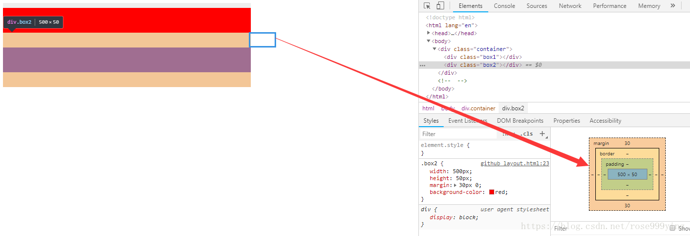
</html>此时发生了空白边的叠加问题; 那么有没有方法让垂直外边距不叠加呢?
答案是:有。
特性5:bfc就是页面上的一个独立容器,容器里面的子元素不会影响外面元素,同样外面的元素不会影响到BFC内的元素。所以就让box1或box2再处于另一个BFC中就行了。

<!DOCTYPE html>
<html lang="en">
<head>
  <meta charset="UTF-8">
  <meta name="viewport" content="width=device-width, initial-scale=1.0">
  <meta http-equiv="X-UA-Compatible" content="ie=edge">
  <title>Document</title>
  <style>
    /**/
    .container {
      position: absolute; /*触发BFC,创建BFC环境*/
      height: auto;
      background-color: #eee;
    }


    .box1 {
      width: 500px;
      height: 50px;
      margin: 10px 0;
      background-color: red;
    }
    .box2 {
      width: 500px;
      height: 50px;
      margin: 30px 0;
      background-color: red;
    }

    .wrap {
      overflow: hidden;
    }
  </style>
</head>
<body>
  <div class="container">
    <div class="wrap">
      <div class="box1"></div>
    </div>
    <div class="box2"></div>
  </div>
  <!--  -->
</body>
</html>
特性3:
左边固定宽度,右边自适应:
<!DOCTYPE html>
<html lang="en">
<head>
  <meta charset="UTF-8">
  <meta name="viewport" content="width=device-width, initial-scale=1.0">
  <meta http-equiv="X-UA-Compatible" content="ie=edge">
  <title>Document</title>
  <style>
    /**/
    .col:nth-of-type(1){
      float: left;
      width: 300px;
      height: 300px;
      background-color: red;
      margin-right: 10px;
    }

    .col:nth-of-type(2)  {
      overflow: hidden;
      height: 300px;
      background-color: aquamarine;
    }
  </style>
</head>
<body>
  <div class="col"></div>
  <div class="col"></div>
  <!--  -->
</body>
</html>
左右定宽,中间自适应:
<!DOCTYPE html>
<html lang="en">
<head>
  <meta charset="UTF-8">
  <meta name="viewport" content="width=device-width, initial-scale=1.0">
  <meta http-equiv="X-UA-Compatible" content="ie=edge">
  <title>Document</title>
  <style>
    /**/
    .col:nth-of-type(1),
    .col:nth-of-type(2){
      float: left;
      width: 200px;
      height: 300px;
      background-color: red;
    }

    .col:nth-of-type(2) {
      float: right;
    }

    .col:nth-of-type(3)  {
      overflow: hidden;
      height: 300px;
      background-color: aquamarine;
    }
  </style>
</head>
<body>
  <div class="container">
    <div class="col"></div>
    <div class="col"></div>
    <div class="col"></div>
  </div>
  <!--  -->
</body>
</html>
文字环绕问题:

<!DOCTYPE html>
<html lang="en">
<head>
  <meta charset="UTF-8">
  <meta name="viewport" content="width=device-width, initial-scale=1.0">
  <meta http-equiv="X-UA-Compatible" content="ie=edge">
  <title>Document</title>
  <style>
    /**/
    .main {
      width: 500px;
      margin: 0 auto;
    }
    .left {
      float: left;
      width: 30px;
      height: 30px;
      background-color: red;
    }
    p {
      background-color:aqua;
    }
  </style>
</head>
<body>
  <div class="main">
    <div class="left"></div>
    <p>
      众所周知,浮动的盒子会遮盖下面的盒子,但是下面盒子里的文字是不会被遮盖的,文字反而还会环绕浮动的盒子。这也是一个比较有趣的特性,没有省略号没有省略号没有省略号没有省略号没有省略号没有省略号没有省略号没有省略号没有省略号没有省略号没有省略号没有省略号没有省略号没有省略号没有省略号没有省略号
    </p>
  </div>
  <!--  -->
</body>
</html>
尝试给p元素: overflow: hidden;看看有什么样的效果呢?

上图跟我们平时做的效果,左边图片,右边文字的效果很像吧?
overflow: hidden;还有清楚浮动的效果,但是这个效果使用的时候,还是要注意的,因为会有一些意想不到的bug;