1、CSS背景图像的区域
background-clip:可以指定背景绘制的范围,共有三个范围
- padding-box(背景内容仅显示在内边距及以内区域)
- border-box(背景内容仅显示在边框内)
- content-box(背景内容仅显示在内容区域)
举个例子
<!DOCTYPE html>
<html>
<head>
	<title>Test</title>
	<meta charset="utf-8">
	<style type="text/css">
		div{
			width: 400px;
			height: 300px;
			background-color: red;
			display: inline-block;
			border: 10px solid transparent;
			padding: 20px;
			margin: 20px;
			text-align: center;
			color: white;
			box-sizing: border-box;
		}
		.contentBox{
			background-clip: content-box;
		}
		.borderBox{
			background-clip: border-box;
		}
		.paddingBox{
			background-clip: padding-box;
		}
	</style>
</head>
<body>
	<div class="contentBox">Content-box</div>
	<div class="borderBox">Border-box</div>
	<div class="paddingBox">Padding-box</div>
</body>
</html>
上面的代码展现出来的结果就是下面这个样子
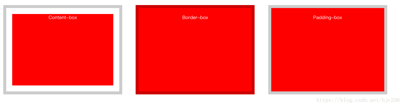
为了展示的更清楚,我将边框宽度设置为10像素,并且设置为透明的黑色。可以看见设置了content-box属性的div,背景颜色仅显示在了内容区域。而content-box与padding-box的主要区别在于背景显示是否包含边框,被设置了border-box属性的div的背景很明显填充到了边框之下,而被设置了padding-box的div则没有。
2、CSS背景定位
background-origin:用来设置图片的起始位置坐标,即原点位置,值依旧有三个与background-clip相同。
background-position:用来设置图片本身的显示位置,有两个值,水平跟竖直偏移量。
举个例子
<!DOCTYPE html>
<html>
<head>
	<title>Test</title>
	<meta charset="utf-8">
	<style type="text/css">
		div{
			width: 400px;
			height: 300px;
			display: inline-block;
			border: 10px solid rgba(0,0,0,0.2);
			padding: 20px;
			margin: 20px;
			text-align: center;
			color: white;
			box-sizing: border-box;
			background-image: url(http://pic21.photophoto.cn/20111122/0033033930517685_b.jpg);
			background-repeat: no-repeat;
		}
		.contentBox{
			background-origin: content-box;
		}
		.borderBox{
			background-origin: border-box;
		}
		.paddingBox{
			background-origin: padding-box;
		}
	</style>
</head>
<body>
	<div class="contentBox">Content-box</div>
	<div class="borderBox">Border-box</div>
	<div class="paddingBox">Padding-box</div>
</body>
</html>
以上代码展示出来是下面这个样子的:
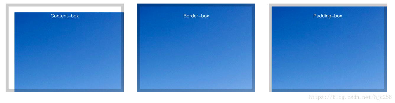
background-origin与background-clip属性一样,background-origin将坐标原点放在内容,边框或内边距框的最左上角。也就是从这一个原点开始显示。同样的background-position属性也是根据原点来进行计算。举个例子看看
<!DOCTYPE html>
<html>
<head>
	<title>Test</title>
	<meta charset="utf-8">
	<style type="text/css">
		div{
			width: 400px;
			height: 300px;
			display: inline-block;
			border: 10px solid rgba(0,0,0,0.2);
			padding: 20px;
			margin: 20px;
			text-align: center;
			color: white;
			box-sizing: border-box;
			background-image: url(http://pic21.photophoto.cn/20111122/0033033930517685_b.jpg);
			background-repeat: no-repeat;
			background-position: 10px 10px;
		}
		.contentBox{
			background-origin: content-box;
		}
		.borderBox{
			background-origin: border-box;
		}
		.paddingBox{
			background-origin: padding-box;
		}
	</style>
</head>
<body>
	<div class="contentBox">Content-box</div>
	<div class="borderBox">Border-box</div>
	<div class="paddingBox">Padding-box</div>
</body>
</html>
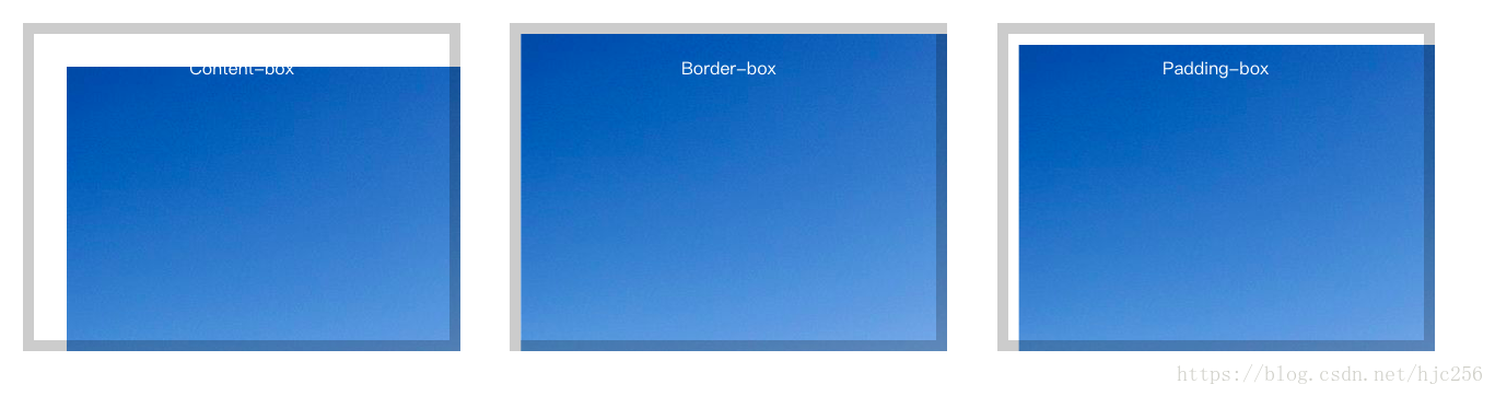
加入background-position属性之后,尽管偏移的值是相同的,但是由于各div的背景原点不同,所以导致背景根据不同的原点进行偏移,所以也就导致呈现出来的结果不同。
3、CSS背景大小
background-size:用来指定背景图片大小。
这个属性可以给两个值,第一个值为宽,第二个值为高。若只填写第一个值,则图片会根据比例自行缩放。若宽高均指定了,则图片会强制拉伸。例如下面代码
<!DOCTYPE html>
<html>
<head>
	<title>Test</title>
	<meta charset="utf-8">
	<style type="text/css">
		div{
			width: 400px;
			height: 300px;
			display: inline-block;
			border: 10px solid rgba(0,0,0,0.2);
			padding: 20px;
			margin: 20px;
			text-align: center;
			color: white;
			box-sizing: border-box;
			background-image: url(http://pic21.photophoto.cn/20111122/0033033930517685_b.jpg);
			background-repeat: no-repeat;
		}
		.contentBox{
			background-size: 100%;
		}
		.borderBox{
			background-size: 100% 100%
		}
	</style>
</head>
<body>
	<div class="contentBox"></div>
	<div class="borderBox"></div>

</body>
</html>