机器学习训练营——机器学习爱好者的自由交流空间(qq 群号:696721295)
在这个例子里,我们阐述在真实数据集上的稳健协方差估计的必要性。这样的协方差估计,对异常点检测,以及更好地理解数据结构都是有益的。
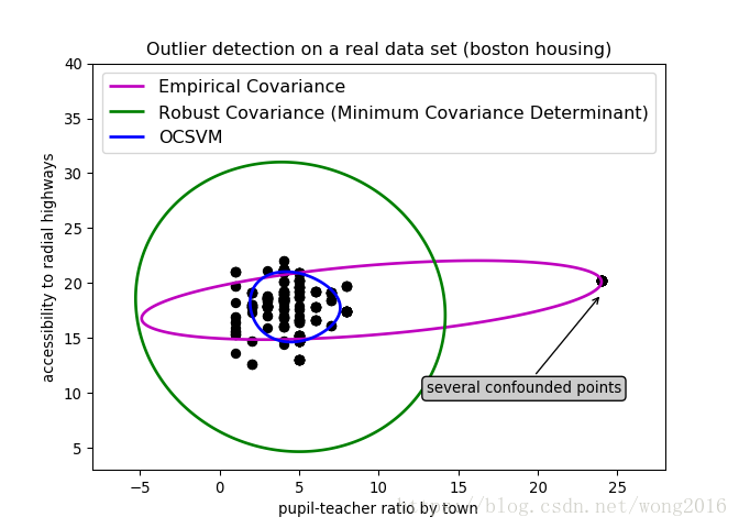
为了方便数据可视化,我们选择来自波士顿房价数据集的两个变量组成的二维数据集作为示例数据集。在下面的例子里,主要的结果是经验协方差估计,它受观测数据形态的影响很大。但是,我们仍然假设数据服从正态分布。这可能产生有偏的结构估计,但在某种程度上仍然是准确的。
一个例子
这个例子阐述,当数据存在一个类时,稳健的协方差估计如何帮助确定另一个相关的类。这个例子里的很多观测,很难确定属于同一个类,这给经验协方差估计带来了困难。当然,可以利用一些筛选工具,例如,支持向量机、高斯混合模型、单变量异常点检测,确定数据里存在两个类。但是,当维数大于2时,这些工具很难奏效。
代码详解
首先,加载必需的函数库。
print(__doc__)

# Author: Virgile Fritsch <[email protected]>
# License: BSD 3 clause

import numpy as np
from sklearn.covariance import EllipticEnvelope
from sklearn.svm import OneClassSVM
import matplotlib.pyplot as plt
import matplotlib.font_manager
from sklearn.datasets import load_boston
取数据集里的两个变量,这两个变量的观测组成两类。
X1 = load_boston()['data'][:, [8, 10]] # two clusters
定义要使用的分类器对象classifiers, 它是一个字典型,由Empirical Covariance, Robust Covariance, 单类支持向量机 OCSVM 三个分类器组成。
# Define "classifiers" to be used
classifiers = {
    "Empirical Covariance": EllipticEnvelope(support_fraction=1.,
                                             contamination=0.261),
    "Robust Covariance (Minimum Covariance Determinant)":
    EllipticEnvelope(contamination=0.261),
    "OCSVM": OneClassSVM(nu=0.261, gamma=0.05)}
colors = ['m', 'g', 'b']
legend1 = {}
使用定义的三个分类器,确定异常点检测边界。
xx1, yy1 = np.meshgrid(np.linspace(-8, 28, 500), np.linspace(3, 40, 500))

for i, (clf_name, clf) in enumerate(classifiers.items()):
    plt.figure(1)
    clf.fit(X1)
    Z1 = clf.decision_function(np.c_[xx1.ravel(), yy1.ravel()])
    Z1 = Z1.reshape(xx1.shape)
    legend1[clf_name] = plt.contour(
        xx1, yy1, Z1, levels=[0], linewidths=2, colors=colors[i])

legend1_values_list = list(legend1.values())
legend1_keys_list = list(legend1.keys())
画出结果图,我们会看到一个明显异常的观测点。
plt.figure(1)  # two clusters
plt.title("Outlier detection on a real data set (boston housing)")
plt.scatter(X1[:, 0], X1[:, 1], color='black')
bbox_args = dict(boxstyle="round", fc="0.8")
arrow_args = dict(arrowstyle="->")
plt.annotate("several confounded points", xy=(24, 19),
             xycoords="data", textcoords="data",
             xytext=(13, 10), bbox=bbox_args, arrowprops=arrow_args)
plt.xlim((xx1.min(), xx1.max()))
plt.ylim((yy1.min(), yy1.max()))
plt.legend((legend1_values_list[0].collections[0],
            legend1_values_list[1].collections[0],
            legend1_values_list[2].collections[0]),
           (legend1_keys_list[0], legend1_keys_list[1], legend1_keys_list[2]),
           loc="upper center",
           prop=matplotlib.font_manager.FontProperties(size=12))
plt.ylabel("accessibility to radial highways")
plt.xlabel("pupil-teacher ratio by town")

plt.show()
阅读更多精彩内容,请关注微信公众号:统计学习与大数据