import pandas as pd
from matplotlib import pyplot as plt
%matplotlib inline
import seaborn as sns
#读取数据
df=pd.read_csv('seaborn.csv',sep=',',encoding='utf-8',index_col=0)
df.head()
| Name | Type 1 | Type 2 | Total | HP | Attack | Defense | Sp. Atk | Sp. Def | Speed | Stage | Legendary | |
| # | ||||||||||||
| 1 | Bulbasaur | Grass | Poison | 318 | 45 | 49 | 49 | 65 | 65 | 45 | 1 | False |
| 2 | Ivysaur | Grass | Poison | 405 | 60 | 62 | 63 | 80 | 80 | 60 | 2 | False |
| 3 | Venusaur | Grass | Poison | 525 | 80 | 82 | 83 | 100 | 100 | 80 | 3 | False |
| 4 | Charmander | Fire | NaN | 309 | 39 | 52 | 43 | 60 | 50 | 65 | 1 | False |
| 5 | Charmeleon | Fire | NaN | 405 | 58 | 64 | 58 | 80 | 65 | 80 | 2 | False |
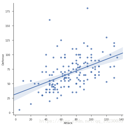
#散点图
#用seaborn画很方便,一句代码还带回归线
sns.lmplot(x='Attack',y='Defense',data=df,size=7)
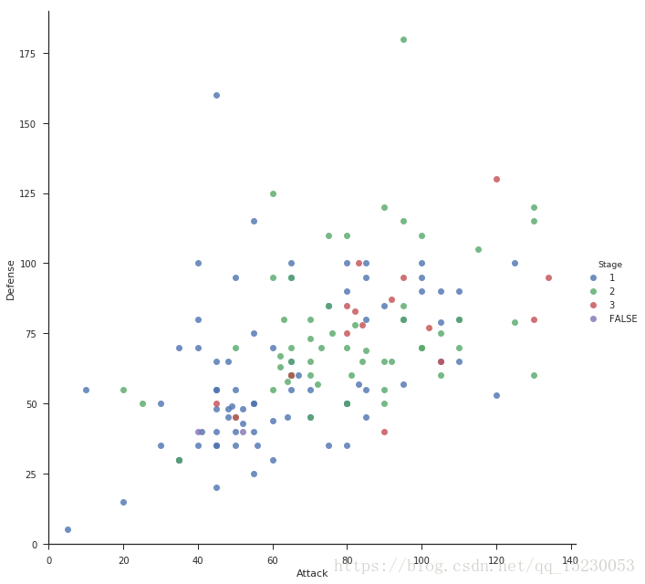
#移除回归线,用颜色区分散点
sns.lmplot(x='Attack',y='Defense',data=df,size=9,fit_reg=False,hue='Stage')
#设置轴范围
plt.ylim(0,None)
plt.xlim(0,None)
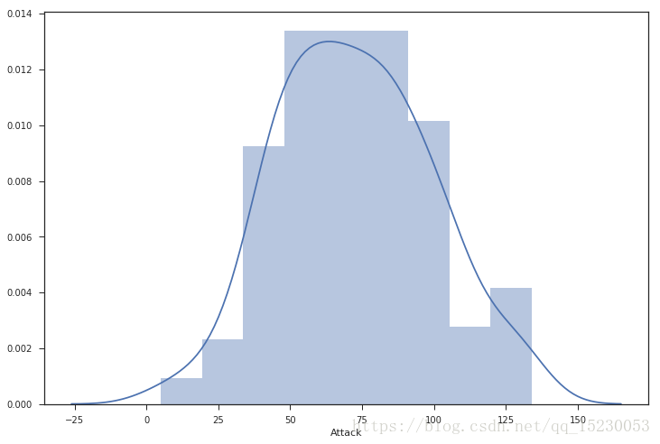
#核密度图
plt.style.use({'figure.figsize':(12, 8)}) #seaborn设置大小
# sb.palplot(sb.color_palette("Paired"))
sns.distplot(df['Attack'])
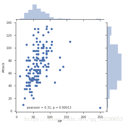
#jointplot 就是直方图 + 散点
# plt.style.use({'figure.figsize':(12, 10)}) #seaborn设置大小
sns.jointplot(x='HP',y='Attack',data=df2)

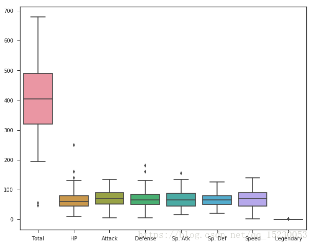
#boxplot
#直接用pandas df画boxplot默认就是用pandas每个series作为一个箱子
sns.boxplot(data=df)
plt.figure(figsize=(10, 10))
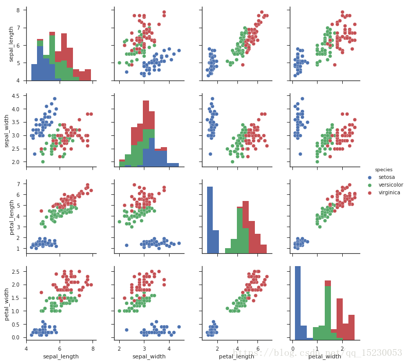
#pairplot
sns.set(style="ticks")
df2 = sb.load_dataset("iris")
sns.pairplot(df2, hue="species")
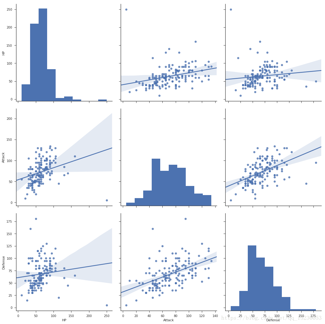
#直方图 + 线性回归
df2=df[['HP','Attack','Defense']]
sns.pairplot(df2,kind="reg",size=5)
#jointplot 就是直方图 + 散点
# plt.style.use({'figure.figsize':(12, 10)}) #seaborn设置大小
sns.jointplot(x='HP',y='Attack',data=df2)
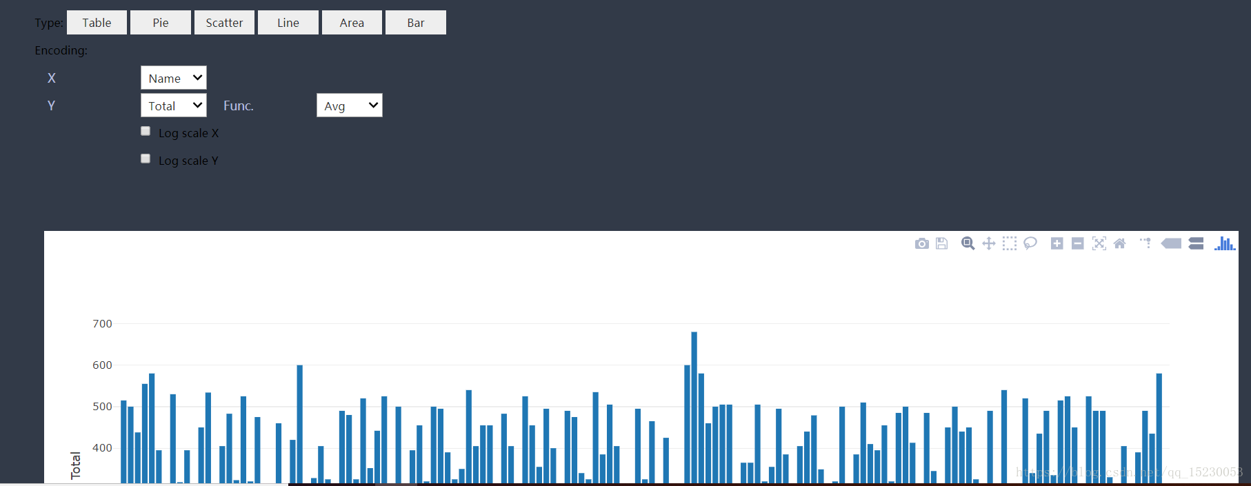
# autovizwidget 可以实现交互式图标和控件
from autovizwidget.widget.utils import display_dataframe
display_dataframe(df)