<template>
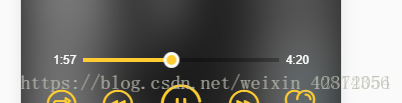
<!-- 进度条 总体长度 -->
<div class="progress-bar" ref="progressBar" @click="progressClick">
<div class="bar-inner">
<!-- 进度条 已播放长度 -->
<div class="progress" ref="progress"></div>
<!-- 进度条 按钮 -->
<div class="progress-btn-wrapper" ref="progressBtn"
@touchstart.prevent="progressTouchStart"
@touchmove.prevent="progressTouchMove"
@touchend.prevent="progressTouchEnd"
>
<div class="progress-btn"></div>
</div>
</div>
</div>
</template>
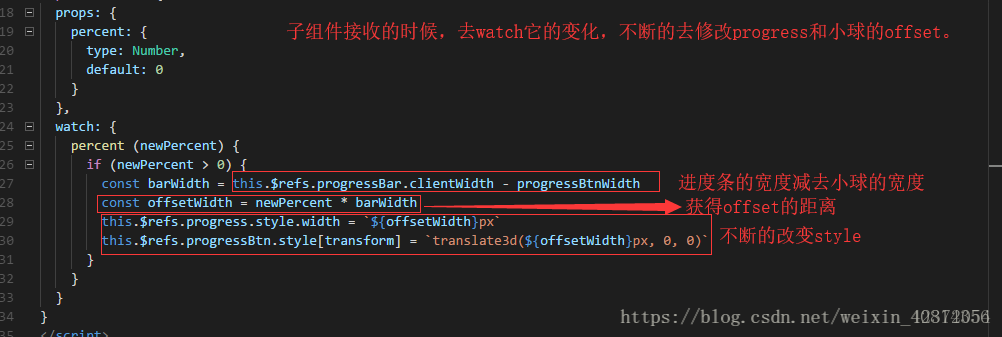
watch: {
    percent (newPercent) {
      if (newPercent >= 0 && !this.touch.initiated) {
        const progressBarWidth = this.$refs.progressBar.clientWidth - progressBtnWidth // 总宽度
        const progressWidth = newPercent * progressBarWidth
        this.$refs.progress.style.width = `${progressWidth}px`
        this.$refs.progressBtn.style[transform] = `translate3d(${progressWidth}px, 0, 0)`
      }
    }
  },
拖动小球而改变进度的实现
  created () {
    this.touch = {} // 将touch的数据挂在此对象下
  },
  methods: {
    progressTouchStart (e) {
      this.touch.initiated = true // 初始化 使用touchu必须先初始化
      this.touch.startX = e.touches[0].pageX // 记录触摸时的位置
      this.touch.left = this.$refs.progress.clientWidth // 记录已经进行的宽度 => 当前进度
    },
    progressTouchMove (e) {
      if (!this.touch.initiated) {
        return
      }
      const deltaX = e.touches[0].pageX - this.touch.startX // 实时得到移动的x位点 减去记录的x坐标  ==偏移量
      const progressWidth = Math.min(Math.max(0, deltaX + this.touch.left), this.$refs.progressBar.clientWidth - progressBtnWidth)
      this.$refs.progress.style.width = `${progressWidth}px`
      this.$refs.progressBtn.style[transform] = `translate3d(${progressWidth}px, 0, 0)`
    },
    progressTouchEnd () {
      this.touch.initiated = false
      this._trgglePercent()
    },
    progressClick (e) {
      const rect = this.$refs.progressBar.getBoundingClientRect()
      const offsetWidth = e.pageX - rect.left
      this.$refs.progress.style.width = `${offsetWidth}px` // e.offsetX 是点击后的偏移量
      this.$refs.progressBtn.style[transform] = `translate3d(${offsetWidth}px, 0, 0)`
      this._trgglePercent()
    },
    _trgglePercent () {
      const progressBarWidth = this.$refs.progressBar.clientWidth - progressBtnWidth // 总宽度
      const percent = this.$refs.progress.clientWidth / progressBarWidth
      this.$emit('percentChange', percent) // 派发事件
    }
  }
子组件继承父组件的数据是不能进行改变的,当子组件数据发生变化,最好的方法就是派发一个事件到父组件,然后在父组件中改变,在传回子组件
父组件
onPregressByChange (percent) {
      const onCurrentTime = this.currentSong.duration * percent // 改变时间显示
      this.$refs.audio.currentTime = onCurrentTime
      if (!this.playing) {
        this.togglePlaying()
      }
      if (this.currentLyric) {
        this.currentLyric.seek(onCurrentTime * 1000) // *1000毫秒  seek歌词跳转 自带方法
      }
    },
点击进度条实现跳转
    progressClick (e) {
      const rect = this.$refs.progressBar.getBoundingClientRect()
      const offsetWidth = e.pageX - rect.left
      this.$refs.progress.style.width = `${offsetWidth}px` // e.offsetX 是点击后的偏移量
      this.$refs.progressBtn.style[transform] = `translate3d(${offsetWidth}px, 0, 0)`
      this._trgglePercent()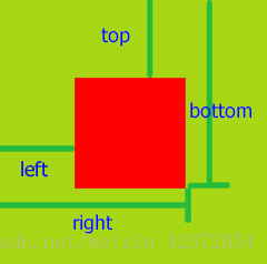
},getBoundingClientRect用于获取某个元素相对于视窗的位置集合。集合中有top, right, bottom, left等属性。
1.语法:这个方法没有参数。
rectObject = object.getBoundingClientRect();
2.返回值类型:TextRectangle对象,每个矩形具有四个整数性质( 上, 右 , 下,和左 )表示的坐标的矩形,以像素为单位。
rectObject.top:元素上边到视窗上边的距离;
rectObject.right:元素右边到视窗左边的距离;
rectObject.bottom:元素下边到视窗上边的距离;
rectObject.left:元素左边到视窗左边的距离;
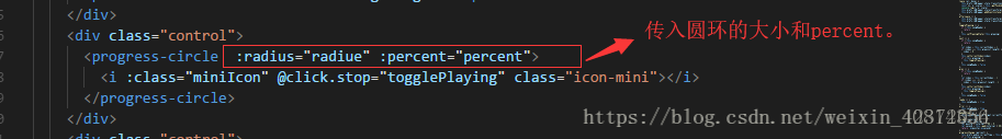
圆形进度条的实现
环形进度条是基于svg实现的
<template>
  <div class="progress-circle">
    <svg :width="radius" :height="radius" viewBox="0 0 100 100" version="1.1" xmlns="http://www.w3.org/2000/svg">
    <!-- width/height表示svg的宽高,viewBox表示根据svg的宽高拉出来的大小 -->
      <circle class="progress-background" r="50" cx="50" cy="50" fill="transparent" />
      <!-- r表示半径,cx 和 cy 属性定义圆点的 x 和 y 坐标 fill表示背景色 -->
      <circle class="progress-bar" r="50" cx="50" cy="50" fill="transparent" :stroke-dasharray="dashArray" :stroke-dashoffset="dashOffset"/>
    </svg>
    <slot></slot>
  </div>
</template>

<style lang="stylus" scoped>
  @import '~common/stylus/variable'

  .progress-circle
    position relative
    circle
      stroke-width 8px
      // stroke-width表示环形的宽度
      transform-origin center
      // 中心旋转
      &.progress-background
        transform scale(0.9)
        stroke $color-theme-d
      &.progress-bar
        transform scale(0.9) rotate(-90deg)
        stroke $color-theme
</style>