版权声明:本文为博主原创文章,码字不易,转载请先经本人同意。 https://blog.csdn.net/promiseCao/article/details/54029848
转眼间2017年了,在这里祝大家2017都能 展翅高飞、心想事成!

上次写博已经是两个月前了,这两个月七搞八搞学了不少黑科技日后必会分享给大家~下面咱们就开门见山了
由于浏览器本身自带的单选按钮且不说好看不好看,各大浏览器厂商也是一人一个样儿想要统一效果相对来说比较麻烦,所以我们常见的做法就是 自定义 一个单选按钮。像这样的效果:
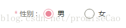
这样的一个性别选择按钮非常的常见,类似的效果也都可以用这种方法写出来。
.rdo {
    width: 20px;
    height: 0px;
    background-color: #000;
    margin-right: 30px;
    border-radius: 50%;
    position: relative;
}
.rdo:before,.rdo:after {
    content: '';
    display: block;
    position: absolute;
    border-radius: 50%;
    transition: .3s ease;
}
.rdo:before {
    top: 0px;
    left: 0px;
    width: 18px;
    height: 18px;
    background-color: #fff;
    border: 1px solid #000;
}
.rdo:after {
    top: 6px;
    left: 6px;
    width: 8px;
    height: 8px;
    background-color: #fff;
}
.rdo:checked:after {
    top: 4px;
    left: 4px;
    width: 12px;
    height: 12px;
    background-color:#ea879a;
}
.rdo:checked:before {
    border-color:#ea879a;
}

<input type="radio" class="rdo" name="sex" checked>
<input type="radio" class="rdo" name="sex">
没错,这里就是全部代码了,就是这么简单!如果你看懂了的话是不是感觉so easy?哈哈~
假如你没看懂也没关系,我们来一点点看。
1.在html结构中添加两个普通的单选按钮
<input type="radio" class="rdo" name="sex" checked>
<input type="radio" class="rdo" name="sex">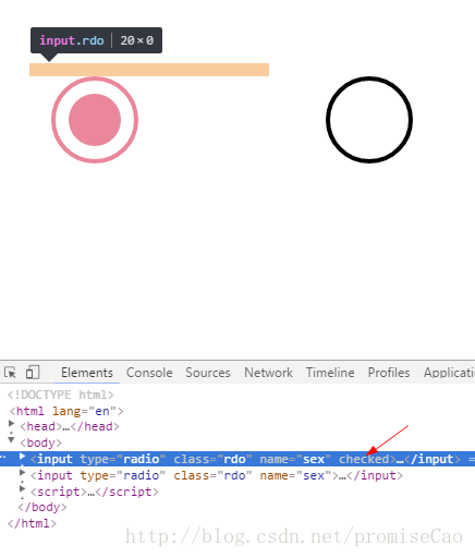
2.设置input的样式,将宽高任意一个设为0,全为0也可以
.rdo {
    width: 20px;
    height: 0px;
    background-color: #000;
    margin-right: 30px;
    border-radius: 50%;
    position: relative;
}
3. 利用before和after伪元素自定义单选按钮的样式
.rdo:before,.rdo:after {
    content: '';
    display: block;
    position: absolute;
    border-radius: 50%;
    transition: .3s ease;
}
.rdo:before {
    top: 0px;
    left: 0px;
    width: 18px;
    height: 18px;
    background-color: #fff;
    border: 1px solid #000;
}
.rdo:after {
    top: 6px;
    left: 6px;
    width: 8px;
    height: 8px;
    background-color: #fff;
}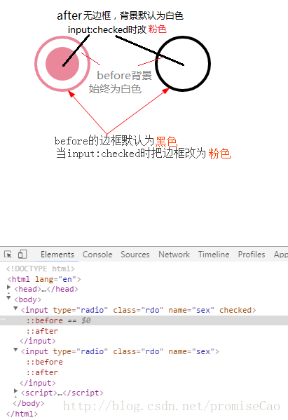
4. 当单选按钮被选中时改变被选中按钮身上before和after伪元素的样式,如上图中所示(图画得贼丑∩_∩,见谅)
.rdo:checked:after {
    top: 4px;
    left: 4px;
    width: 12px;
    height: 12px;
    background-color:#ea879a;
}
.rdo:checked:before {
    border-color:#ea879a;
}
如果朋友们有什么更好的办法模拟单选按钮效果欢迎留言探讨^_^
所有博客已转移至个人博客地址:www.clramw.top