1.写在前面
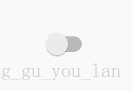
本文主要讲的是在Android原生Switch控件的基础上进行样式自定义,内容很简单,但是在实现的过程中还是遇到了一些问题,在此记录下来,希望对大家能够有所帮助,看下效果图:

2.自定义样式
2.1 原生样式
首先看下原生的效果(Android 7.1):
布局文件如下:
<Switch
    android:layout_width="wrap_content"
android:layout_height="wrap_content" />- 1
- 2
- 3
2.2 自定义样式
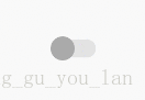
设计给的效果图大多数都不会使用原生效果,所以我们需要对样式进行自定义,比如下面这种效果:
定义Switch的开关按钮状态:
开启状态:switch_custom_thumb_on.xml
<?xml version="1.0" encoding="utf-8"?>
<shape xmlns:android="http://schemas.android.com/apk/res/android"
    android:shape="oval">
    <solid android:color="#94C5FF" />
    <size
        android:width="20dp"
        android:height="20dp" />
</shape>- 1
- 2
- 3
- 4
- 5
- 6
- 7
- 8
关闭状态:switch_custom_thumb_off.xml
<?xml version="1.0" encoding="utf-8"?>
<shape xmlns:android="http://schemas.android.com/apk/res/android"
    android:shape="oval">
    <solid android:color="#AAA" />
    <size
        android:width="20dp"
        android:height="20dp" />
</shape>- 1
- 2
- 3
- 4
- 5
- 6
- 7
- 8
定义一个selector:switch_custom_thumb_selector.xml
<?xml version="1.0" encoding="utf-8"?>
<selector xmlns:android="http://schemas.android.com/apk/res/android">
    <item android:drawable="@drawable/switch_custom_thumb_on" android:state_checked="true" />
    <item android:drawable="@drawable/switch_custom_thumb_off" android:state_checked="false" />
</selector>- 1
- 2
- 3
- 4
- 5
到此Switch的开关按钮状态就定义好了,接下来定义一下Switch滑动轨道的状态:
开启状态:switch_custom_track_on.xml
<?xml version="1.0" encoding="utf-8"?>
<shape xmlns:android="http://schemas.android.com/apk/res/android"
    android:shape="rectangle">
    <solid android:color="#B6D6FE" />
    <stroke
        android:width="5dp"
        android:color="#00000000" />
    <corners android:radius="20dp" />
</shape>- 1
- 2
- 3
- 4
- 5
- 6
- 7
- 8
- 9
关闭状态:switch_custom_track_off.xml
<?xml version="1.0" encoding="utf-8"?>
<shape xmlns:android="http://schemas.android.com/apk/res/android"
    android:shape="rectangle">
    <solid android:color="#E3E3E3" />
    <stroke
        android:width="5dp"
        android:color="#00000000" />
    <corners android:radius="20dp" />
</shape>- 1
- 2
- 3
- 4
- 5
- 6
- 7
- 8
- 9
定义一个selector:switch_custom_track_selector.xml
<?xml version="1.0" encoding="utf-8"?>
<selector xmlns:android="http://schemas.android.com/apk/res/android">
    <item android:drawable="@drawable/switch_custom_track_on" android:state_checked="true" />
    <item android:drawable="@drawable/switch_custom_track_off" android:state_checked="false" />
</selector>- 1
- 2
- 3
- 4
- 5
Switch自定义样式,默认情况下开关按钮和滑动轨道的高度是一样的,并且在xml文件中对轨道的宽高设置是无效的,如果想要修改轨道的高度可以这样做:
轨道高度低于开关按钮高度(效果中的第一个效果):轨道增加一个透明的边框
轨道高度高于开关按钮高度(效果中的第二个效果):开关按钮增加一个透明的边框
轨道的宽度会随着开关按钮的宽度自动变化,如果想要修改轨道的宽度,修改开关按钮的宽度就可以了。
设置自定义样式
thumb是开关按钮的属性,track是滑动轨道的属性,只需要把上面的两个selector文件设置进去就大功告成了。
<Switch
    android:layout_width="wrap_content"
    android:layout_height="wrap_content"
    android:thumb="@drawable/switch_custom_thumb_selector"
android:track="@drawable/switch_custom_track_selector" />- 1
- 2
- 3
- 4
- 5
3.更多属性
如果想要在开关按钮上显示文字怎么办,textOn和textOff属性可以分别设置开启和关闭的文字,别忘了将showText属性设置为true,这样才能显示出来:
<Switch
    android:layout_width="wrap_content"
    android:layout_height="wrap_content"
    android:layout_marginTop="30dp"
    android:showText="true"
    android:switchTextAppearance="@style/SwitchTheme"
    android:textOff="OFF"
    android:textOn="ON"
    android:thumb="@drawable/switch_rectangle_thumb_selector"
android:track="@drawable/switch_rectangle_track" />- 1
- 2
- 3
- 4
- 5
- 6
- 7
- 8
- 9
- 10
显示文字还不够,还需要修改文字的颜色:
在res文件夹下建一个color文件夹,定义一个文本颜色状态的selector:switch_text_selector.xml
<?xml version="1.0" encoding="utf-8"?>
<selector xmlns:android="http://schemas.android.com/apk/res/android">
    <item android:color="#FFF" android:state_checked="false" />
    <item android:color="#000" android:state_checked="true" />
</selector>- 1
- 2
- 3
- 4
- 5
然后在style文件中定义一个样式:
<style name="SwitchTheme" parent="@android:style/TextAppearance.Small">
    <item name="android:textColor">@color/switch_text_selector</item>
</style>- 1
- 2
- 3
最后在Switch中设置一下就可以了:
android:switchTextAppearance="@style/SwitchTheme"- 1
4.写在最后
本文只讲了效果图中第一种样式的实现方法,更多样式可以在GitHub上进行下载查看,如有疑问,可以给我留言。