1、创建一个flex容器
任何一个flexbox布局的第一步是需要创建一个flex容器。为此给元素设置display属性的值为flex
2、通过flex-direction来改变主轴方向
默认值是row,可以修改成column
3、移动到顶部
移动到顶部,取决于主轴的方向,如果它是垂直的方向,通过align-items设置,如果它是水平方向,通过justify-content设置。
垂直移动到顶部:移动到右边则是justify-content:flex-end;居中为center
.flexcontainer{ -webkit-flex-direction: column; flex-direction: column; -webkit-justify-content: flex-start; justify-content: flex-start; }水平显示移动到顶部:移动到右边则是align-items:flex-end;居中为center
.flexcontainer{ display: -webkit-flex; display: flex; -webkit-flex-direction: row; flex-direction: row; -webkit-align-items: flex-start; align-items: flex-start; }自动伸缩量
设置flex:固定值
flex:100;示例:
<!DOCTYPE html>
<html lang="en">
<head>
<meta charset="UTF-8">
<title>Document</title>
<style type="text/css">
*{
margin: 0;
padding: 0;
}
.box{
display: flex;
align-items: center;
justify-content: center;
width: 300px;
height: 500px;
background:red;
}
.child{
background: blue;
margin: 30px;
}
</style>
</head>
<body>
<div class="box">
<div class="child">我是盒子1</div>
<div class="child">我是盒子2</div>
</div>
</body>
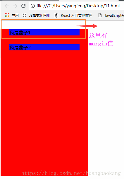
</html>页面效果:
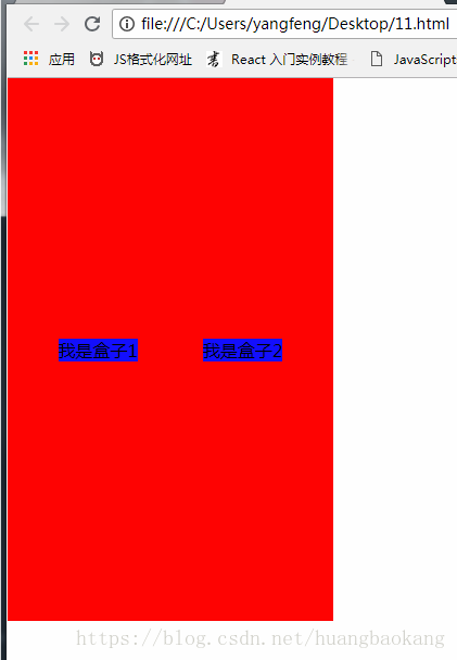
可以看出,div的显示方式跟传统的不一样了,正常布局应该是块元素,如,去掉display:flex,将换行显示。如下: