EditText 背景设置
1. 调整背景颜色
EditText默认的效果:
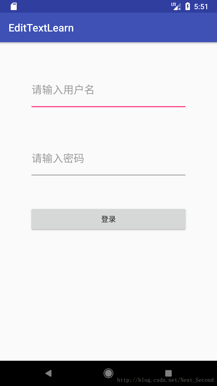
其中,下划线的颜色有两种状态:
- normal color 没有焦点时的颜色,可以通过
colorControlNormal来设置。 - activated color 获取到焦点时的颜色,可以通过
colorControlActivated来设置。
eg.
styles.xml
    <!-- EditText 样式 -->
    <style name="EditTextStyle" parent="Base.Widget.AppCompat.EditText">

        <item name="colorControlNormal">@color/edit_text_normal_color</item>
        <item name="colorControlActivated">@color/edit_text_activated_color</item>
    </style>
colors.xml
    <!-- EditText -->
    <color name="edit_text_normal_color">#00FF00</color>
    <color name="edit_text_activated_color">#FF00FF</color>
在布局文件中,设置EditText的theme:
<EditText
android:id="@+id/et_user_name"
android:layout_width="300dp"
android:layout_height="80dp"
android:layout_alignParentTop="true"
android:layout_centerHorizontal="true"
android:layout_marginTop="50dp"
android:hint="请输入用户名"
android:textSize="20sp"
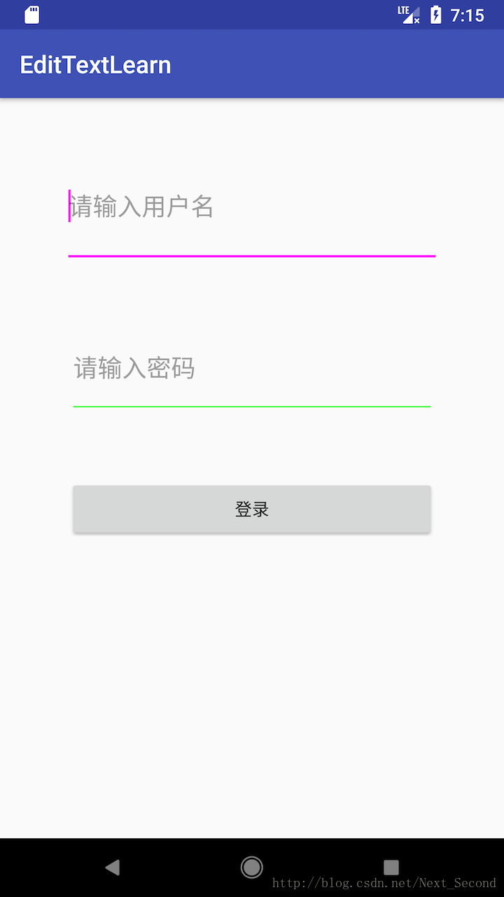
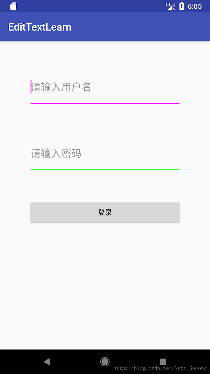
android:theme="@style/EditTextStyle" />这样设置之后,效果图为:
2. 设置背景下划线的位置
默认情况下,EditText的style设置为Base.Widget.AppCompat.EditText,查看其源代码,我们可以一步一步地看到其具体的设值:(具体代码位置为sdk_path/platforms/android-xx/data/res)
    <!-- styles.xml -->
    <style name="Base.Widget.AppCompat.EditText" parent="Base.V7.Widget.AppCompat.EditText"/>

    <!-- styles.xml -->
    <style name="Base.V7.Widget.AppCompat.EditText" parent="android:Widget.EditText">
        <item name="android:background">?attr/editTextBackground</item>
        <item name="android:textColor">?attr/editTextColor</item>
        <item name="android:textAppearance">?android:attr/textAppearanceMediumInverse</item>
    </style>

    <!-- themes_material.xml -->
<item name="editTextBackground">@drawable/edit_text_material</item>其中,edit_text_material的内容为:
<?xml version="1.0" encoding="utf-8"?>
<!-- Copyright (C) 2014 The Android Open Source Project

     Licensed under the Apache License, Version 2.0 (the "License");
     you may not use this file except in compliance with the License.
     You may obtain a copy of the License at

          http://www.apache.org/licenses/LICENSE-2.0

     Unless required by applicable law or agreed to in writing, software
     distributed under the License is distributed on an "AS IS" BASIS,
     WITHOUT WARRANTIES OR CONDITIONS OF ANY KIND, either express or implied.
     See the License for the specific language governing permissions and
     limitations under the License.
-->

<inset xmlns:android="http://schemas.android.com/apk/res/android"
       android:insetLeft="@dimen/edit_text_inset_horizontal_material"
       android:insetRight="@dimen/edit_text_inset_horizontal_material"
       android:insetTop="@dimen/edit_text_inset_top_material"
       android:insetBottom="@dimen/edit_text_inset_bottom_material">
    <selector>
        <item android:state_enabled="false">
            <nine-patch android:src="@drawable/textfield_default_mtrl_alpha"
                android:tint="?attr/colorControlNormal" />
        </item>
        <item android:state_pressed="false" android:state_focused="false">
            <nine-patch android:src="@drawable/textfield_default_mtrl_alpha"
                android:tint="?attr/colorControlNormal" />
        </item>
        <item>
            <nine-patch android:src="@drawable/textfield_activated_mtrl_alpha"
                android:tint="?attr/colorControlActivated" />
        </item>
    </selector>
</inset>可以看到,EditText默认的background是一个InsetDrawable。
关于InsetDrawable的相关知识:
InsetDrawable对应于<inset>标签,它可以将其他Drawable内嵌到自己当中去,并可以在四周留出一定的间距。当一个View希望自己的背景比自己的实际区域小的时候,可以使用InsetDrawable来实现。其中,InsetDrawable的语法为:
<?xml version="1.0" encoding="utf-8"?>
<inset xmlns:android="http://schemas.android.com/apk/res/android"
       android:drawable="@drawable/drawable_resource"
       android:insetLeft="dimension"
       android:insetRight="dimension"
       android:insetTop="dimension"
       android:insetBottom="dimension">
</inset>
android:insetLeft等四个属性分别表示,左右上下内凹的大小。
android:drawable表示资源图片的位置。该资源距离外边距的大小即insetLeft等的值。
另外,inset内部还可以包含shape,color, nine-patch等元素。这些边距表示距离inset内部的元素的距离。在EditText的backgound中,安卓系统就使用了selector+nine-patch。
EditText的背景默认边距
我们可以查看源代码:
    <!-- values/dimens_material.xml -->
    <dimen name="edit_text_inset_horizontal_material">4dp</dimen>
    <dimen name="edit_text_inset_top_material">10dp</dimen>
    <dimen name="edit_text_inset_bottom_material">7dp</dimen>
所以,我们看到的默认EditText背景框,其距离左右距离各4dp,距离上部10dp,距离底部7dp。
修改背景边距
在做项目的时候,我们有一个需求,就是EdtiText的背景下划线,是紧贴这EditText的底部的,并且左右也是紧贴着的。所以,我们可以将相关的源代码拿过来,然后修改边距的数值即可:
具体步骤为:
- 复制相关源代码到资源目录:edit_text_material.xml, textfield_activated_mtrl_alpha.9.png , textfield_default_mtrl_alpha.9.png
- 在dimens.xml文件中添加尺寸,并根据需求设值。
- 在布局文件中设值EditText的background。
在demo中,我将第一个EditText的背景边距设置为0,而第二个EditText为默认边距,大家可以对比看一下效果: